Setting the standard for FMCG websites for alcohol brands
By Ryan Stockall
Many big FMCG websites are flat and functional. Even in traditionally high interest and engaging categories such as alcohol where brands go heavy on emotion, attitude and personality, we are mostly presented with lacklustre and transactional websites.
Bigger brands often still rely on their wide distribution, shelf standout and traditional advertising as a way to drive sales and engage with users.
It has typically been smaller, challenger brands without the big distribution or marketing budgets who have really made the most of their ‘owned’ media such as websites and social channels to raise awareness, drive engagement and in many cases directly sell their products.
At BGN, we are big believers in the benefits of having a great website for powerful storytelling and as a way to engage customers and potential customers beyond what your pack design and a piece of advertising can achieve.
In this article, we’ve pulled out five alcoholic drink brands that we believe are setting the standard in the digital space and how.
1. Telling a product story well
Hardin’s Creek (www.hardinscreek.com)

The Hardin's Creek site is all about taking the users on a guided journey to explore past, present and future product ranges. With a limited amount of pages, each section of the site is there for a reason. Not over loading the user with unnecessary information it provides just enough to hook someone leaving them with a desire to know more.
2. Creating a fully immersive journey
Pasqua (www.pasqua.it)
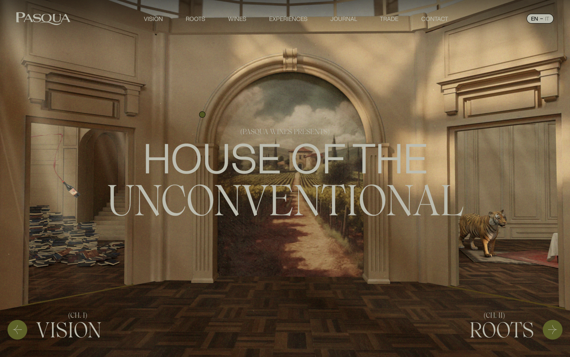
Pasqua is very clear about the fact it is not selling ordinary wine. So their website is equally not ordinary to match. The site pulls out all the stops and takes people on a user led experiential journey to uncover more details and create that feeling of luxury.
3. Bring to life a multi-sensory ‘brand world’
Valdoca (www.valdoca.com)
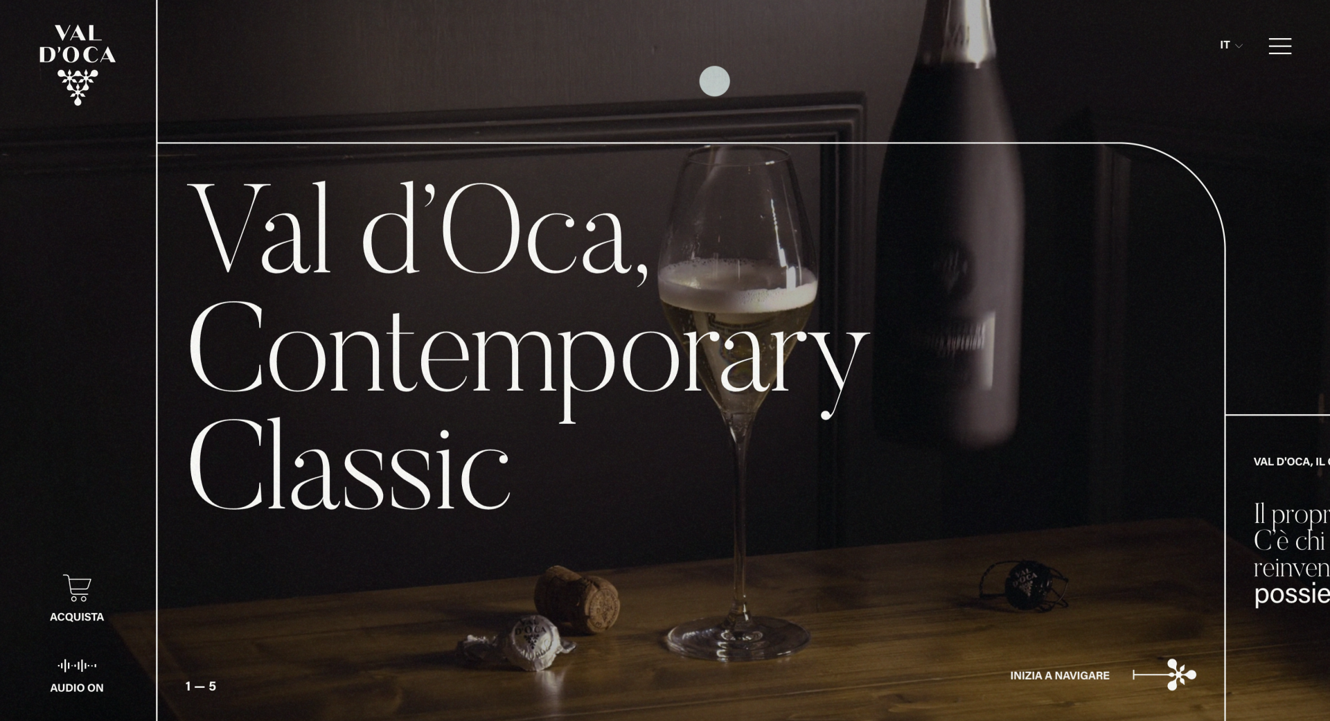
Every restaurant, hotel, etc has its own smell, style and sound that fits their aesthetic and brands are often the same. Valdoca is a great example of a site bringing to life as many of these sensory elements as they can in a digital setting. From the smooth jazz playing once you land to the art direction of the photography and just how the site glides you seamlessly through the content.
4. KISS (Keep it Simple Stupid)
Pillars (www.pillarsbrewery.com)
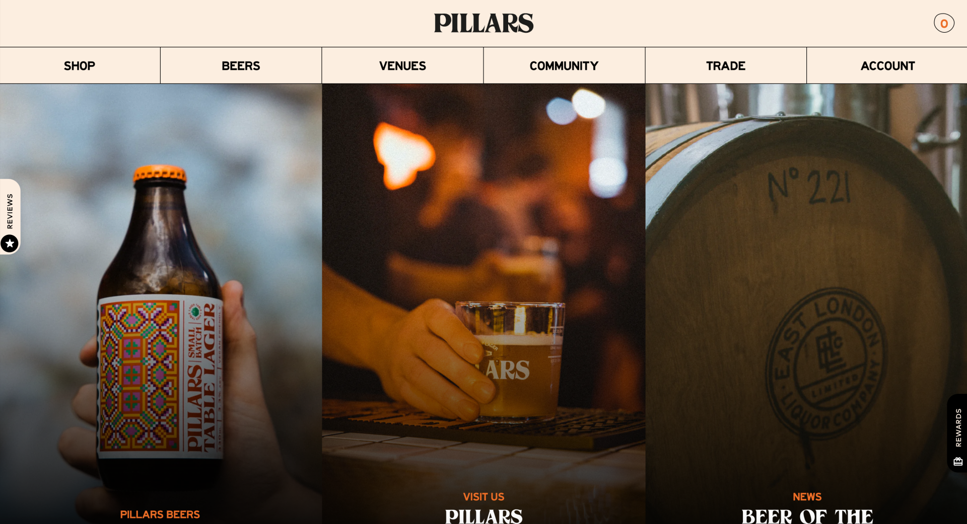
It is not only uber premium and luxury brands that should invest in their websites. Pillars does a great job at simplifying, helping users easily navigate the different parts of their site, and still managing to create a clear sense of personality with some lovely small details and finishes.
5. A reason to come back
Ette (www.ettespirits.com)
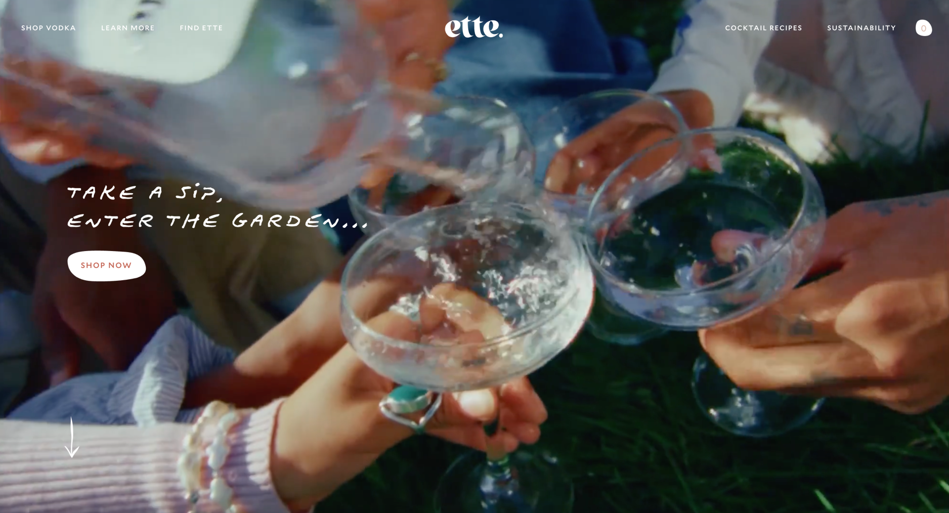
One of the main metrics for a successful website is ‘time spent on site’. How do we keep users on the site for longer? And how do we encourage people to come back again? There are many different tactics brands can use to help this from gamification, a members page with updating offers, events and exclusive new, articles and in the case of Ette really simple recipes.
So there you have it, five ways different alcohol brands are raising, elevating and pushing standards with their websites.
Get in touch if you want to know more about how we can help you raise the digital and web standard with your brand. We have our own in-house digital brand designers and website developers.
We’re BGN, a brand led design and creative agency and we help ambitious brand set the standard in their space.

