To set the standard in prop-tech and con-tech.
The brief
The brief was to consolidate three standalone brands into one overarching Zutec brand in order to simplify and show the connection of each brand across the entire building lifecycle from planning to property maintenance. There was also a desire to modernise the Zutec brand and cement its position as a leader in its field.

Digitalised documentation
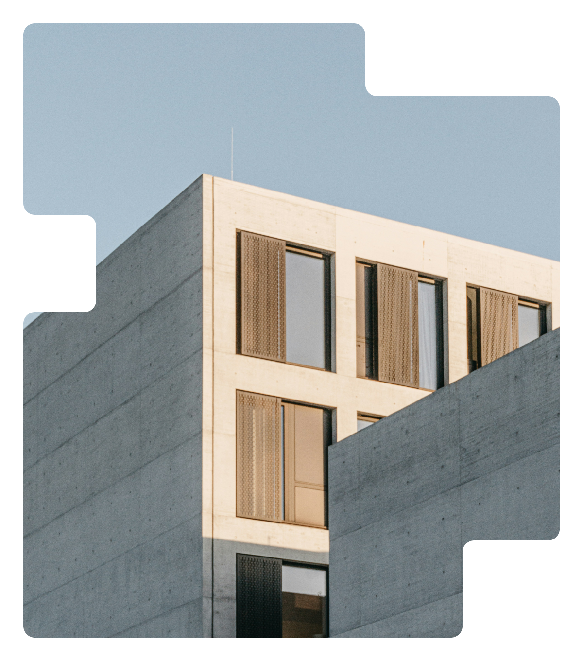
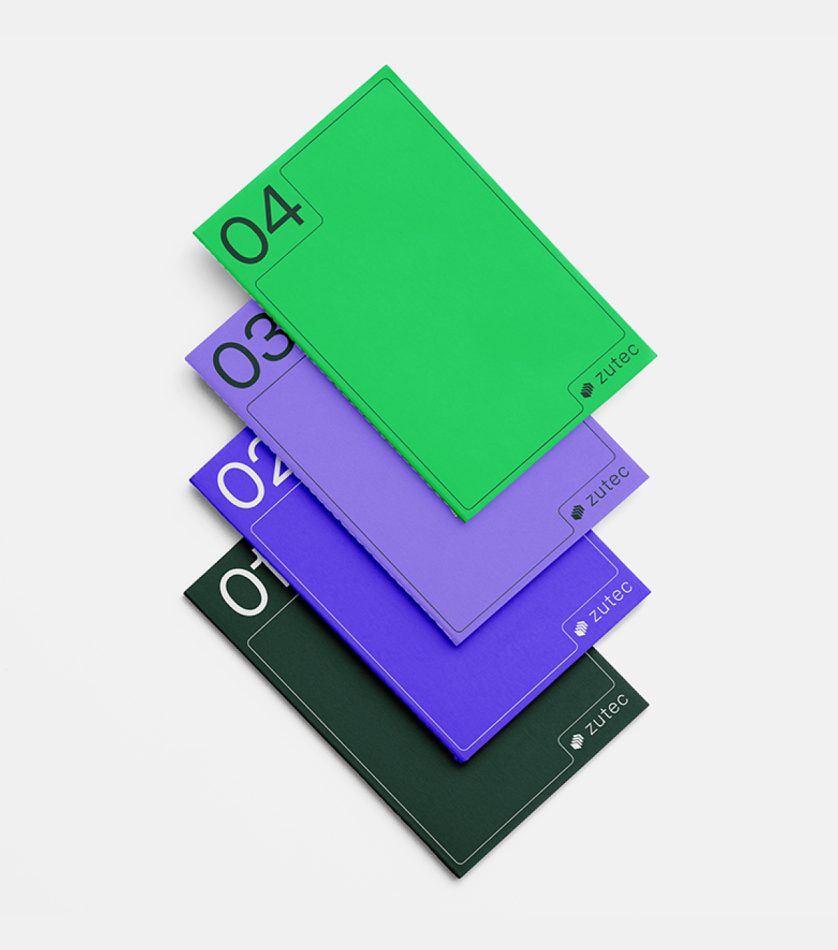
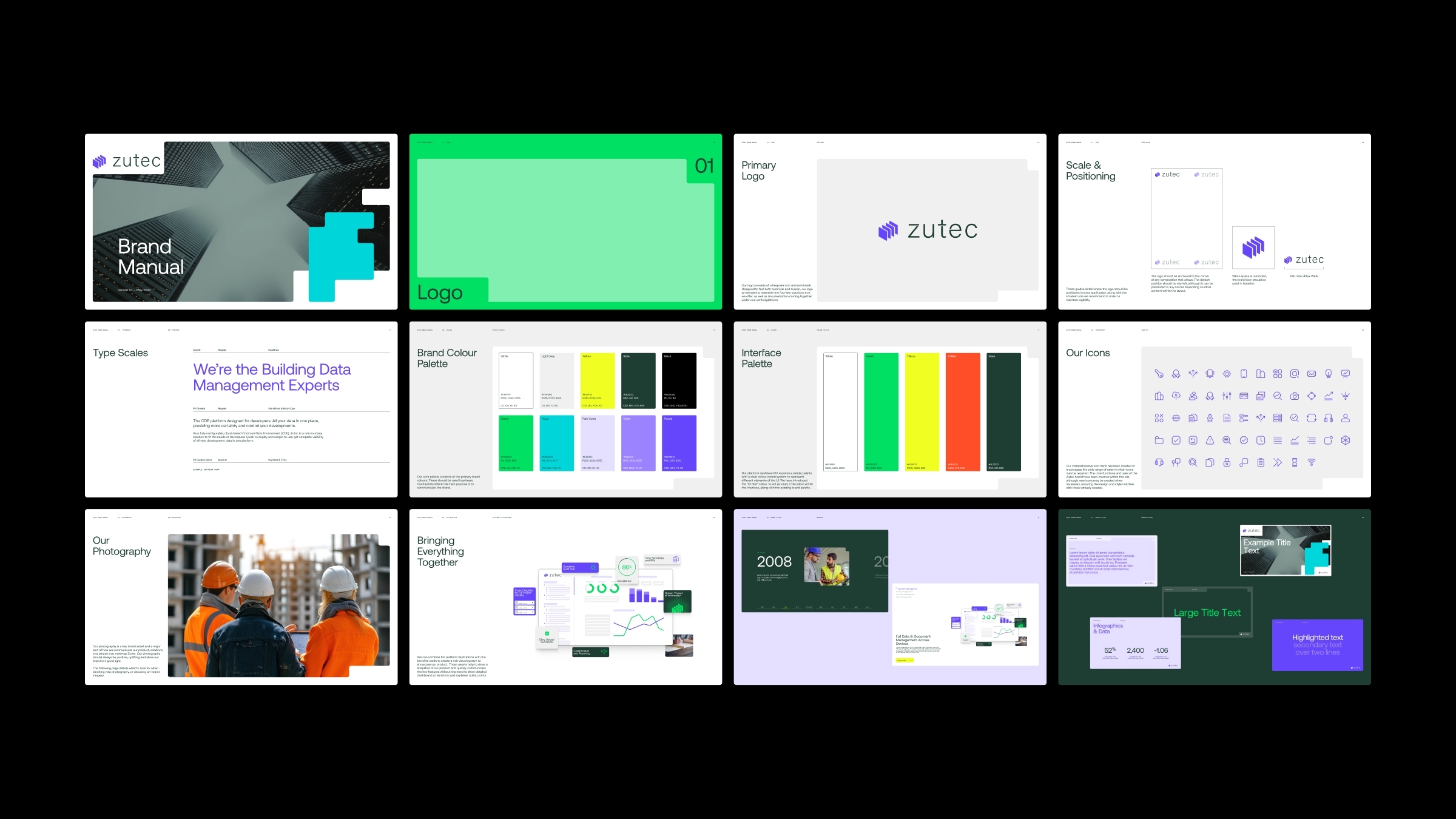
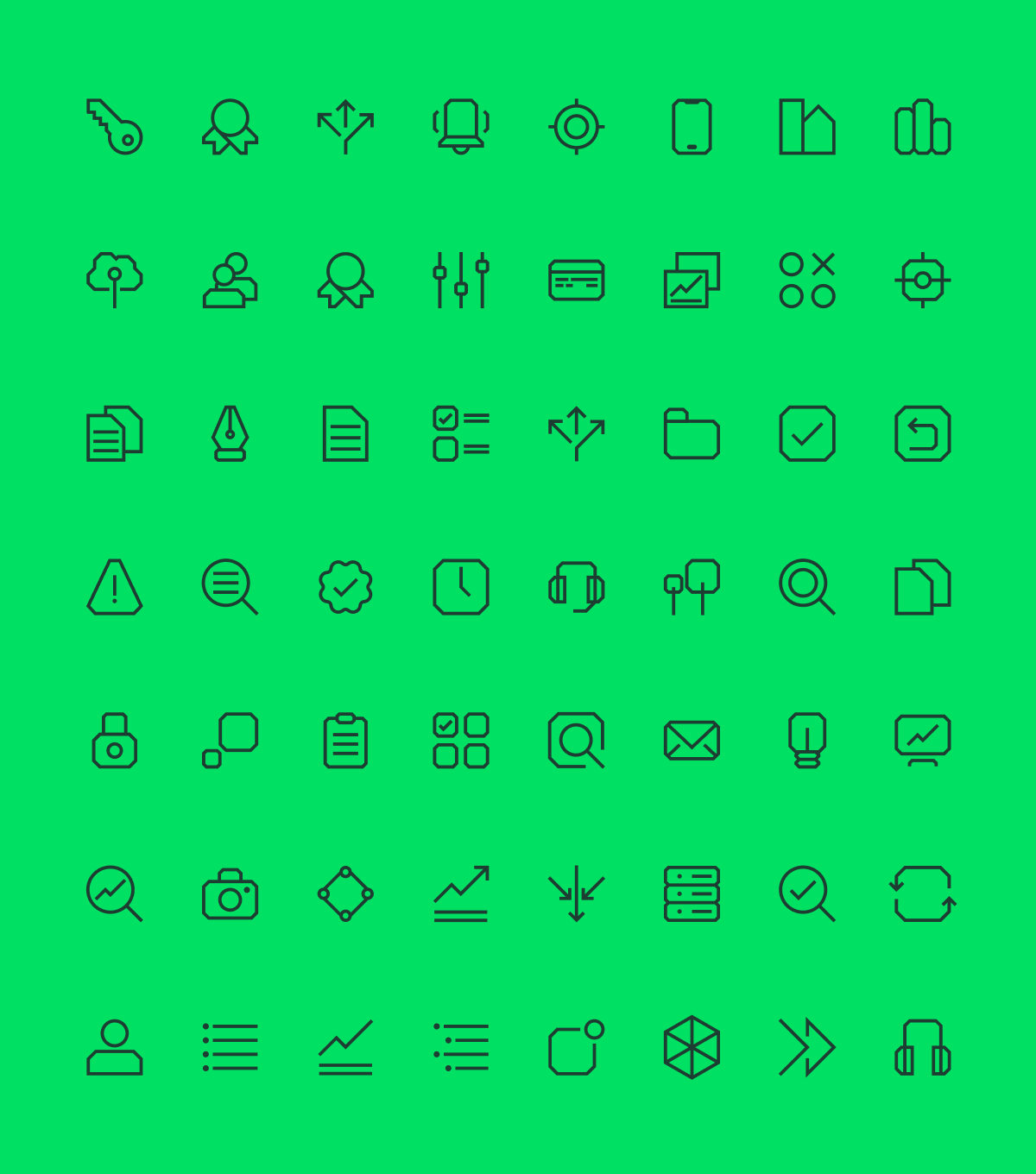
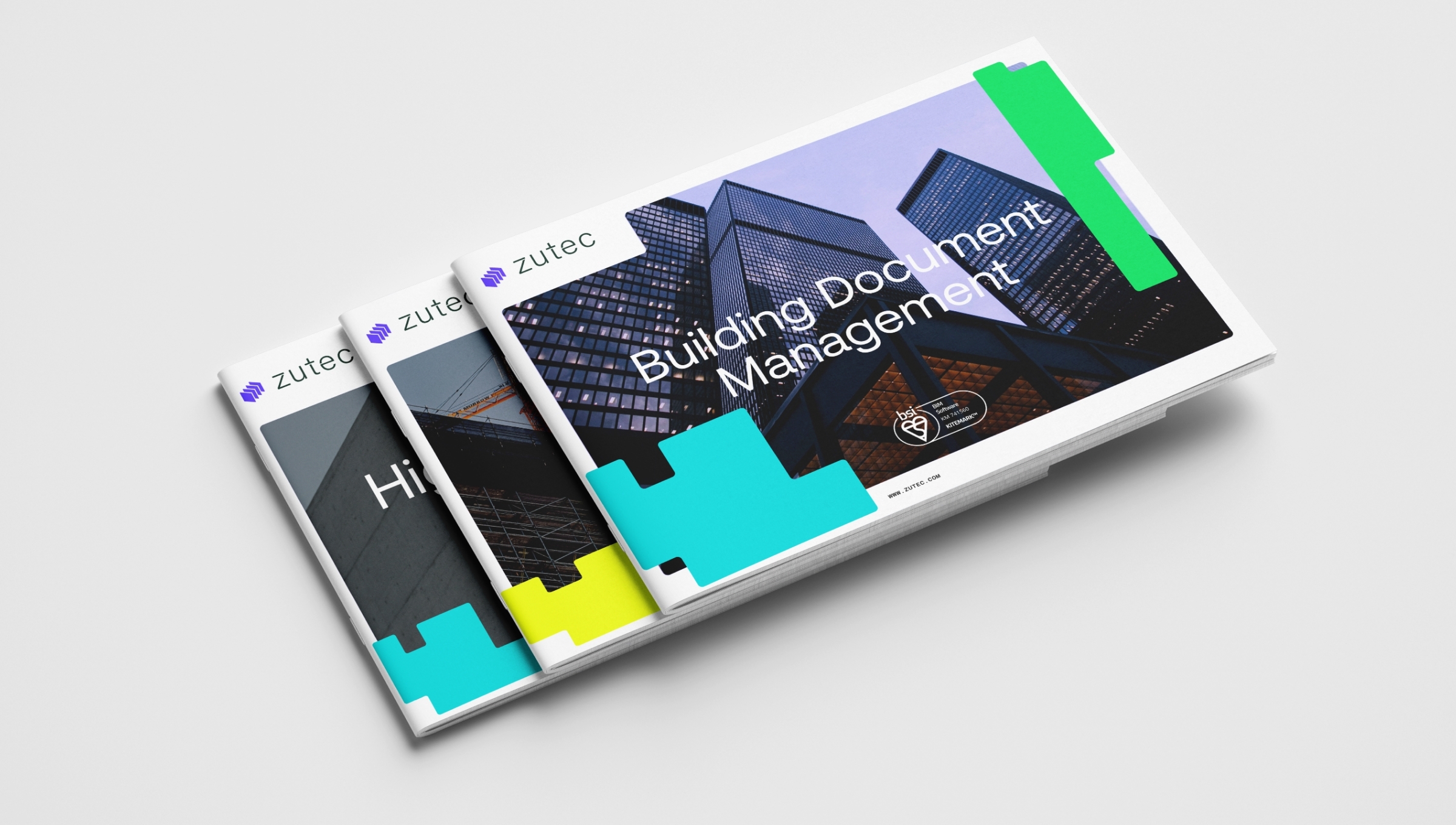
Our creative idea used the concept of concept of digitisation showing the collation of building documentation and using the outline of building floorplans as the primary starting points. These distinct shapes combined with a bold digital colour palette reinforce the cutting-edge tech aspect of the refreshed brand. The new Zutec logo represents the four key solutions offered by the brand across the lifecycle as well as how all this documentation seamlessly comes together.
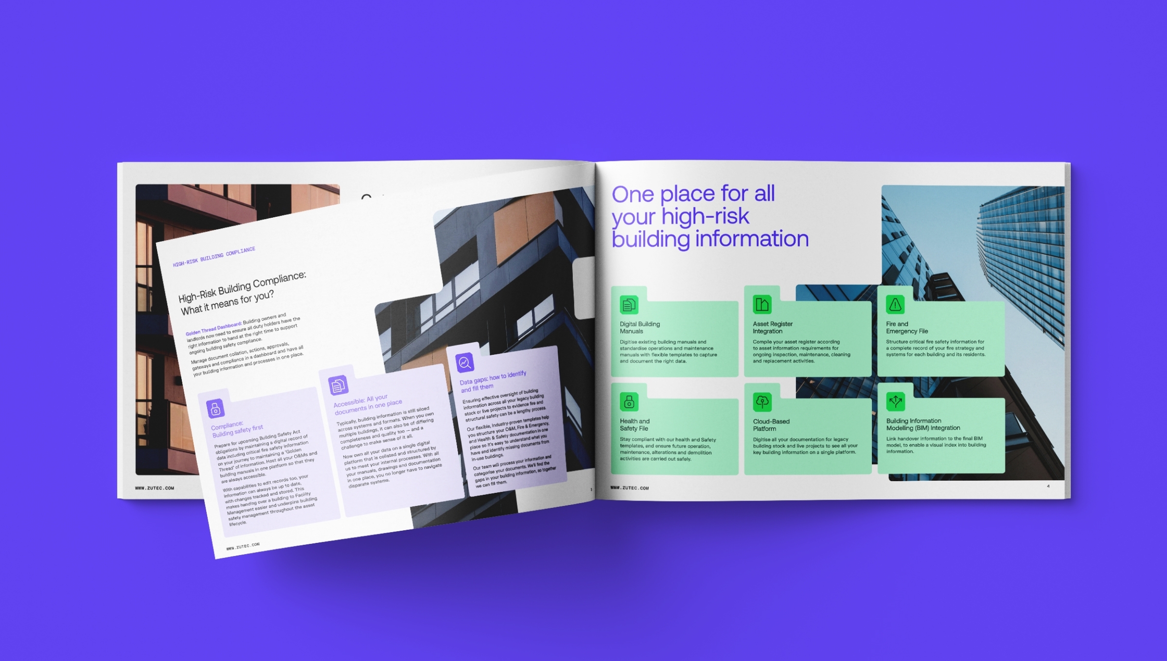
Building for better
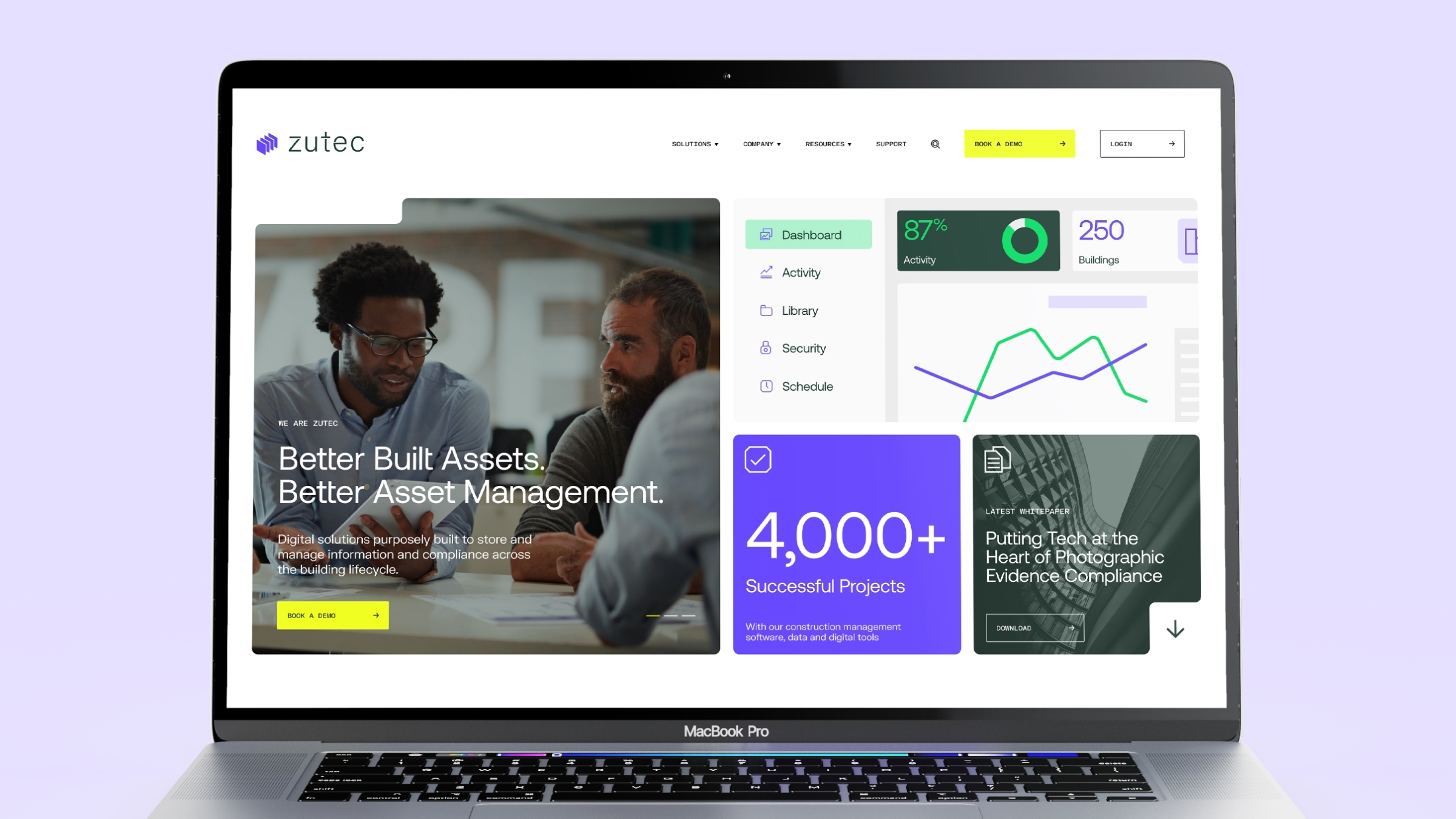
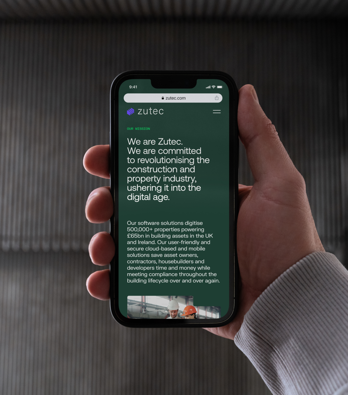
We rolled out this new proposition and visual identity across a new website and a suite of supporting marketing collateral including brochures, videos and digital templates. The new website, as a key touchpoint for the brand, is simple to navigate and slick from a user experience and helps set the brand apart from its competitors.

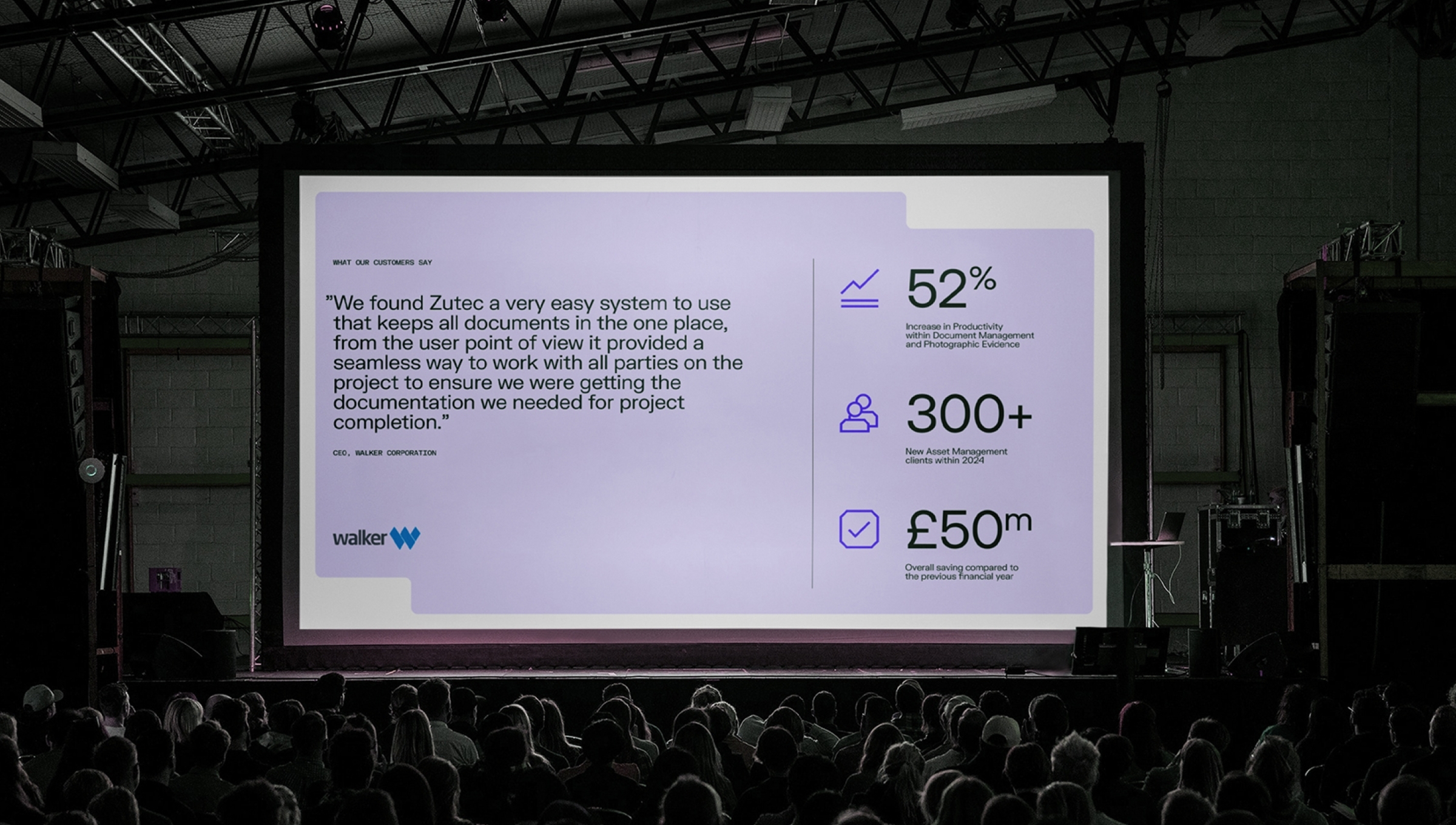
BGN instinctively understood this challenge and their mix of strategy and creativity helped us connect those dots. The simplified approach is already changing perceptions and is helping our alignment with the latest digital and regulatory requirements of our customers.
CMO