Setting the standard in affordable luxury home improvements
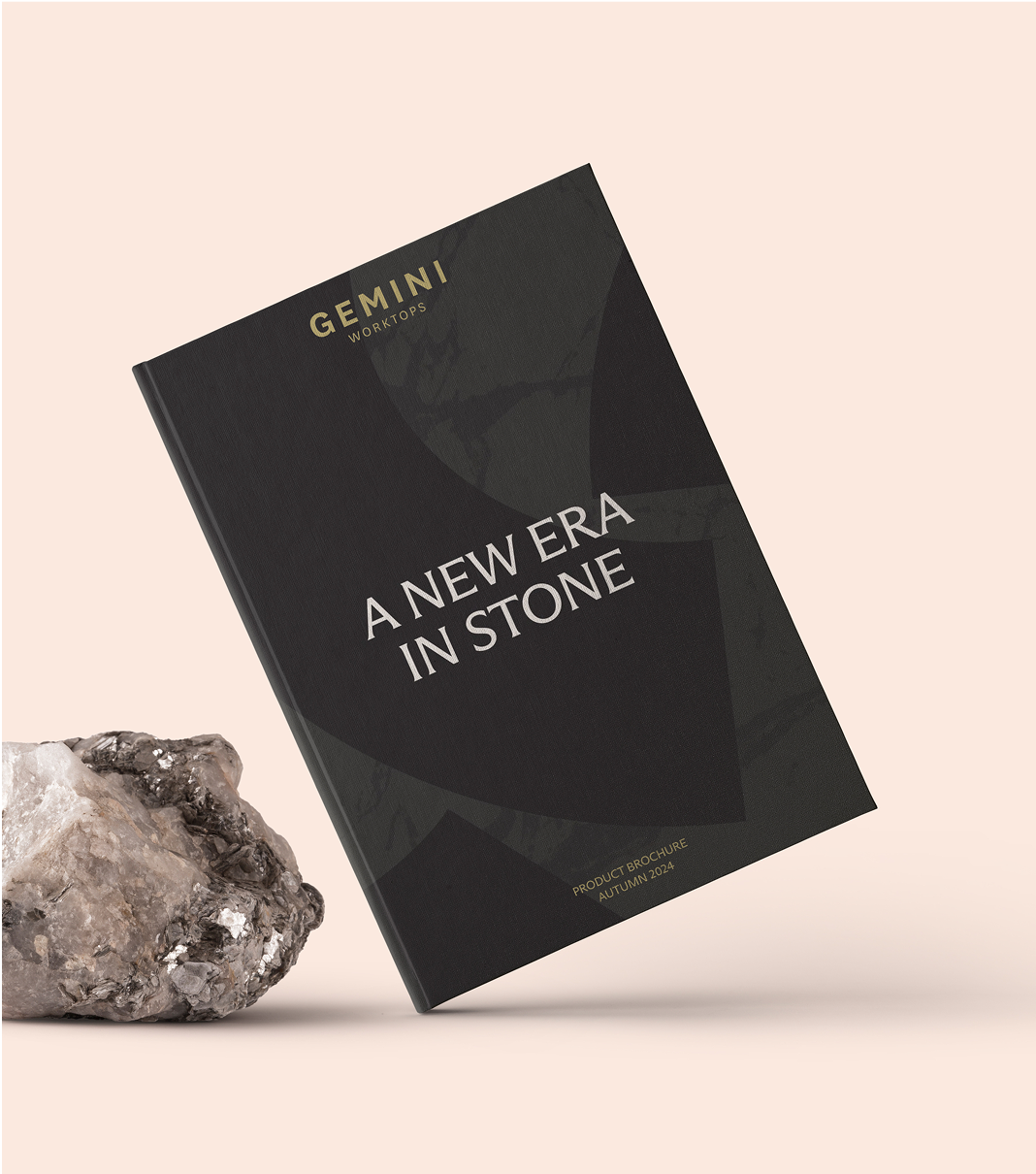
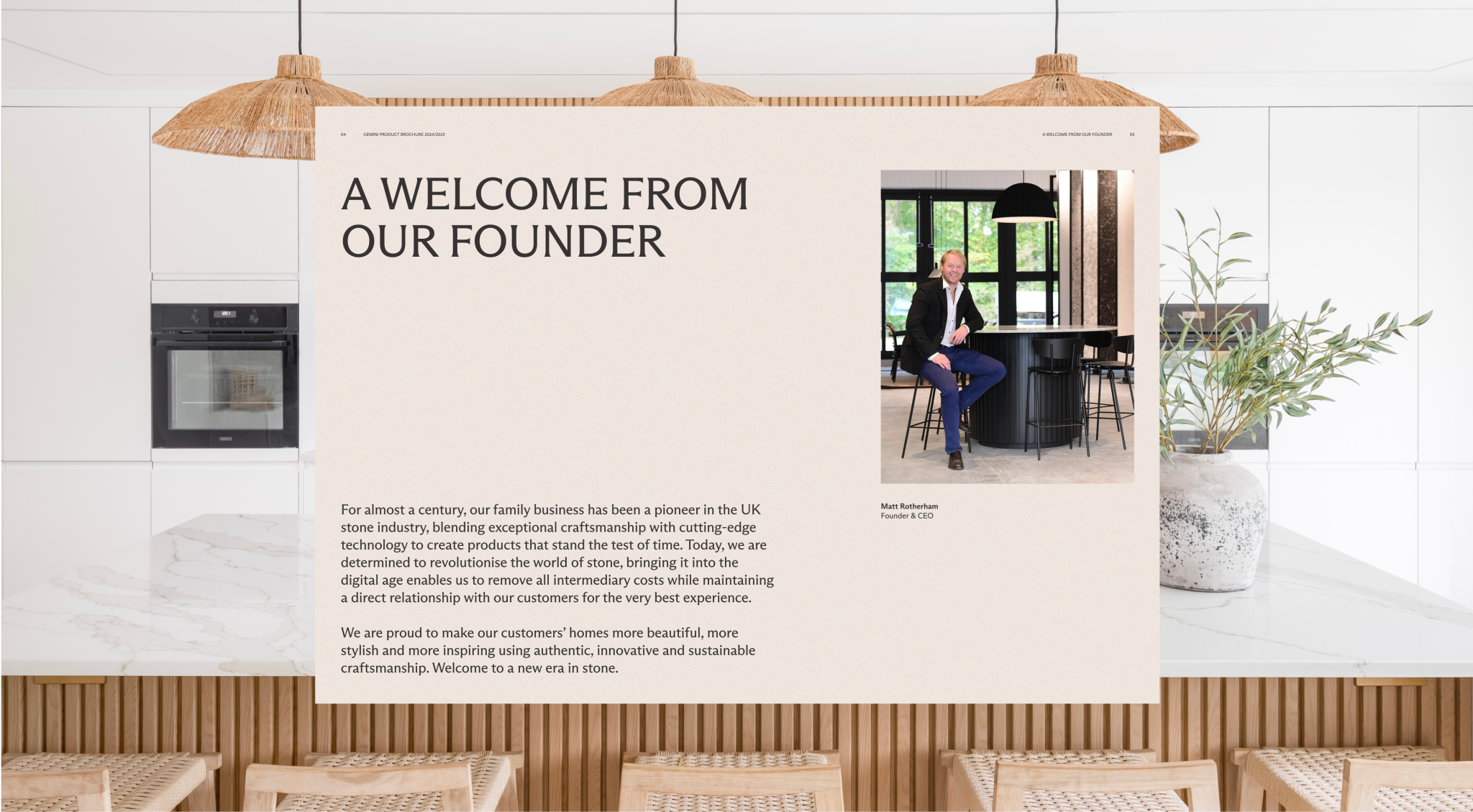
We collaborated with Gemini Worktops to refine their existing brand while developing two distinct sub-brands for their expanding product line.
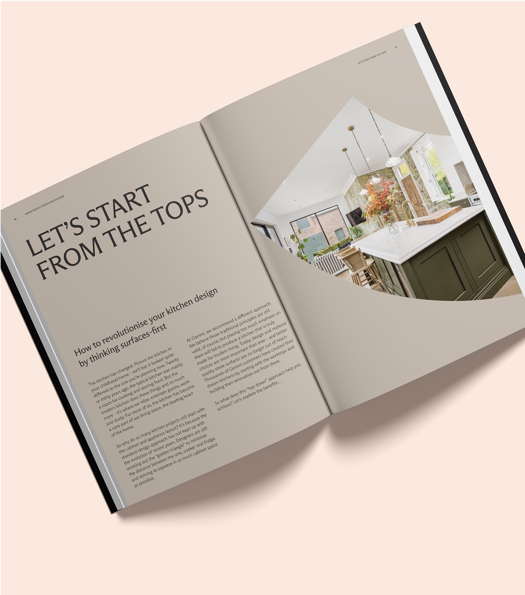
Our goal was to enhance their overall market presence, ensuring each brand encapsulated the unique selling point of the product, while fitting underneath the main Gemini Worktops brand.


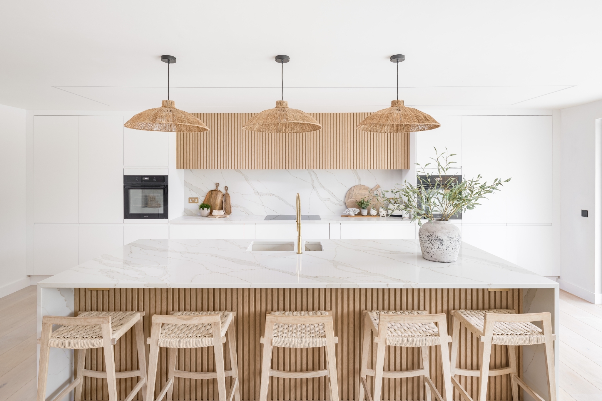
We retained the existing logo, but expanded the brand with a refreshed colour palette, dynamic and flexible type system and a rich set of brand assets. The direction behind this refresh was to add a sophisticated, heritage element to the visual identity to better reflect the family owned nature of the brand and the many years of British craftsmanship involved in the creation of Gemini Worktops.
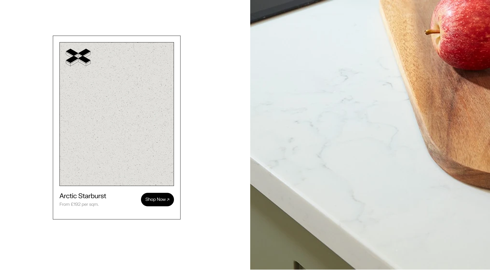
Minerox is a next-generation quartz surface crafted from hybrid mineral stone. Handmade in the UK by expert stonemasons, it embodies four generations of artisanal excellence.

The minimal yet strong word-mark reflects the science-driven essence of the brand. Its distinctive "X" icon represents interlocking worktop slabs, symbolizing precision and craftsmanship. This "X" can also transform into a slab-like icon, reinforcing the brand’s theme of discovery.
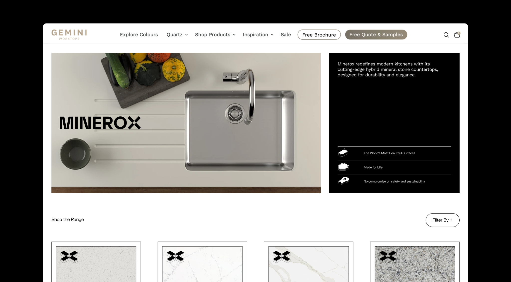
A refined, essential colour palette keeps the focus on photography, with a vibrant highlight adding a contemporary, science-inspired touch. The chosen typeface complements the logo’s modern and minimal aesthetic.
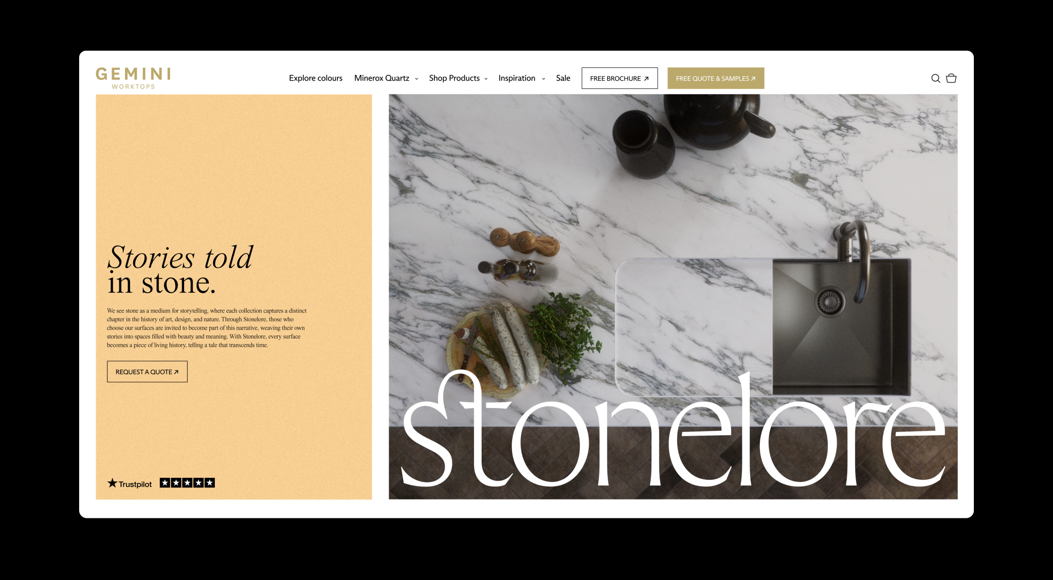
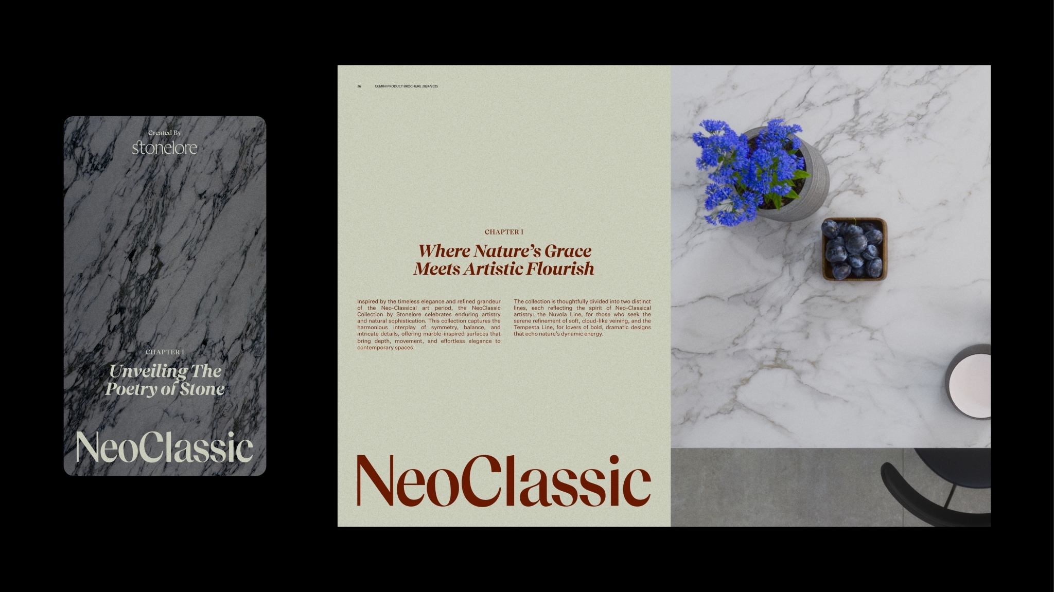
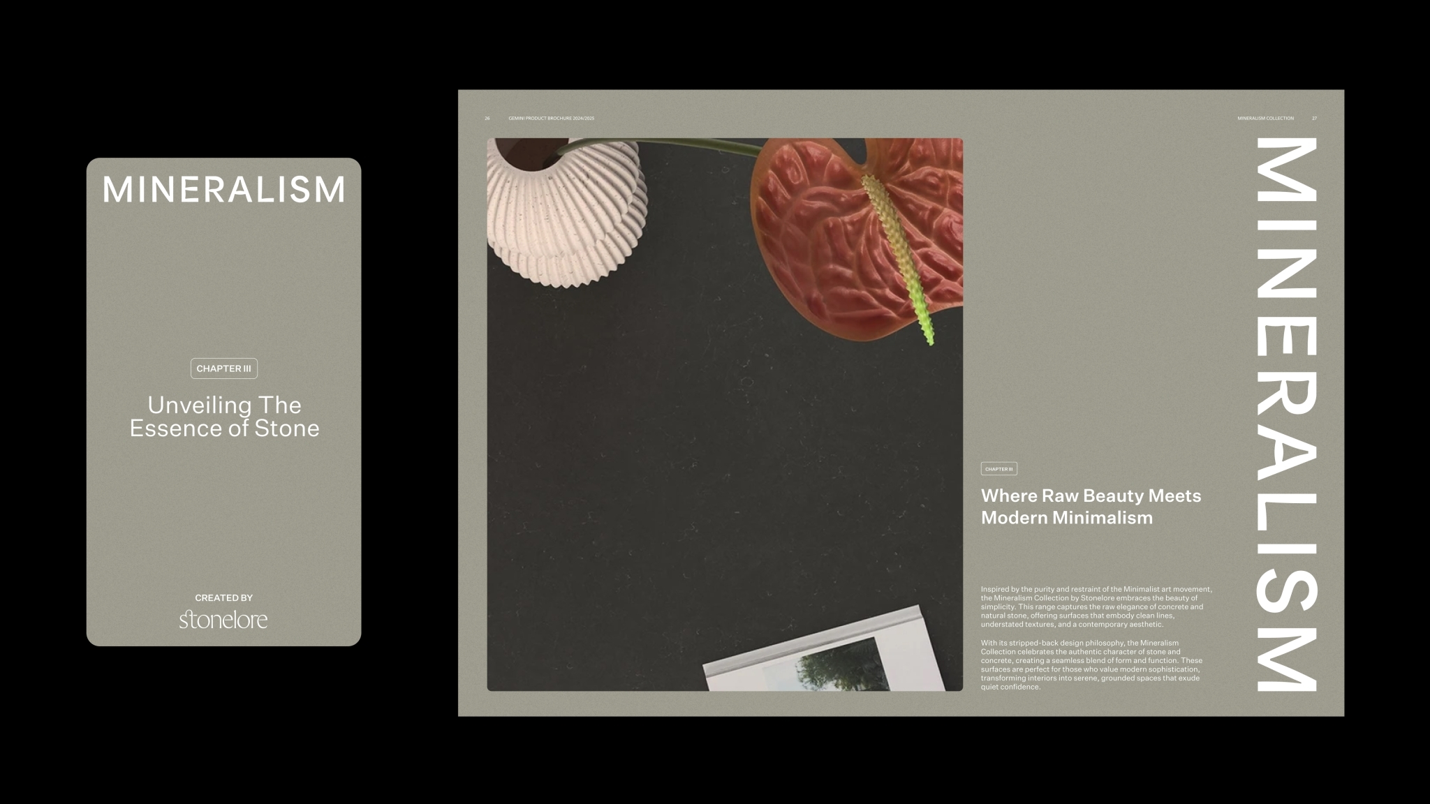
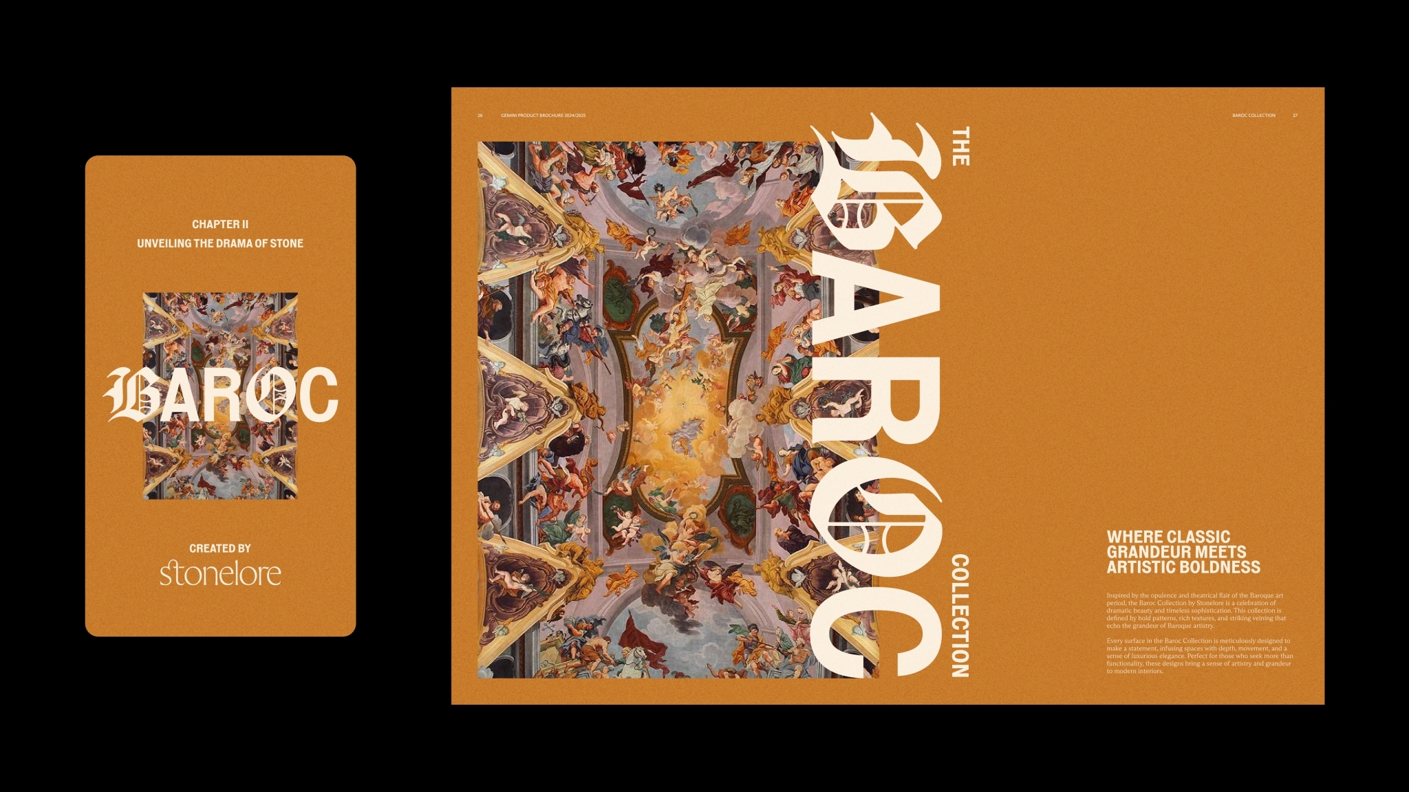
The ornate nature of the wordmark and icon evoke the rich details within the slabs themselves, along with aligning with the folklore theme of the collection name.

The colour palette echos the hues found within the range and provides a neutral backdrop for the product photography to really shine. The typeface and icon style have been chosen to further extend the traditional and sophisticated feel of the brand.