To set the standard for a luxury shopping destination.
The Story
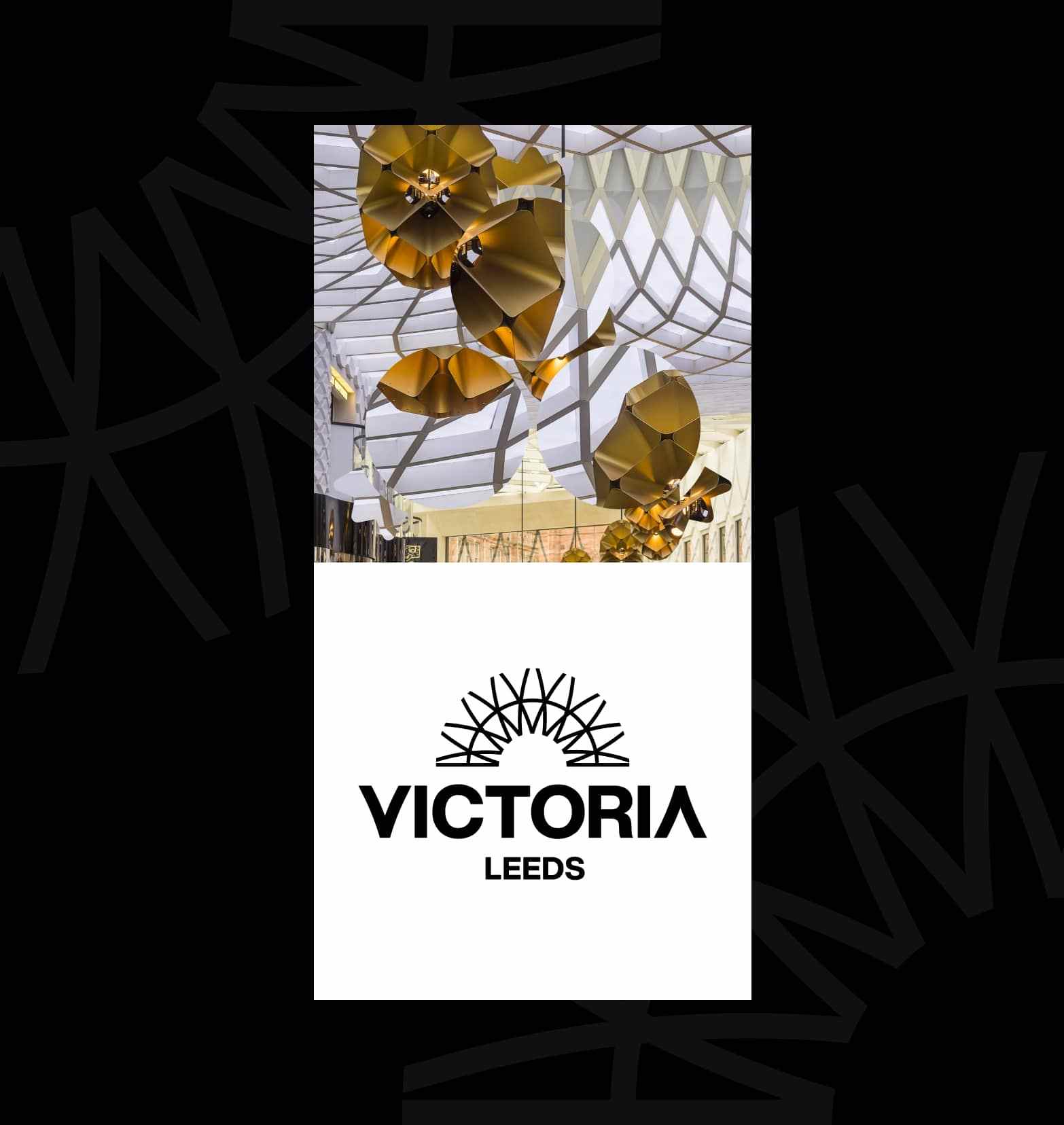
Victoria Leeds, a luxury shopping destination based in Leeds, approached us with the challenge of creating a visual identity and brand for the centre that positions it as aspirational yet accessible, serving as an ideal place to dine, drink, experience, and socialise. The new identity needed to seamlessly unite the two separate parts of the centre, incorporating the distinct architectural styles of both buildings into one cohesive venue.
The Process
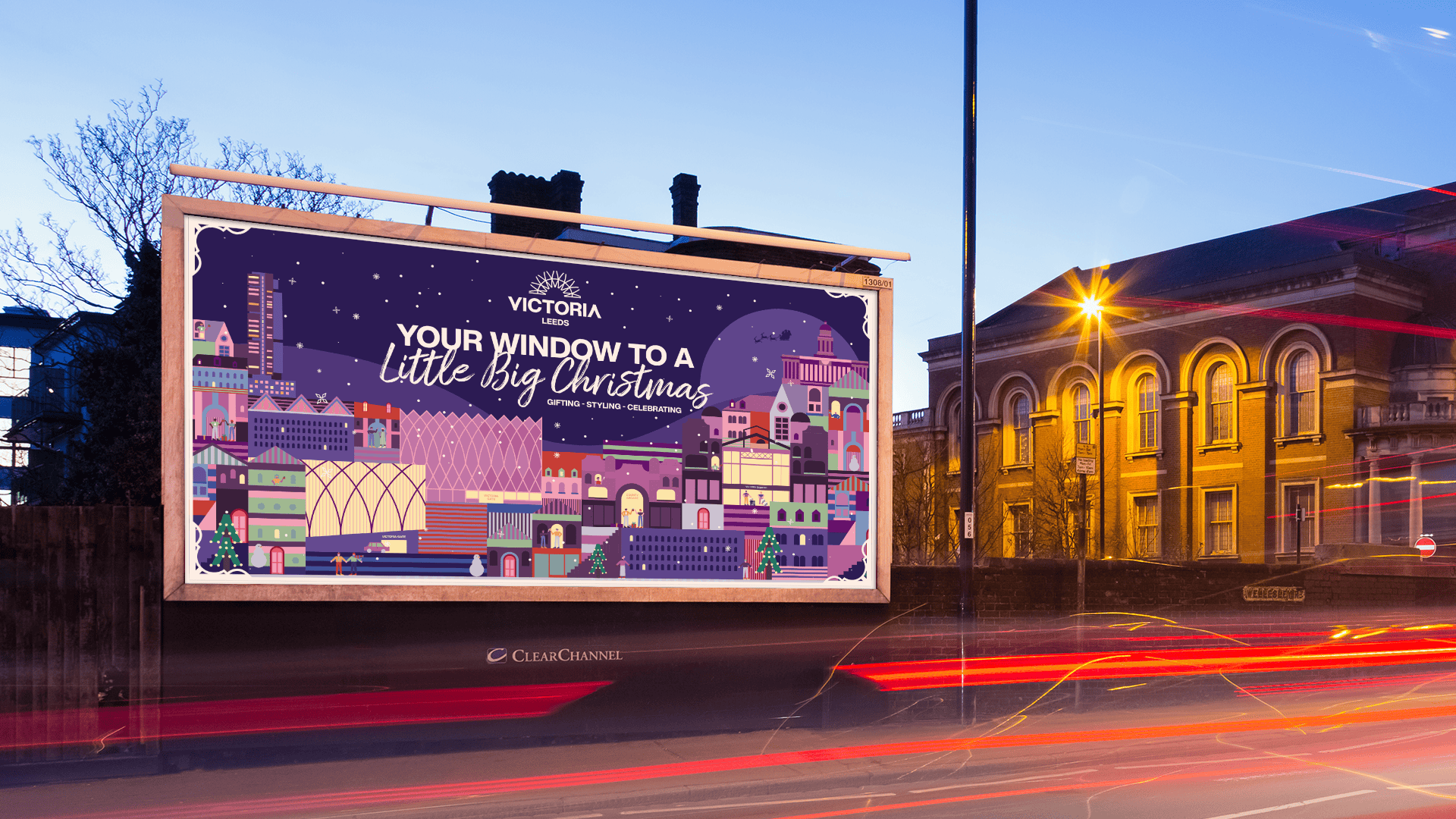
The chosen creative concept was positioned as always 'something else/something more' to see or do at Victoria Leeds.
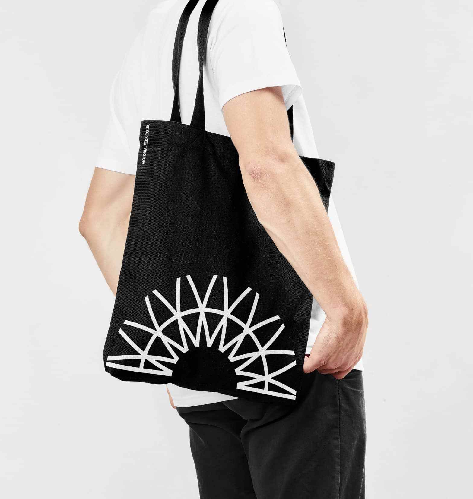
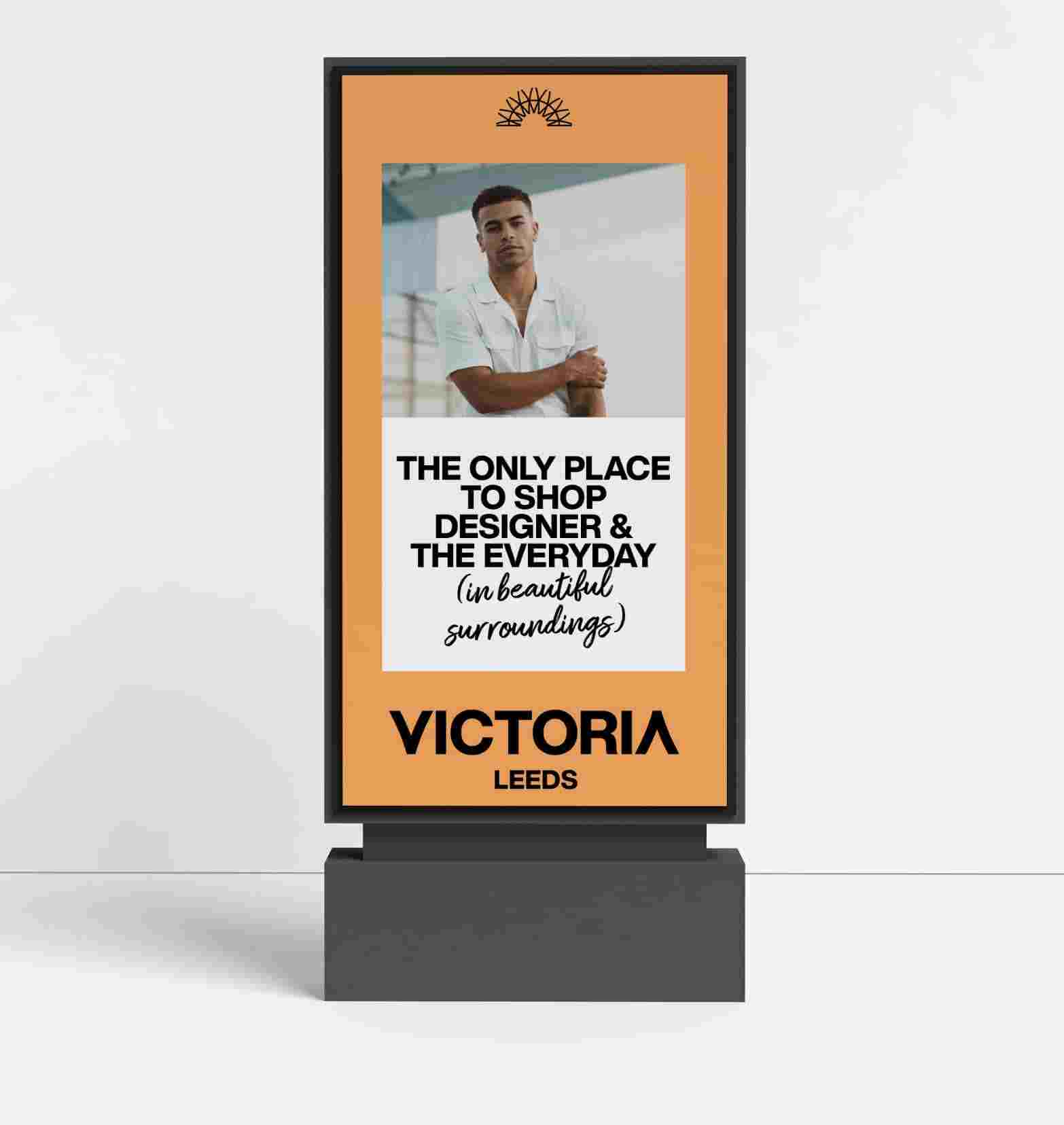
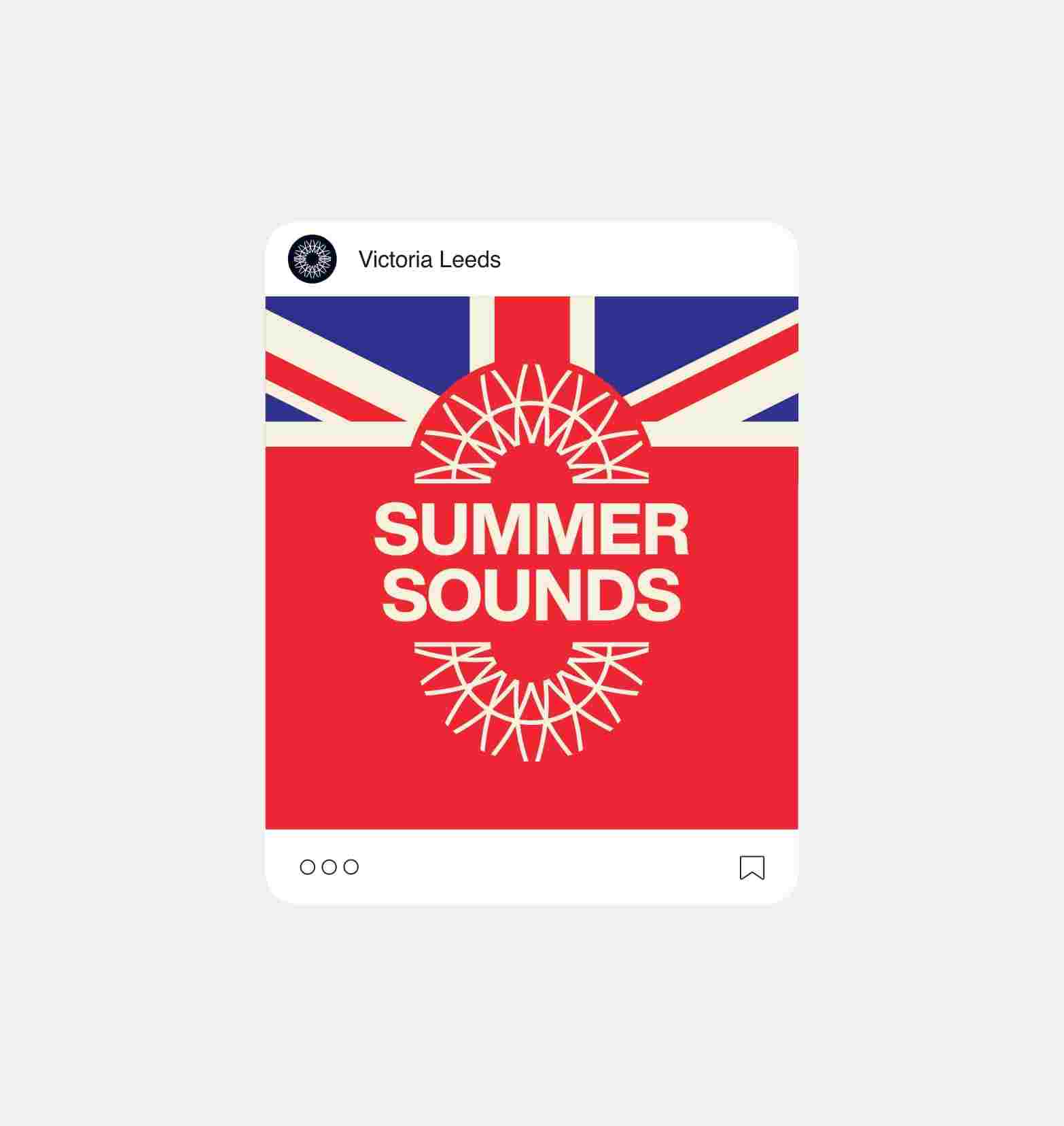
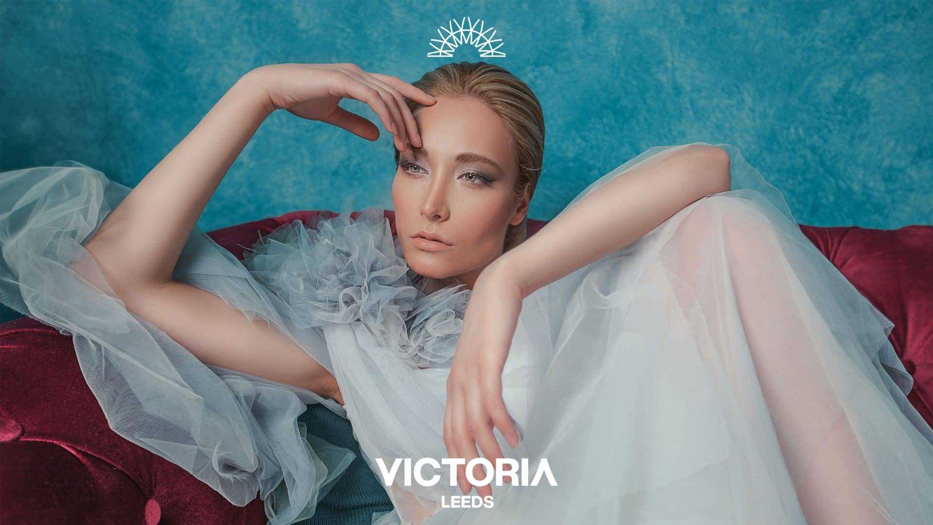
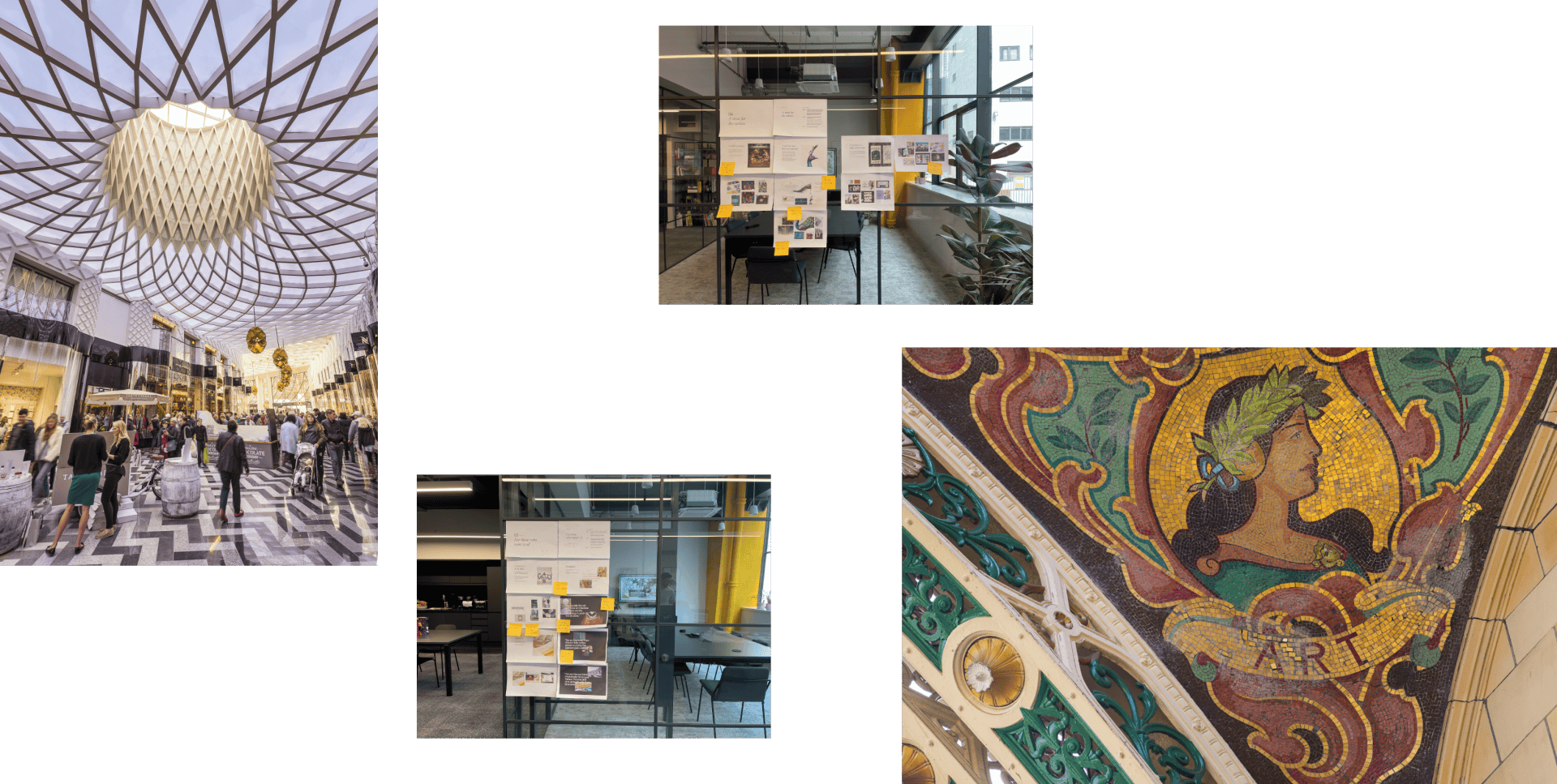
Drawing inspiration from the architectural styles, we explored a shape that resonated with both centres and crafted a radial pattern containing a V. This semi-circle marque became our primary logo, and we incorporated the same stylised V shape at the beginning and end of our VICTORIA logo lockup, creating visual symmetry and tying the typography to the marque.
The brand assets employ simple typography paired with a secondary handwritten-style typeface contained within parentheses. This lockup allows for an extension of the messaging.

The Outcome
A clear brand proposition and identity, which positions the centre as not only a shopping destination but a hub for dining and experiences. Additionally, we designed and developed a website to align with the brand, featuring a store directory, centre map, and details about events and offers.