To set the standard for a digital presence in the yogurt industry.
The Challenge
Onken has long been a staple in our fridges. After a redesign of their packaging, we were tasked with updating their online presence to match their new playful, bold identity, with a brand proposition of ‘feed your inner happiness.’
The Process
At BGN, we pride ourselves on taking a non-standard approach because we believe in the power of the brand, and we consider ‘owned media’ a powerful brand touchpoint.
Looking at how other competitors were representing themselves online, the standard was functional, flat, and underwhelming for a category anchored in ‘vitality.’ We explored what inner happiness looked and felt like in terms of visual and mood, and wireframed a user journey before going into creative execution.
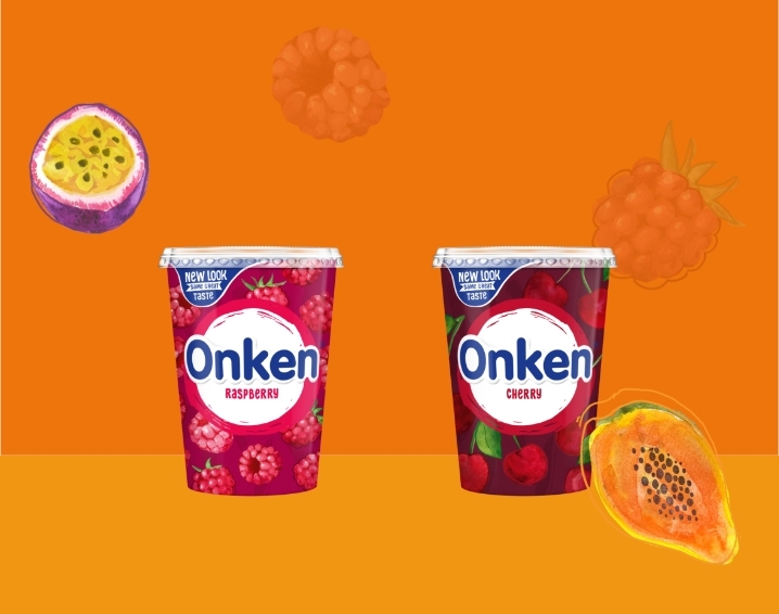
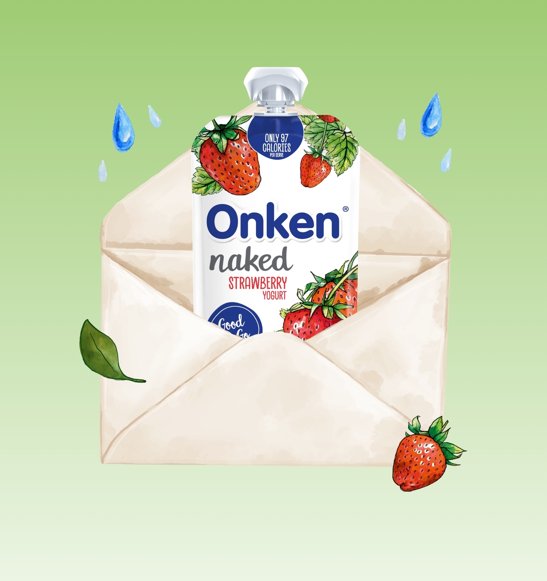
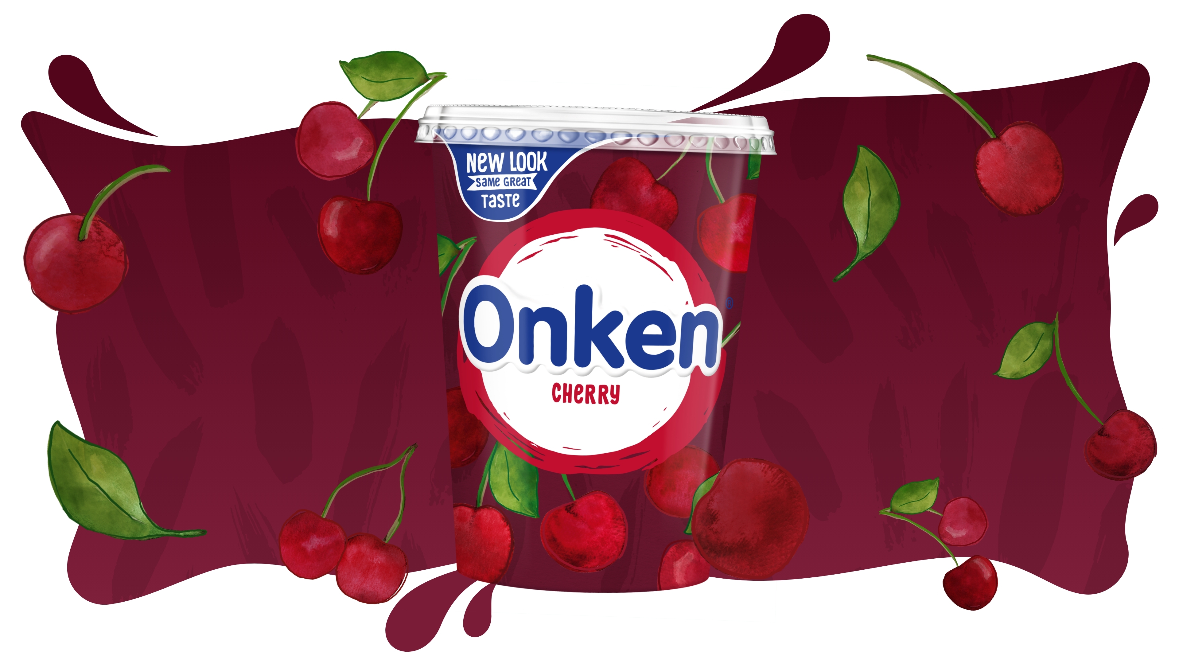
The real hero of the brand is the yogurts themselves. Each product page on the site springs to life and explodes from the listing page. As the ranges are so different (from fruits to whole grain and naturals), each page uses a bespoke colour palette and illustrations to really push the individuality and breadth.
The Outcome
A website that feels alive and makes people instantly feel happy and uplifted. With a focus on bringing the brand to life through animation and motion, utilising the pack assets: the bright fruit illustrations, colours, and textures.
The Onken website is now used as a key brand touchpoint, directing users from the packaging to campaign landing pages, recipes, and stockist information.