Brand building for a pioneering architect practice.

The Challenge
NBDA had gotten as far as they could with their original identity and website. They were still generating leads at a steady pace, but not as many as they felt they should have been. They were worried that their identity was a major contributing factor, failing to effectively differentiate NBDA from its competitors, or even hint at the true nature of their offering.
The Solution
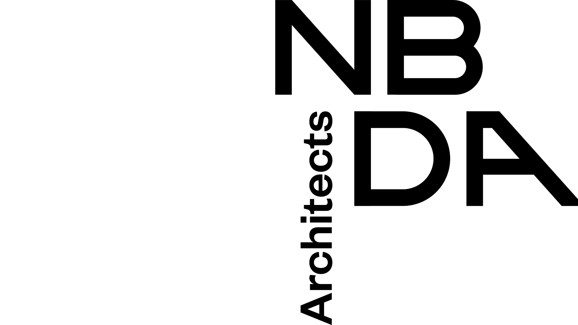
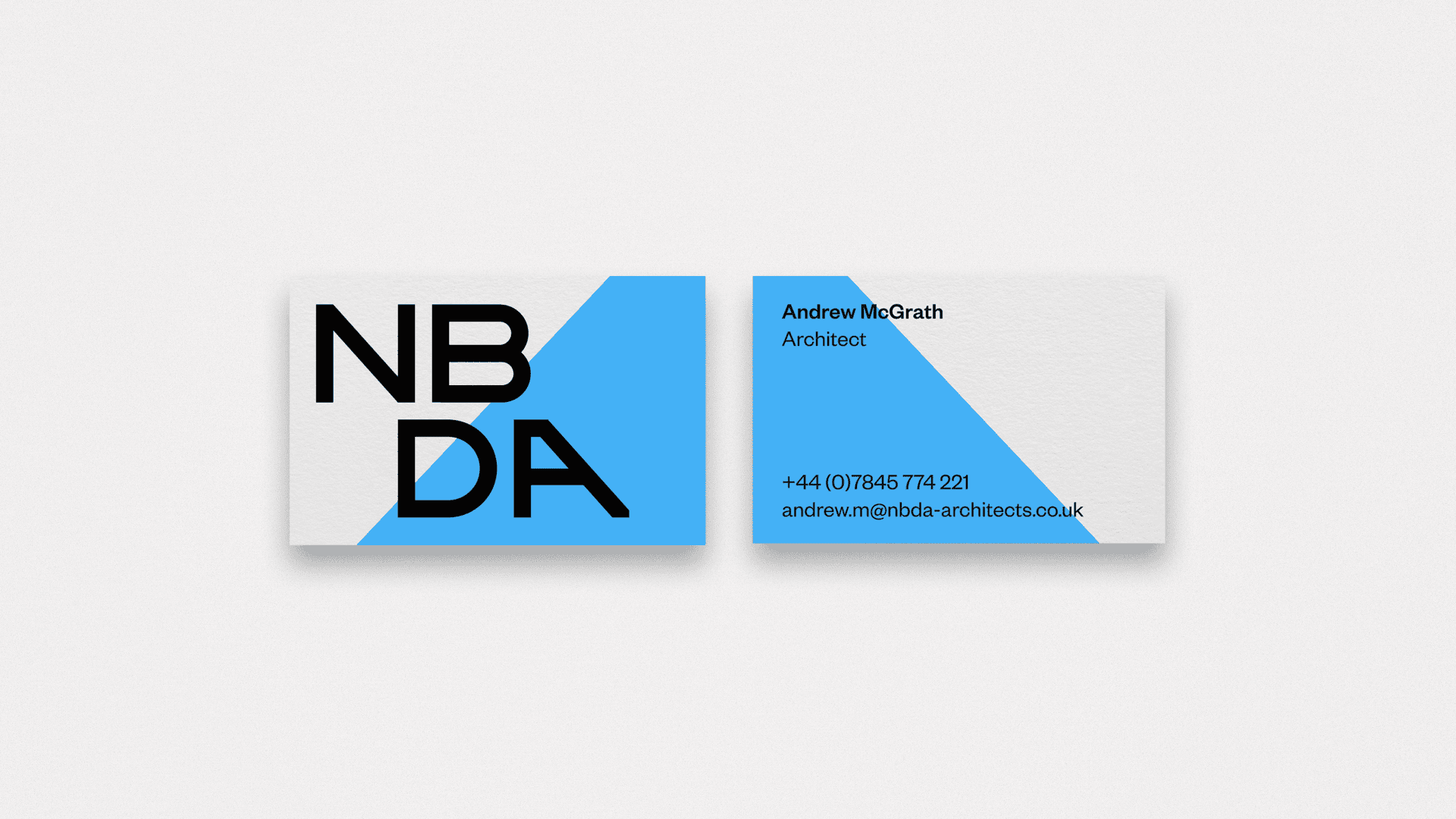
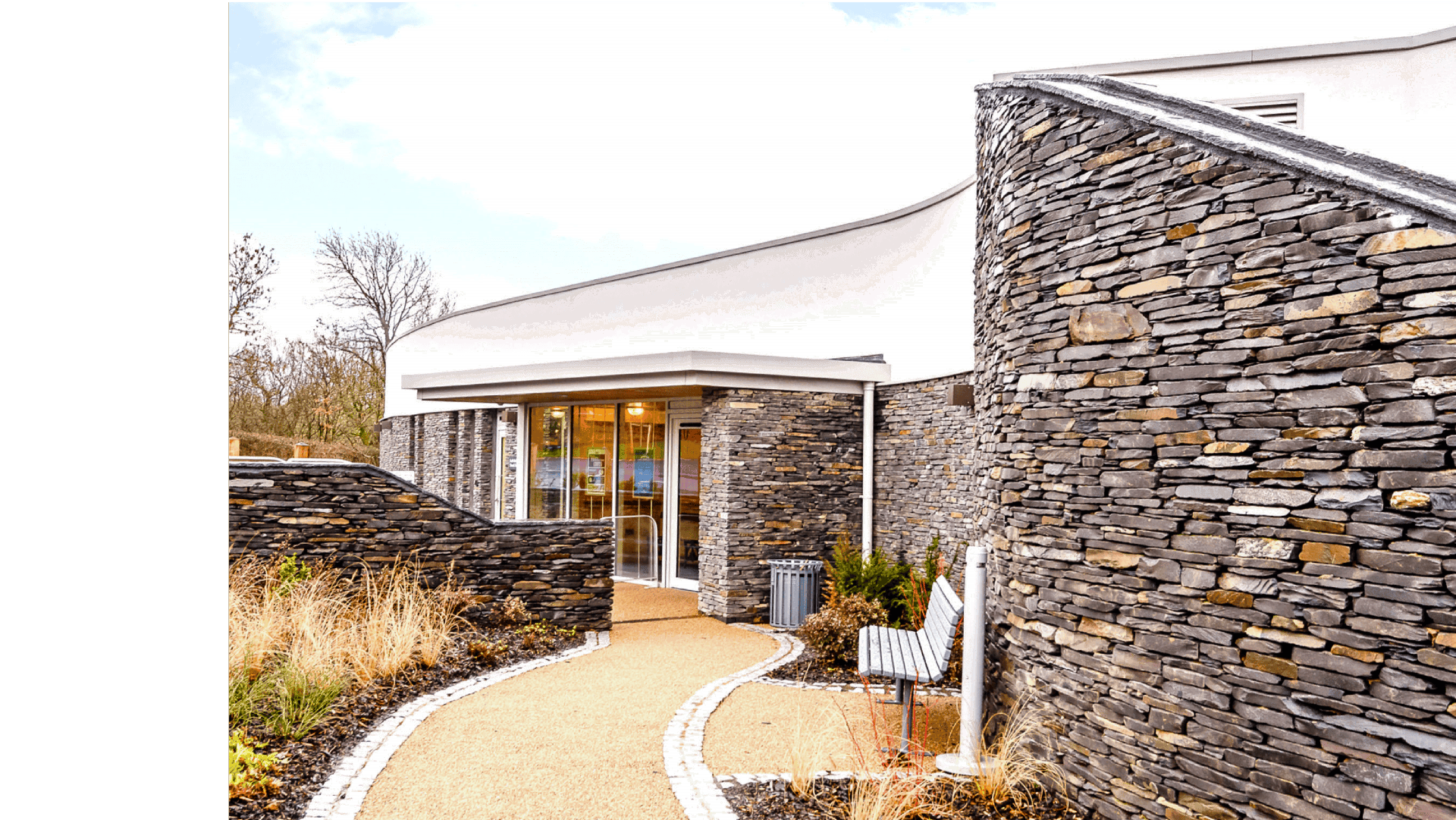
With the above in mind, we created an identity that starts and ends with the bespoke logotype we have created, using the lines, spacing and structure of architect’s blueprints to form the NBDA initials. In order to do so, however, every stroke needed to be carefully considered, painstakingly planned to make a cohesive, efficient whole – in much the same way architects operate on a day to day basis. This is in perfect keeping with NBDA’s overall approach, and a constant reminder of the craft at the core of NBDA’s operations. The logotype sits in contrast with the rest of the identity, which is more colourful to reflect NBDA’s adaptability and creativity.
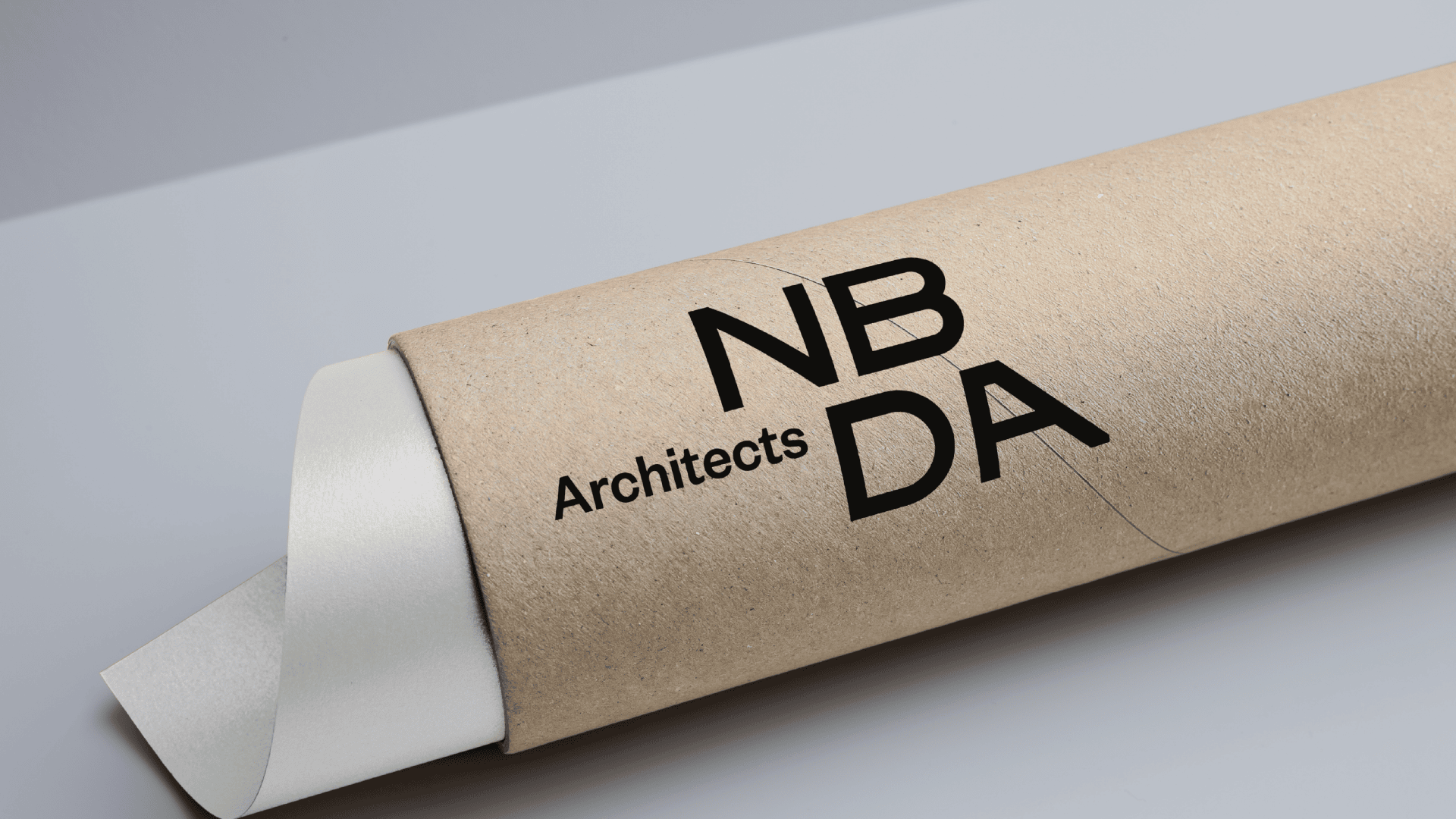


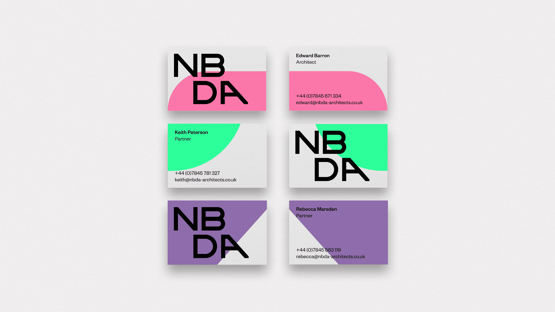
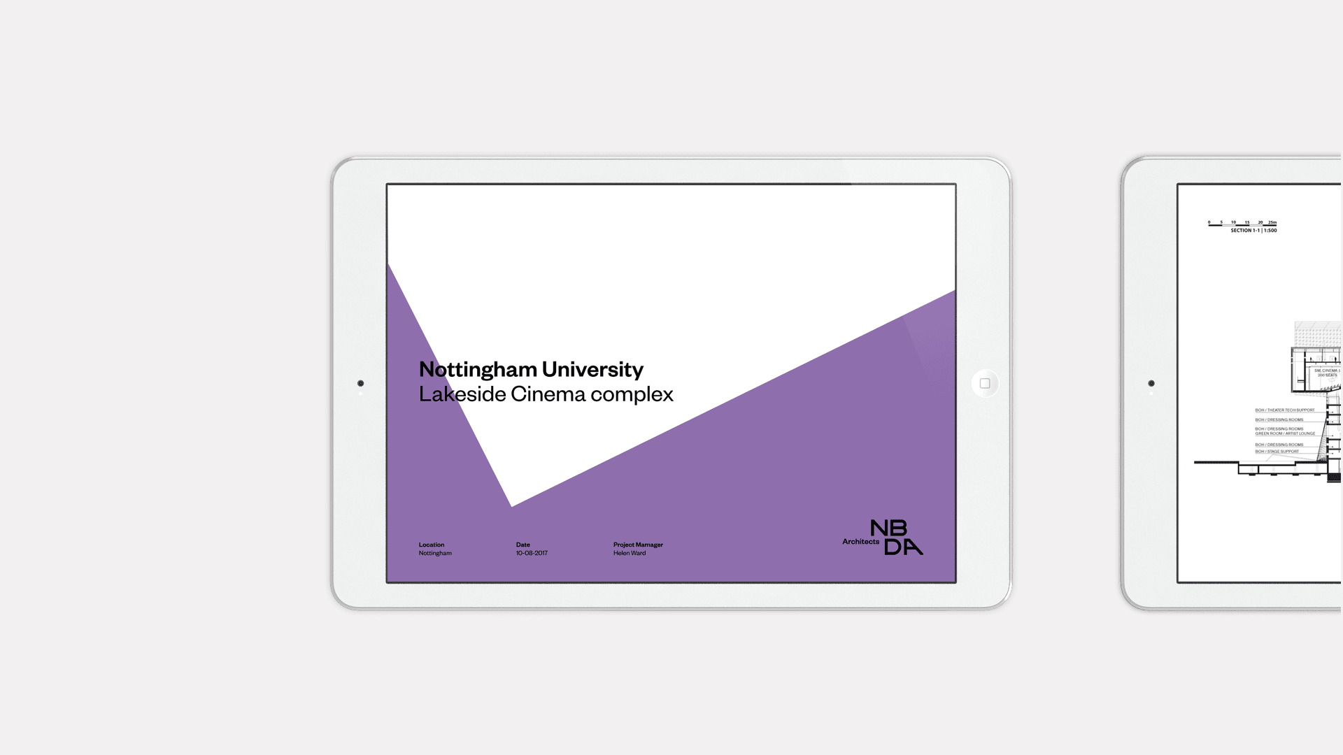
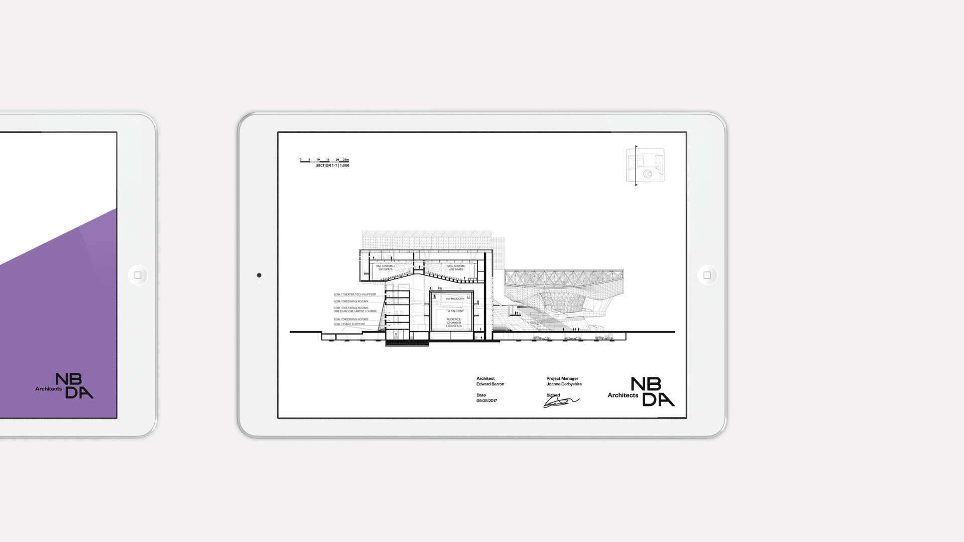
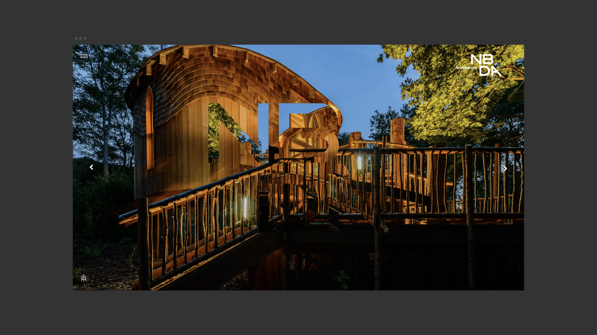
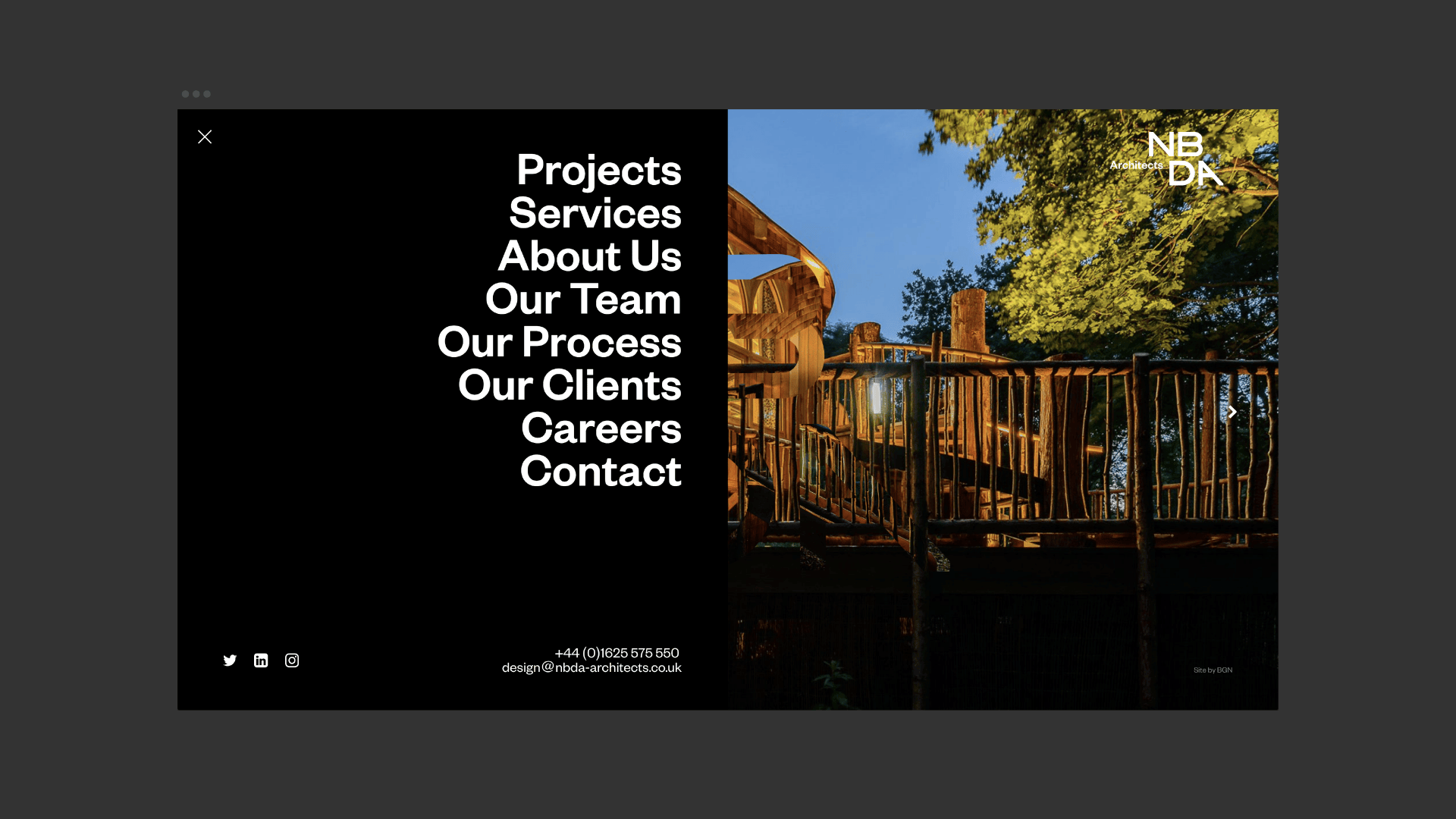
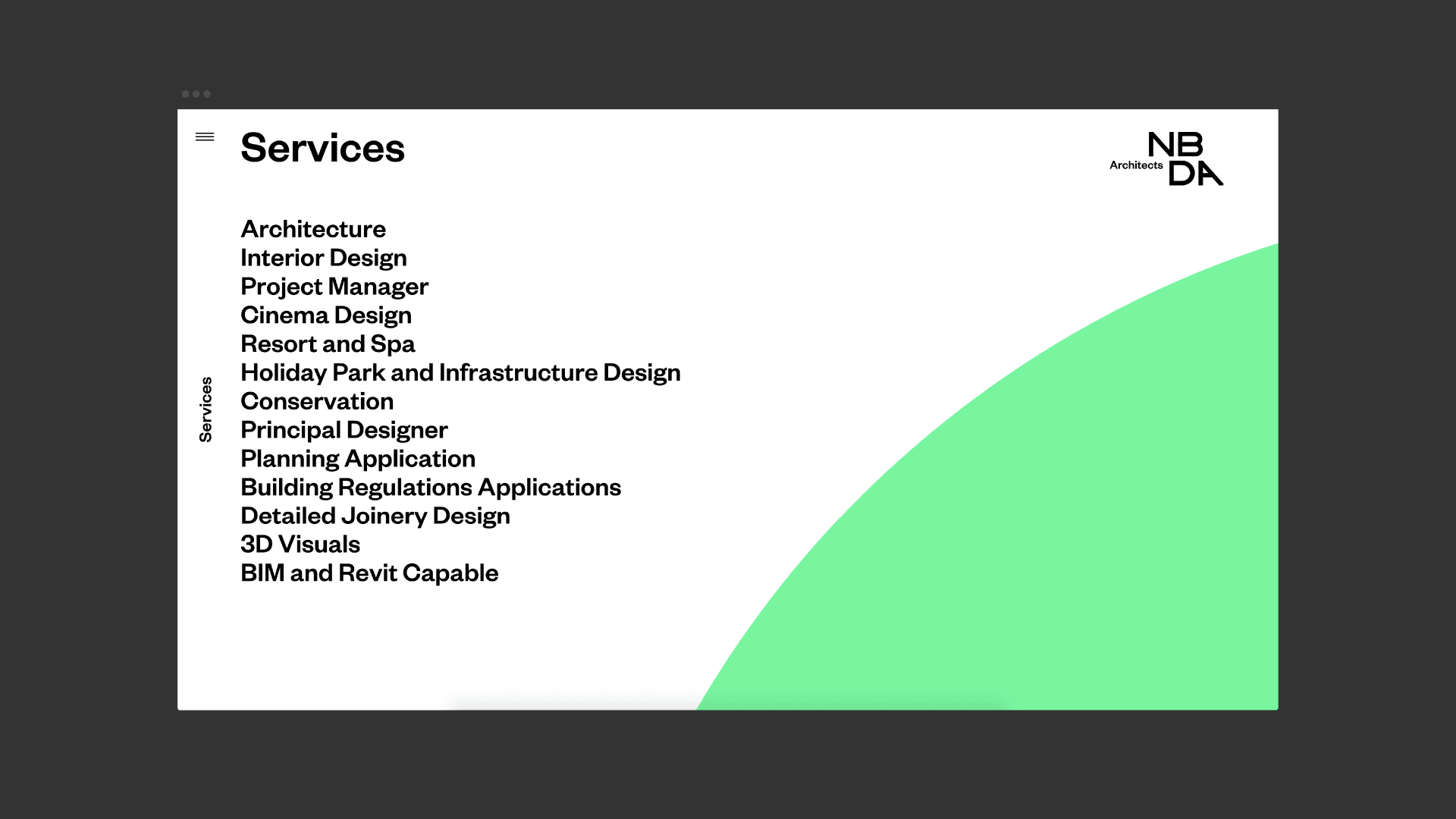
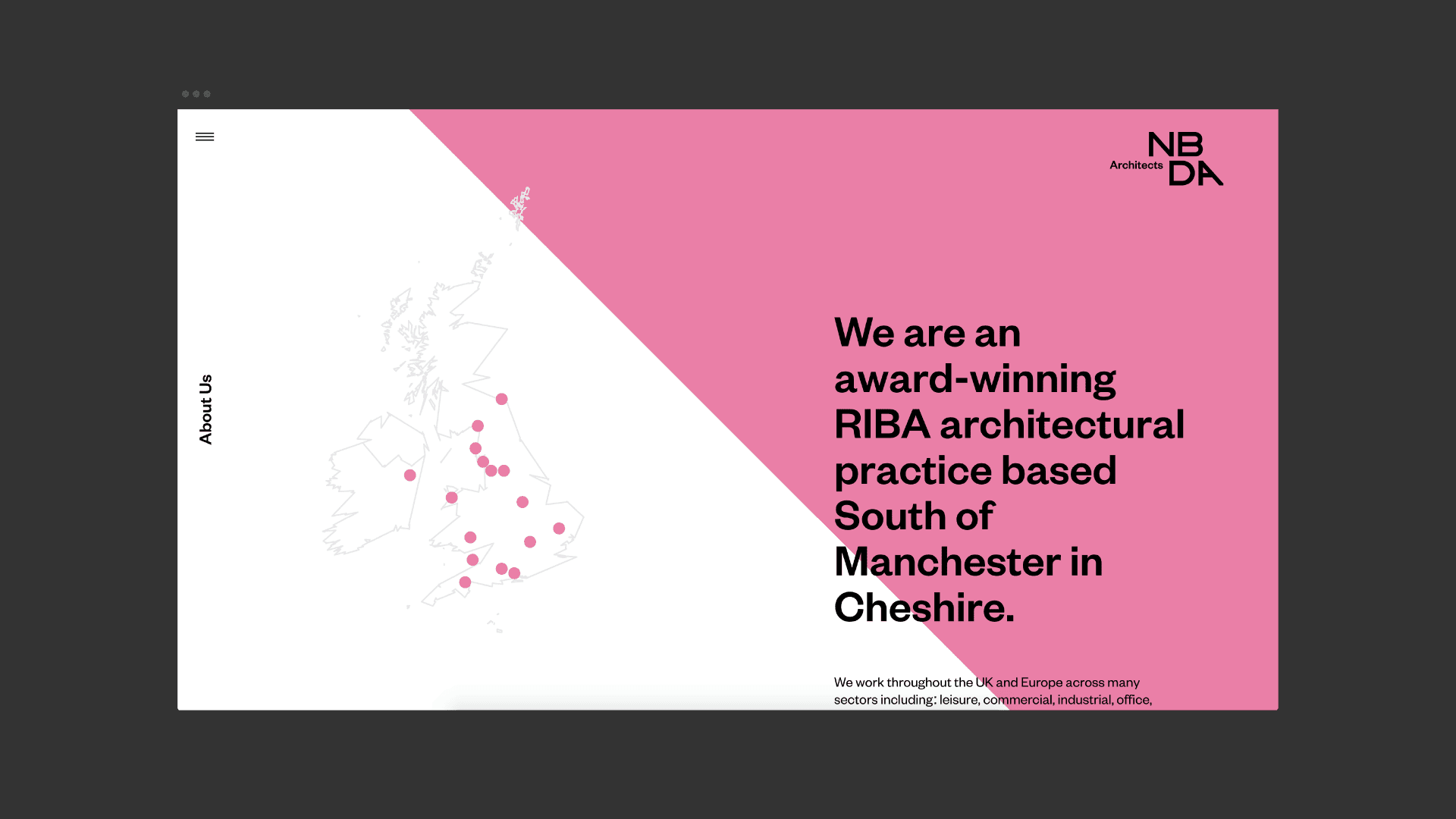
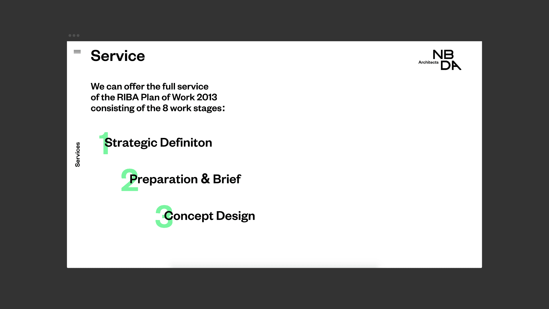
The website we designed is simple in concept, but delivered with an outstanding level of finish. The negative space in each individual letter within our logotype gave us a flexible toolkit of shapes, which could then be coloured and used as backdrops to break up sections of content. They could even be used as masks on the imagery that NBDA will come to share on social media from this point onwards. Ultimately, our identity is contemporary and flexible, a perfect companion to take NBDA from strength to strength in the weeks and months to come.