Challenging the expectations of skin care brands.
The Story
Natural Therapy London offer a completely natural range of skincare, made with patented formulas. The problem was that they weren’t any way near as well known as they should be. Their packaging was tired, their audience narrower than they anticipated – it was time to relaunch and overhaul the identity, targeting the mass market and repositioning the brand as a more premium, desirable proposition.

The Brief
There is a lot to like with Natural Therapy’s range – it’s organic, vegan-friendly, made with responsibly sourced, premium ingredients and completely free of microbeads, parabens and so on. The problem was that they weren’t any way near as well known as they should be. Their packaging was tired, their audience narrower than they anticipated – it was time to relaunch and overhaul the identity, targeting the mass market and repositioning the brand as a more premium, desirable proposition.
Concept
Following a series of workshops with the Natural Therapy team, one thing became clear to us. Natural Therapy were ahead of the curve in so many ways. They never used any of the microbeads, parabens and other dubious additives that other skincare brands have used up until now. They never used them because they knew how harmful they were to the environment, and it with touches like this that we see Natural Therapy as a new standard in skincare – showing customers what they can, and should expect from skincare brands.
1 / 5
Execution
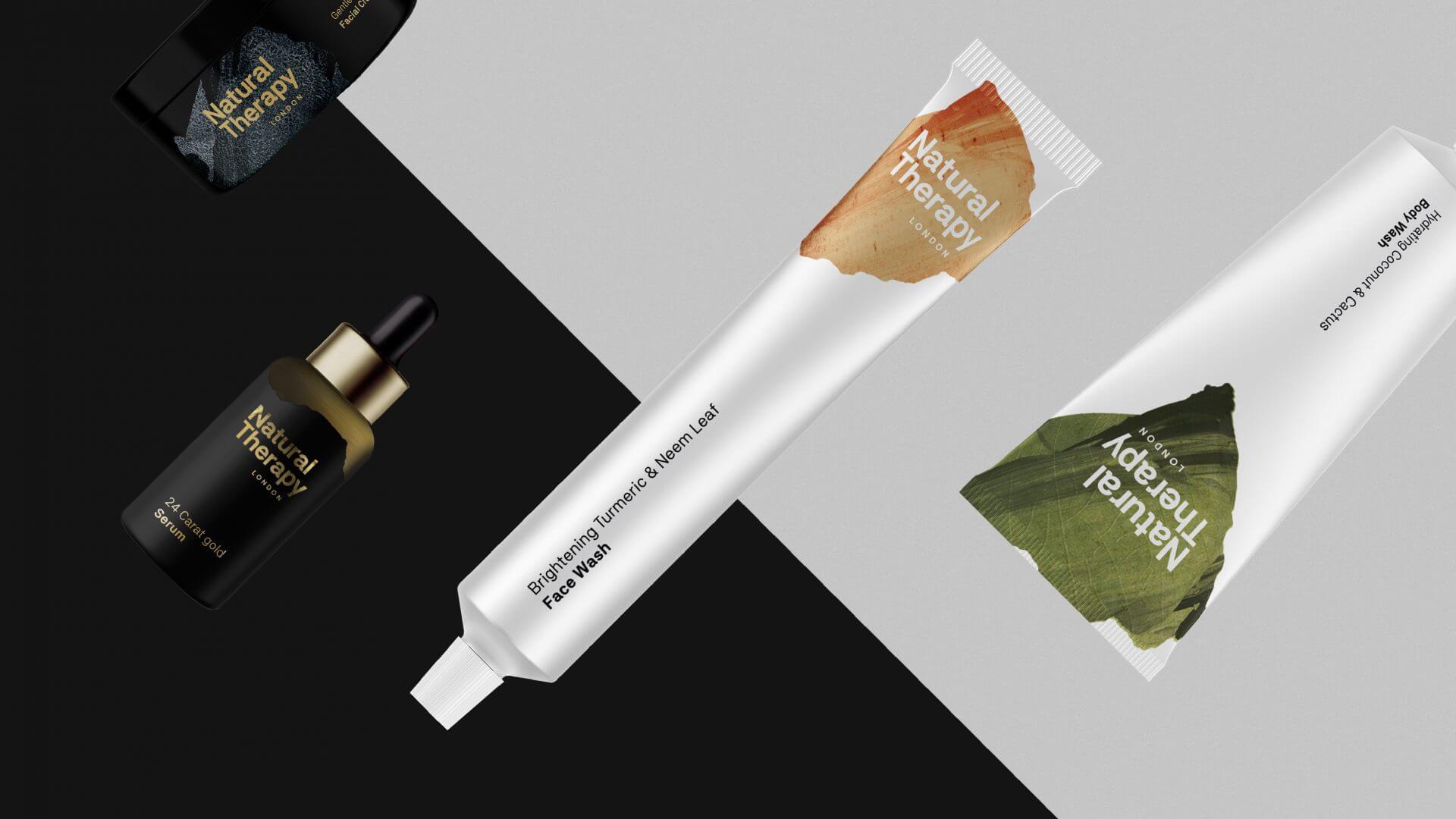
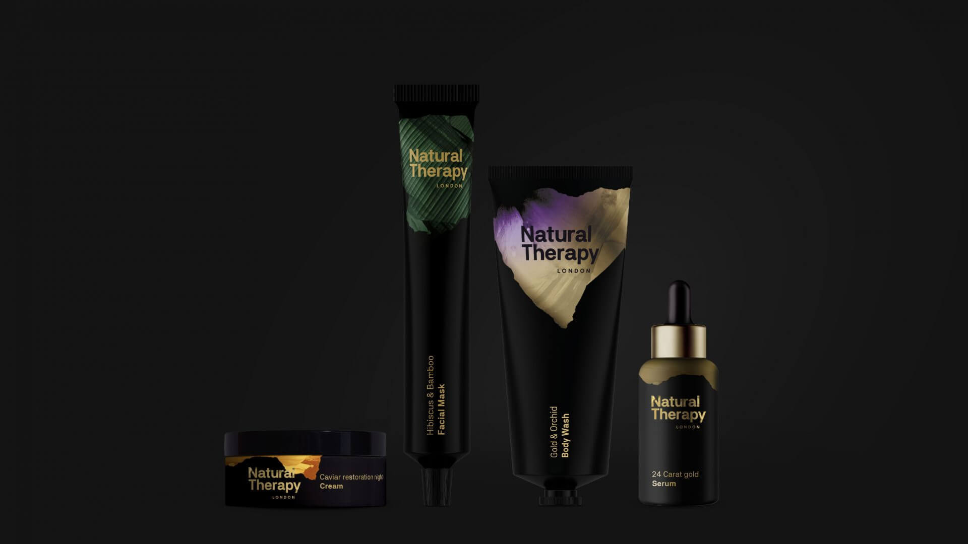
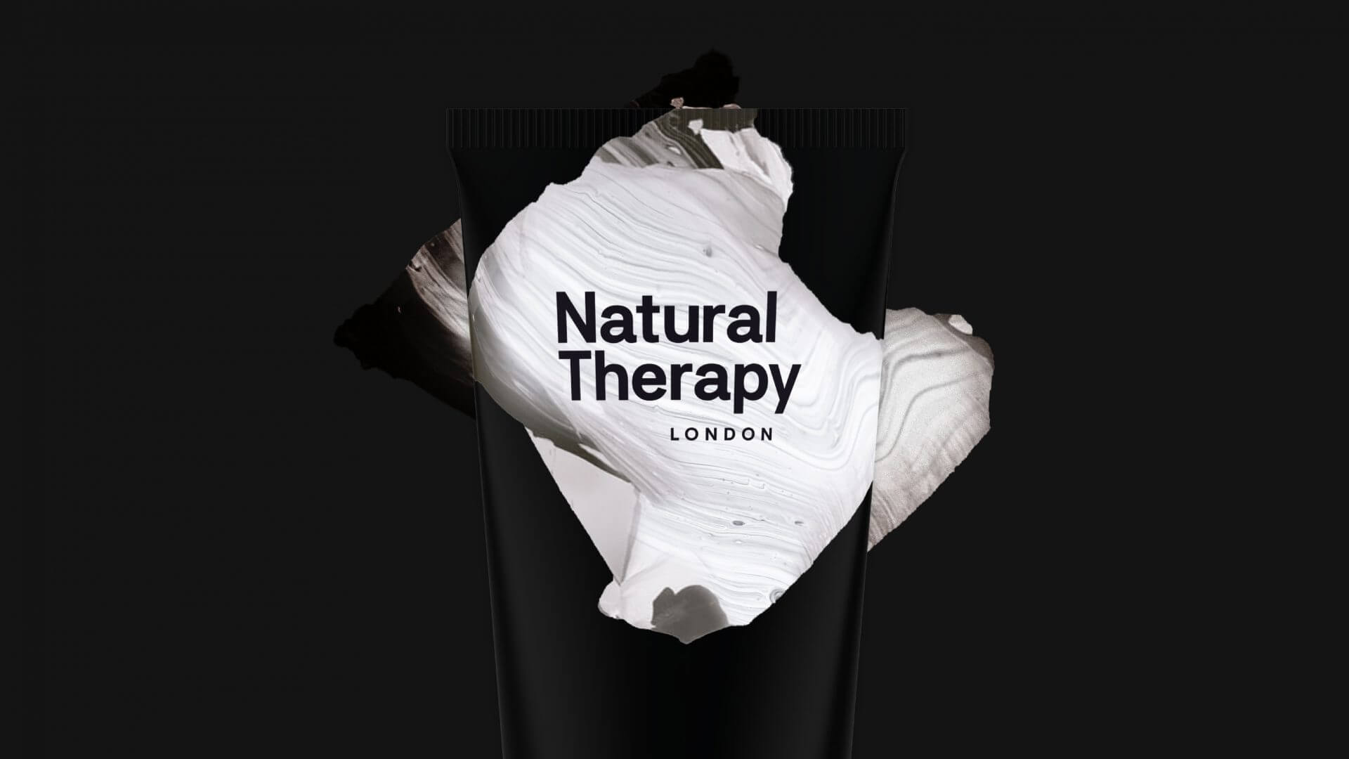
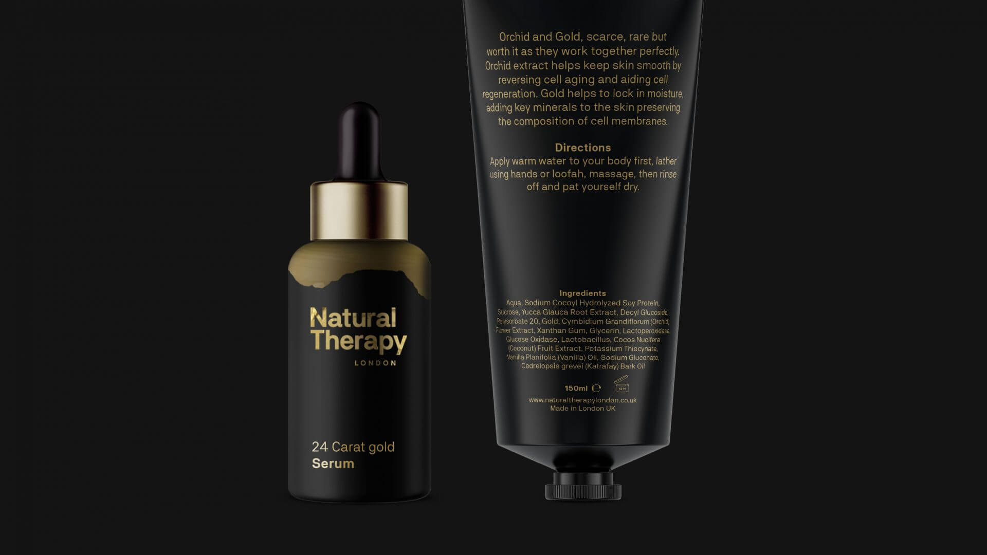
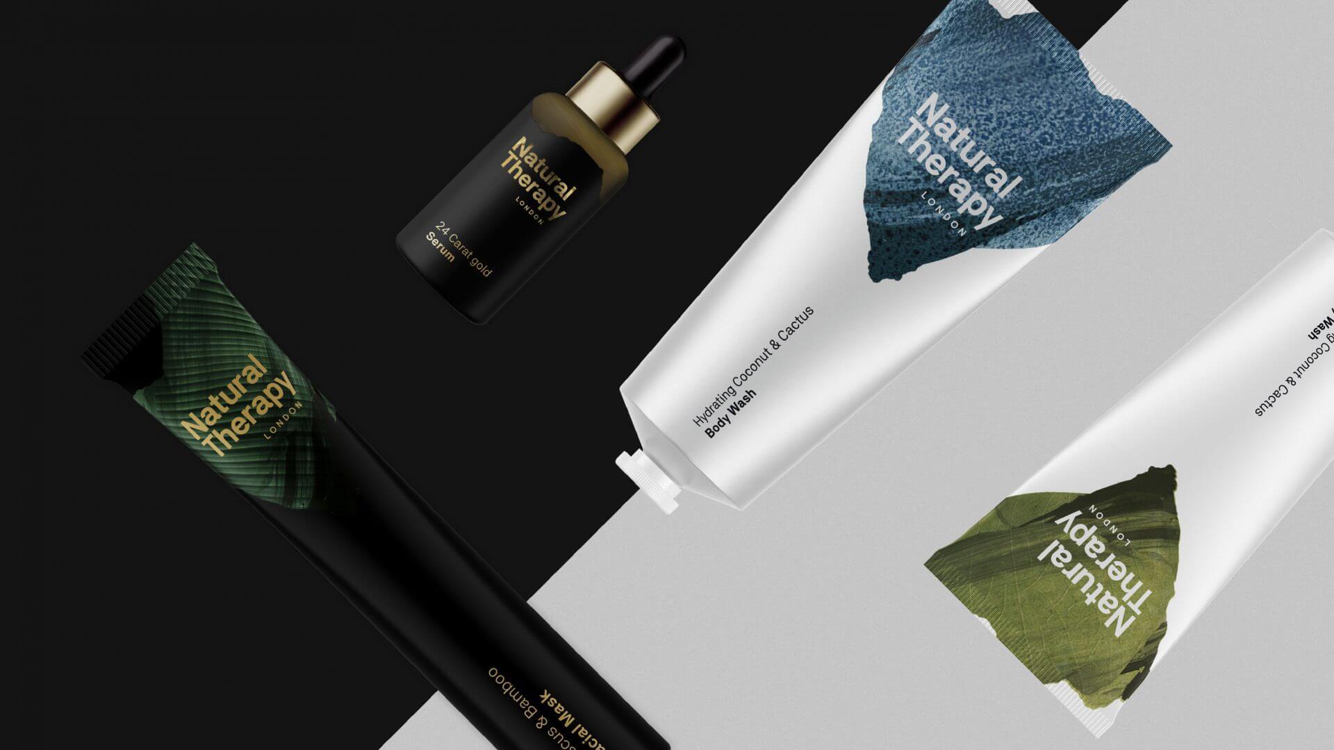
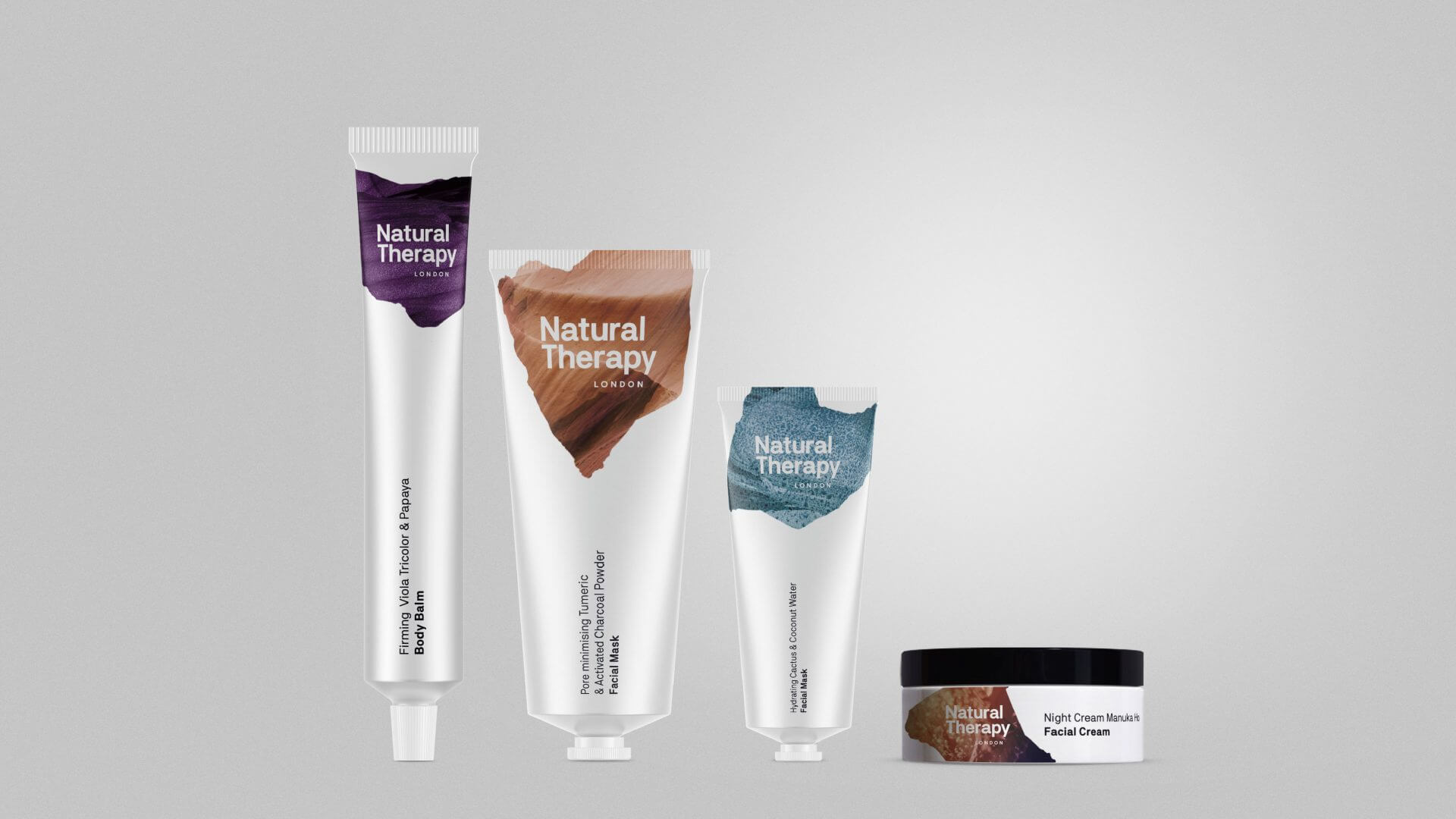
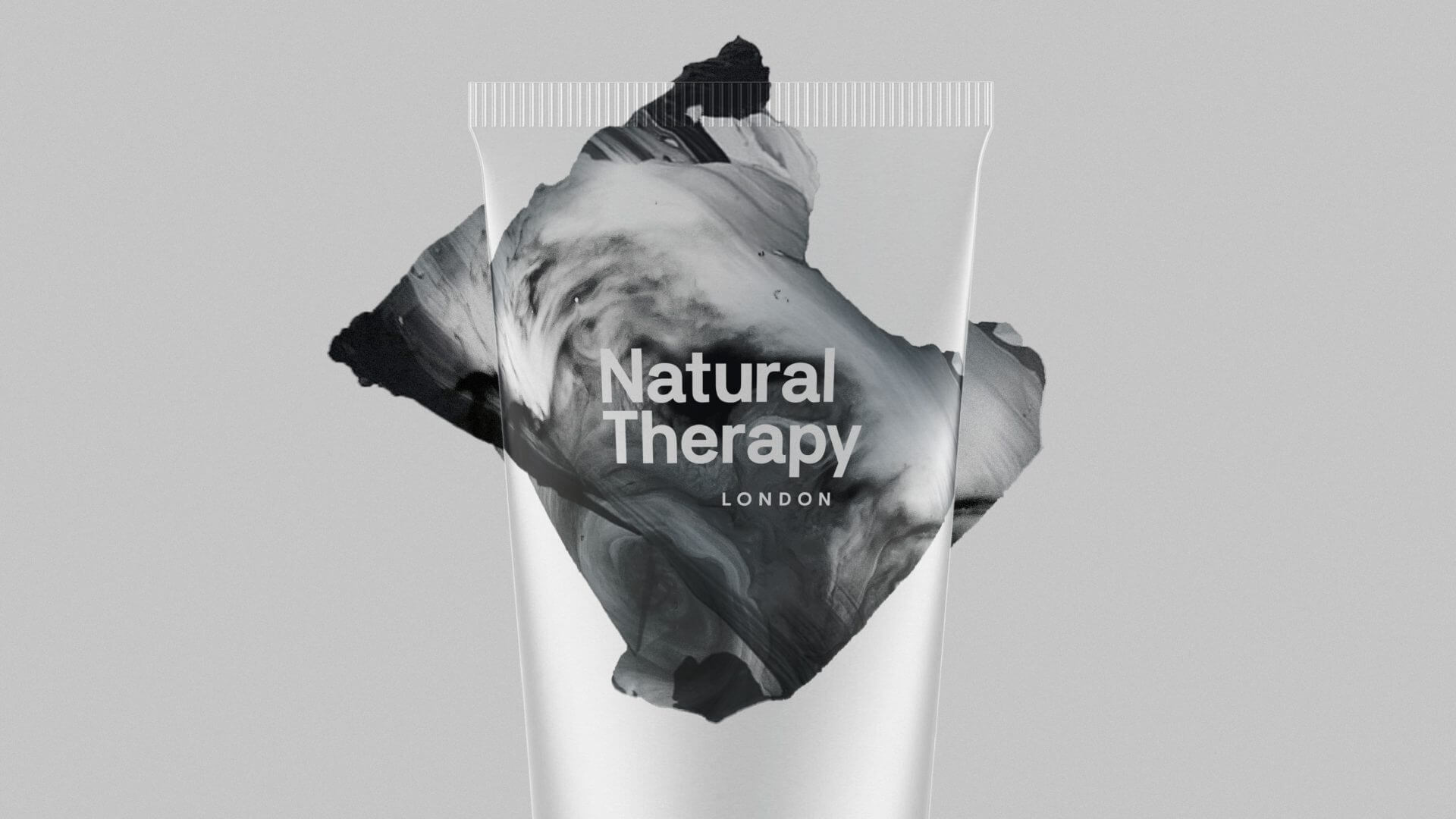
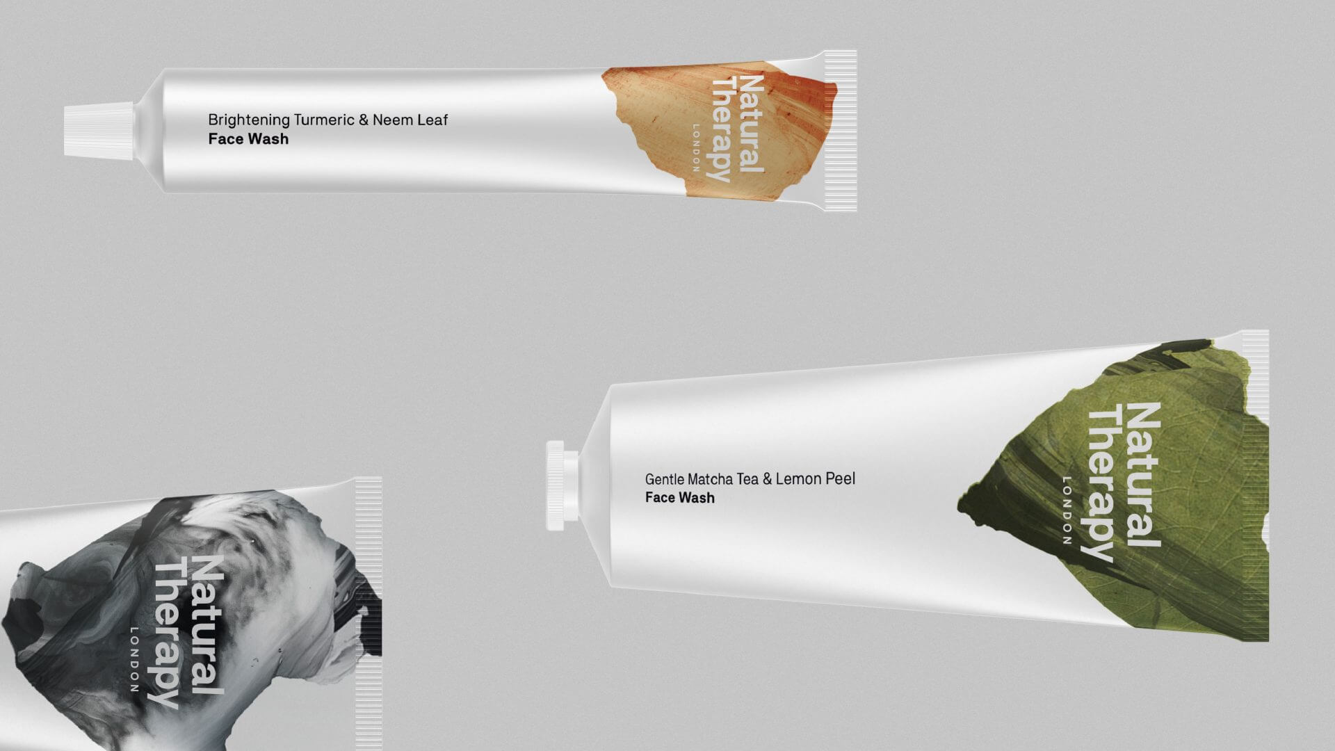
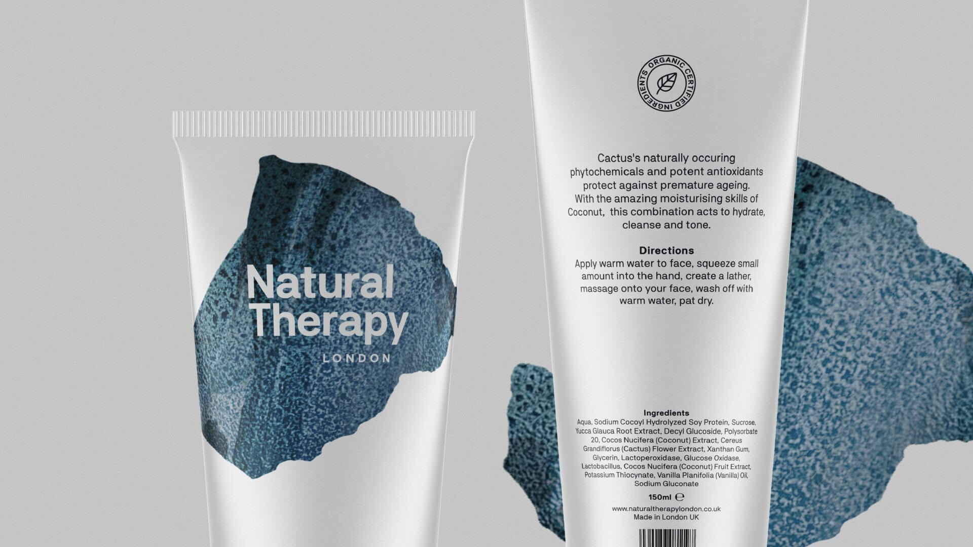
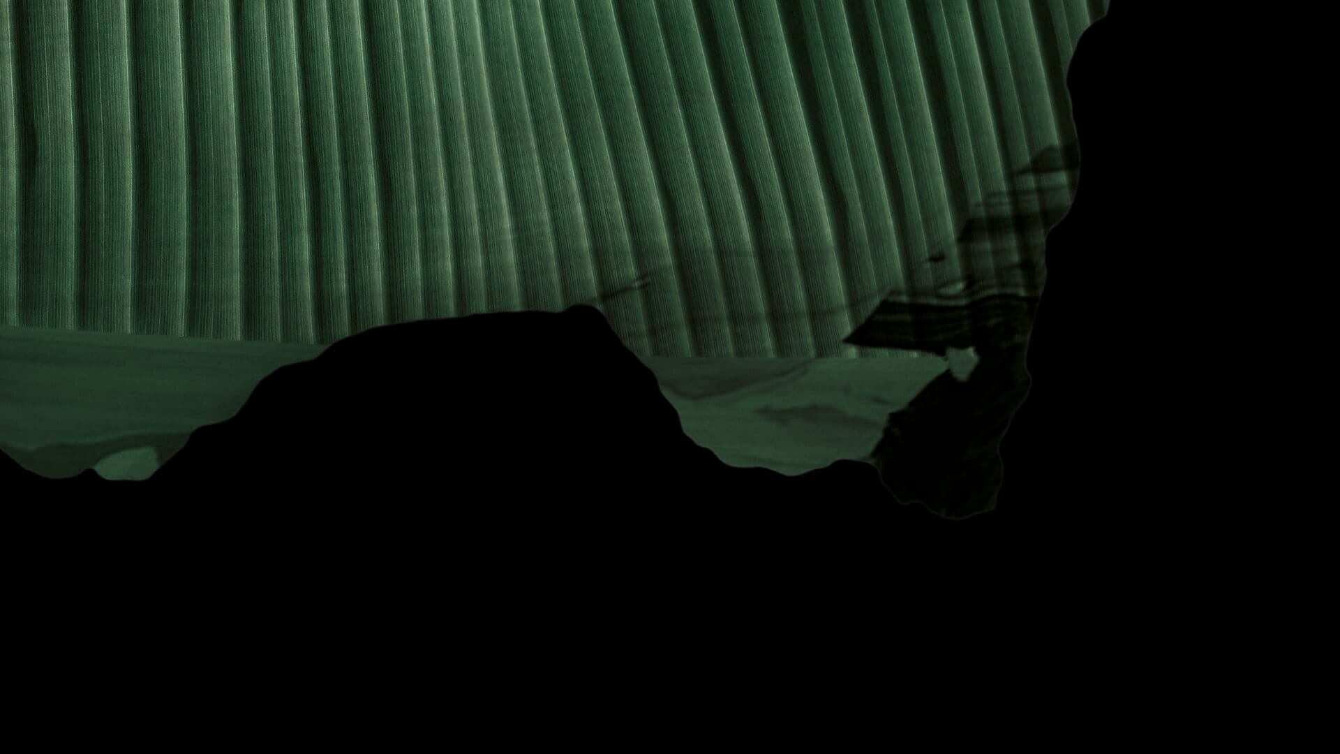
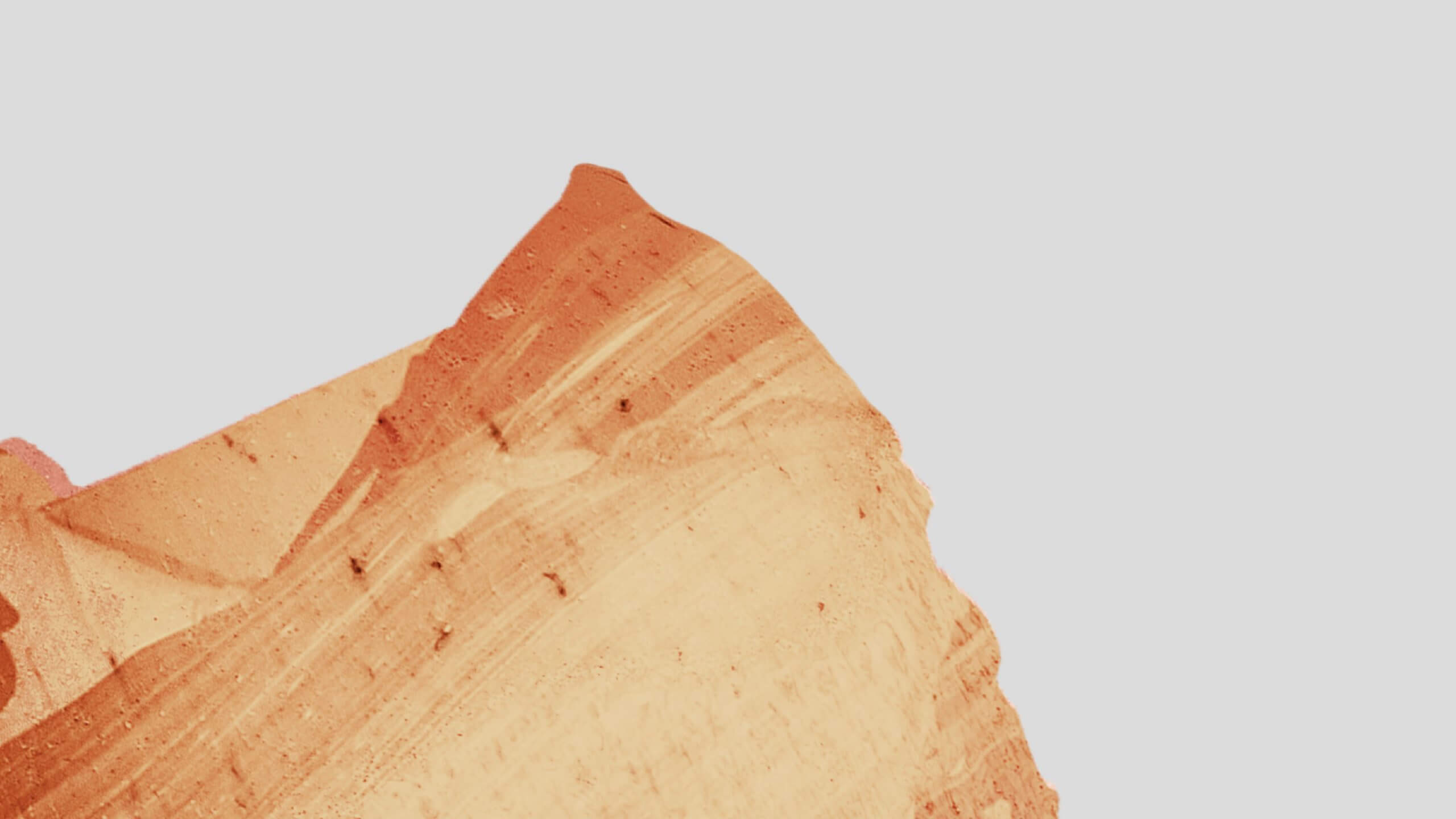
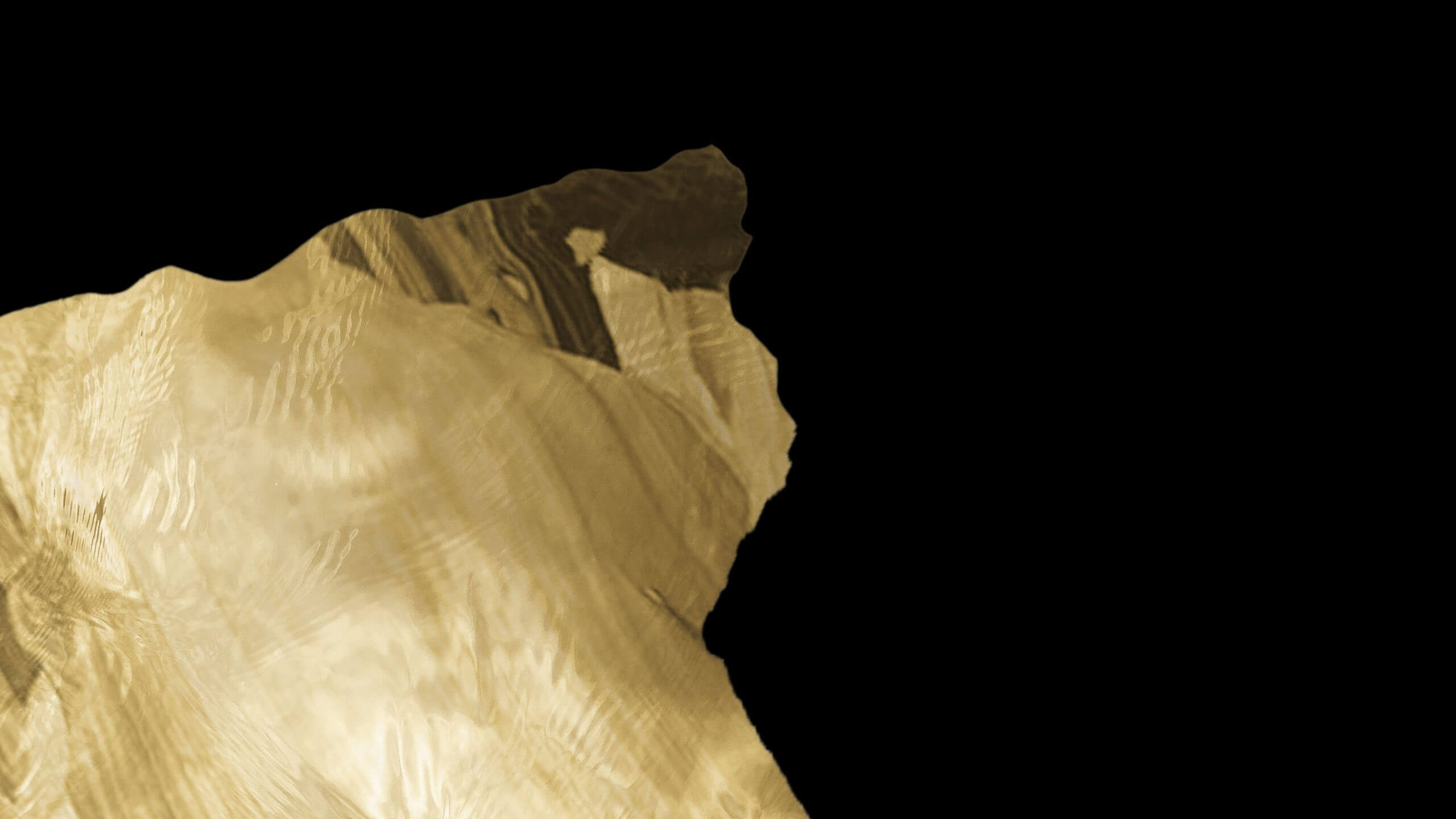
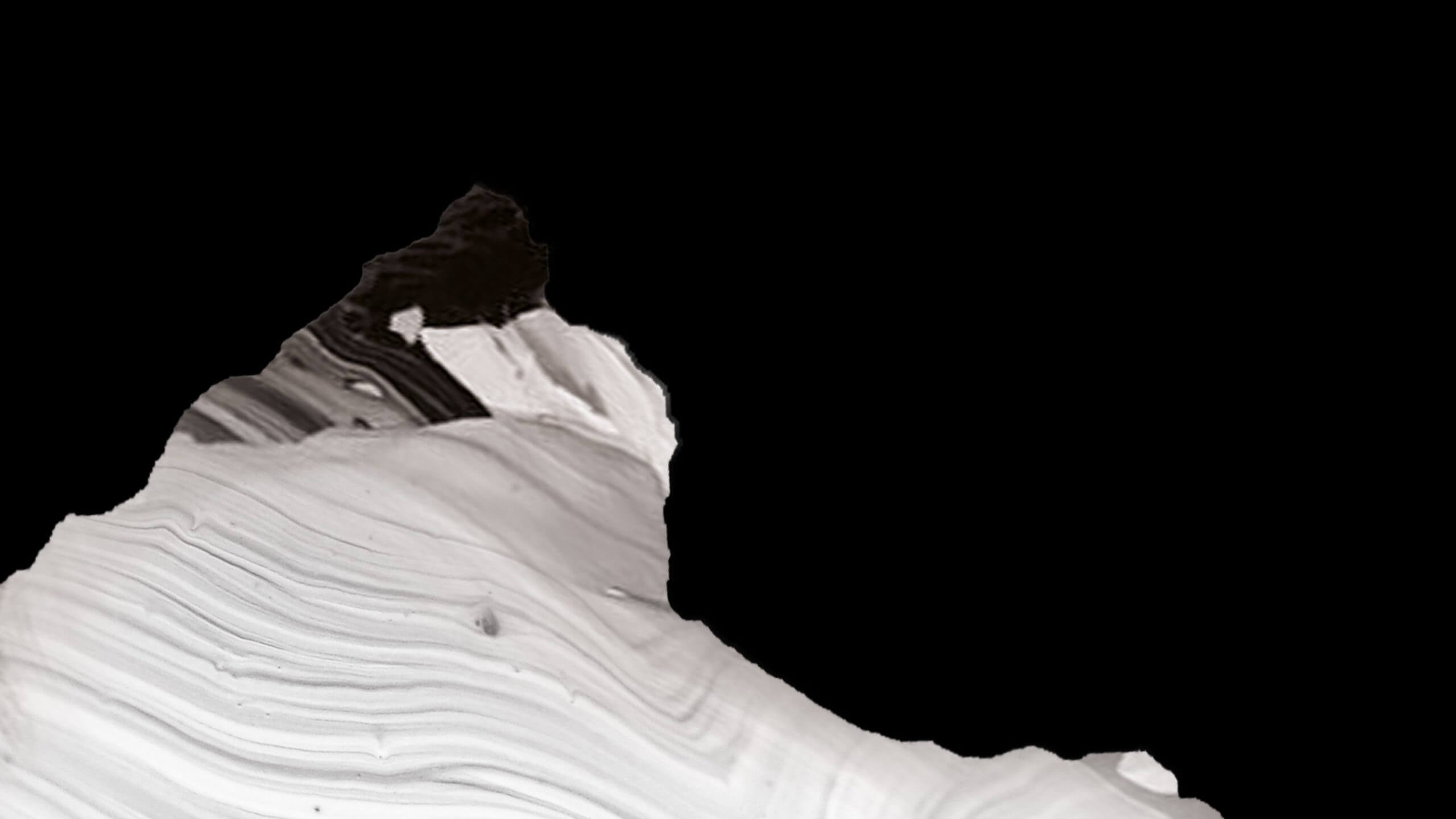
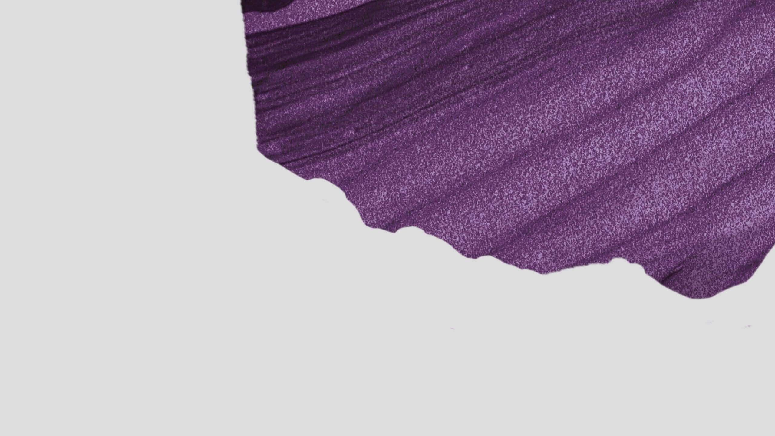
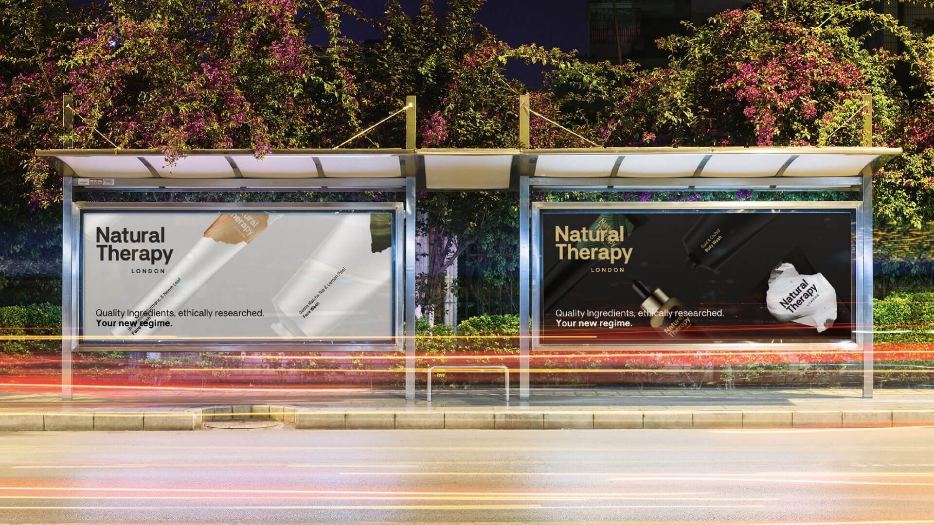
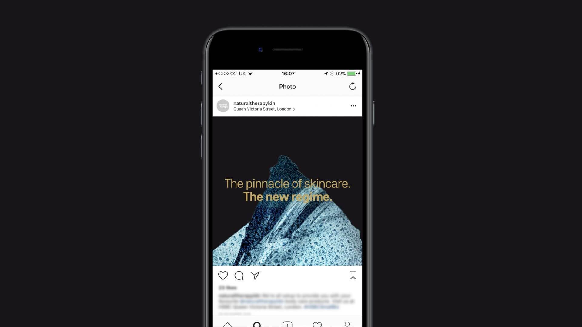
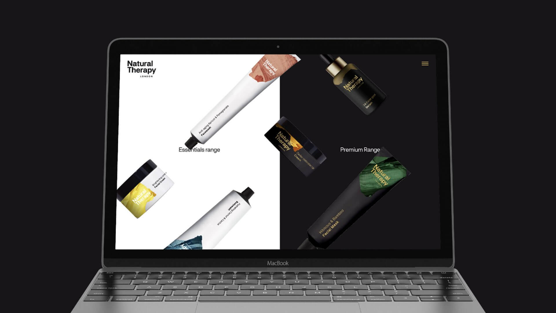
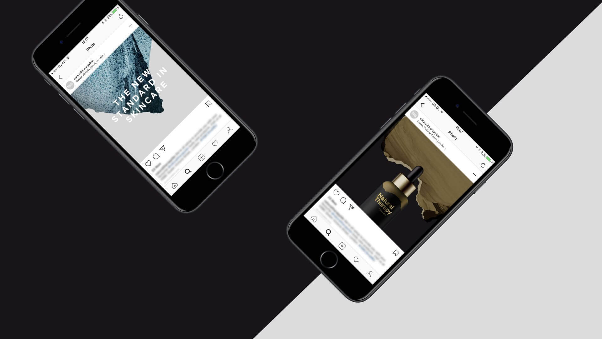
Our packaging design mixes natural textures with absolute minimalism and modernity. Using a clean, sans serif typeface and primarily monochrome colour palette (white on the everyday range, black on the premium range) sets the stage for the unique textures featured on each distinct flavour. The textures we use are from the natural world, directly related to the flavours contained within each bottle – making sure each has a very different, distinctive feel within a coherent brand framework overall.
1 / 2
1 / 3