To set the standard for Gen Z haircare.
The Challenge
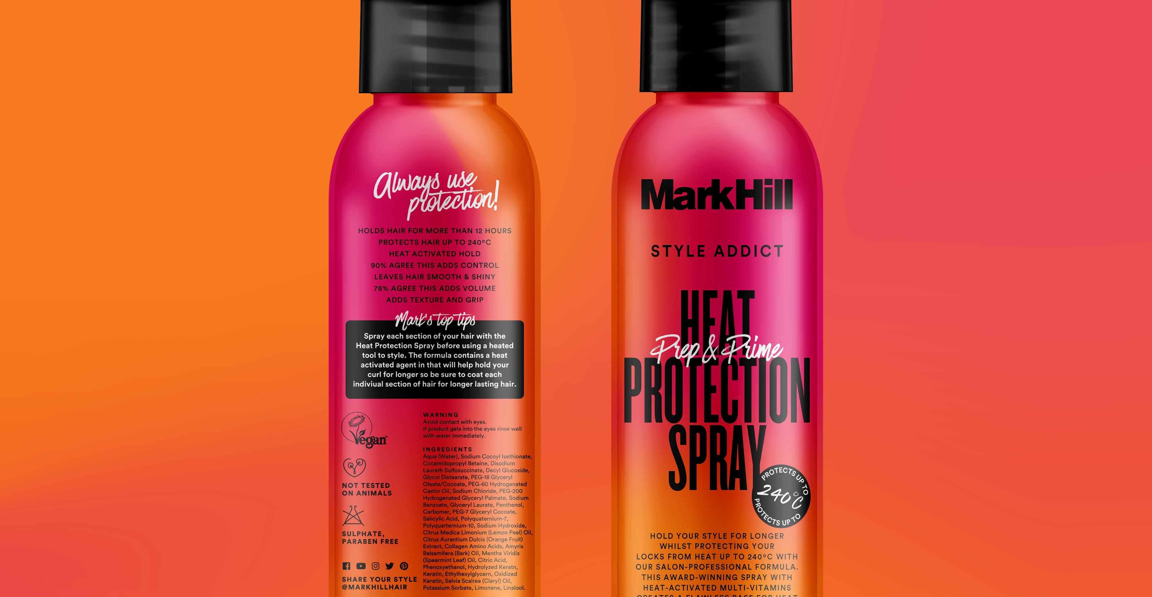
Mark Hill, a popular hair care brand established by celebrity hairstylist, sought to modernise and refresh its brand identity, with the aim to resonate with and capture the attention of a socially-focused Gen-Z audience. Our task was to refresh the identity and craft a set of guidelines, detailing how the brand could visually extend into other ranges and formats.
The Process
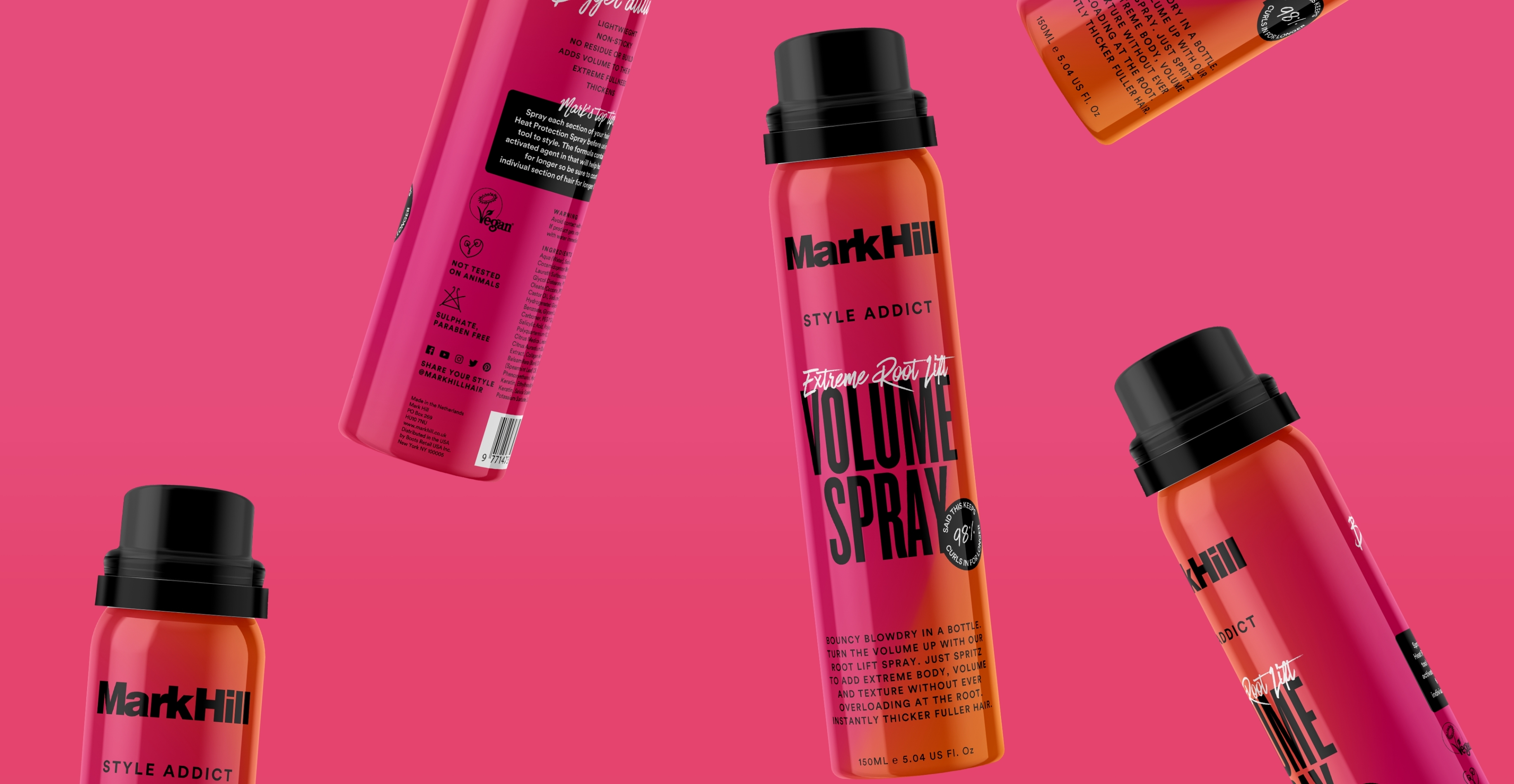
Research revealed that the ‘Mark Hill’ name and the brand's vibrant colours held significant equity, making it crucial to retain them. However, our target consumer was strongly inclined towards trend-led fast fashion brands like Missguided and Pretty Little Thing. We leveraged this insight as a springboard for creative inspiration.
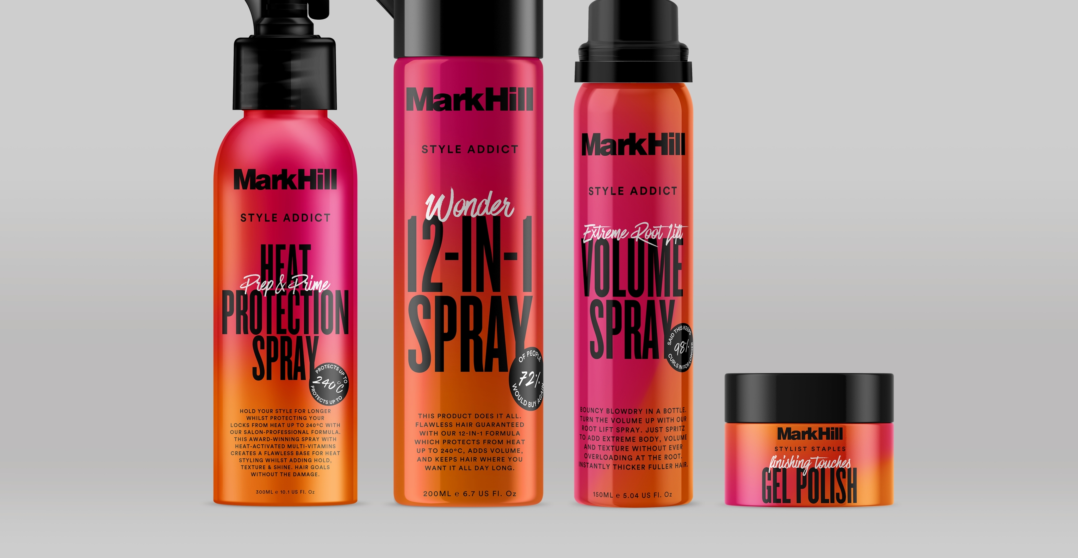
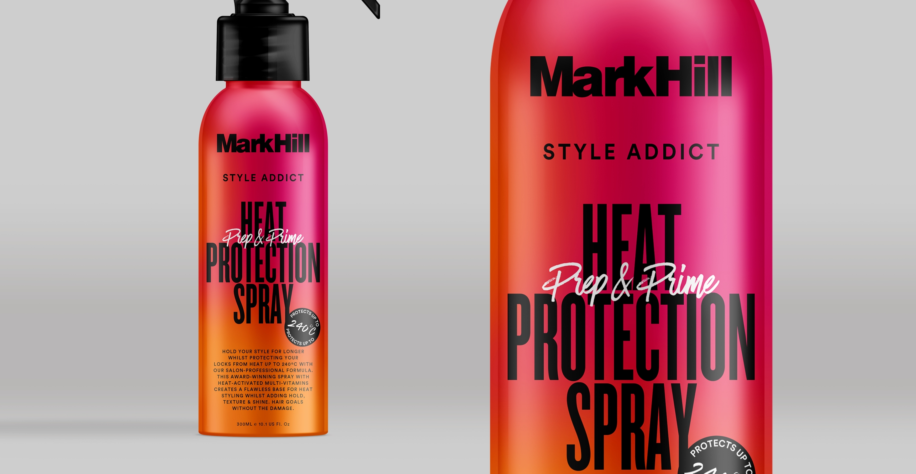
We designed a versatile collection of fluid ombres, offering endless modifications for diverse flows of the same colours, enhancing the brand and packaging visually.
Next, we tackled typography and label systems. Our goal was to create a typographic label system that maintained coherence and instant recognisability across various sizes, formats, and materials on the shelf.
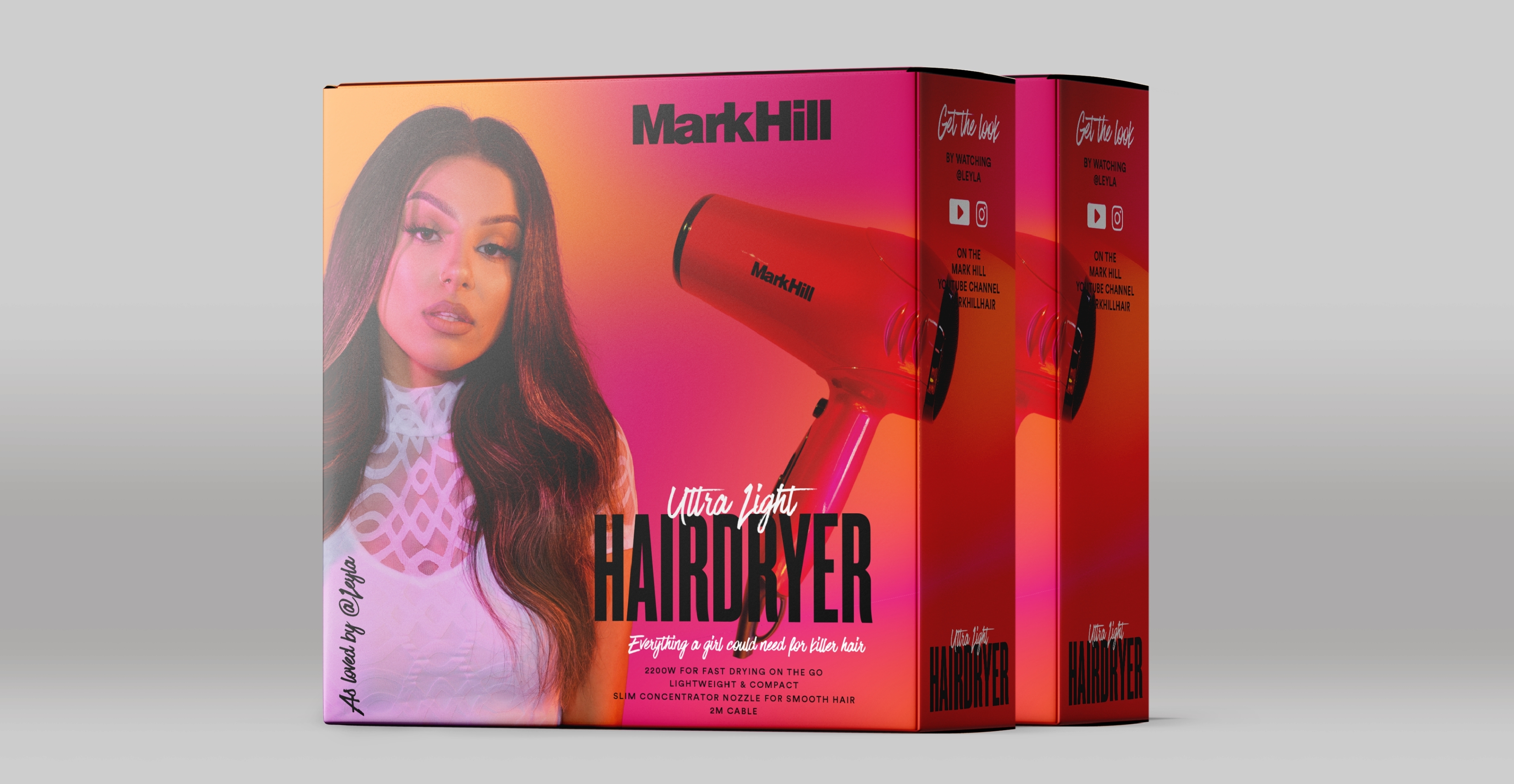
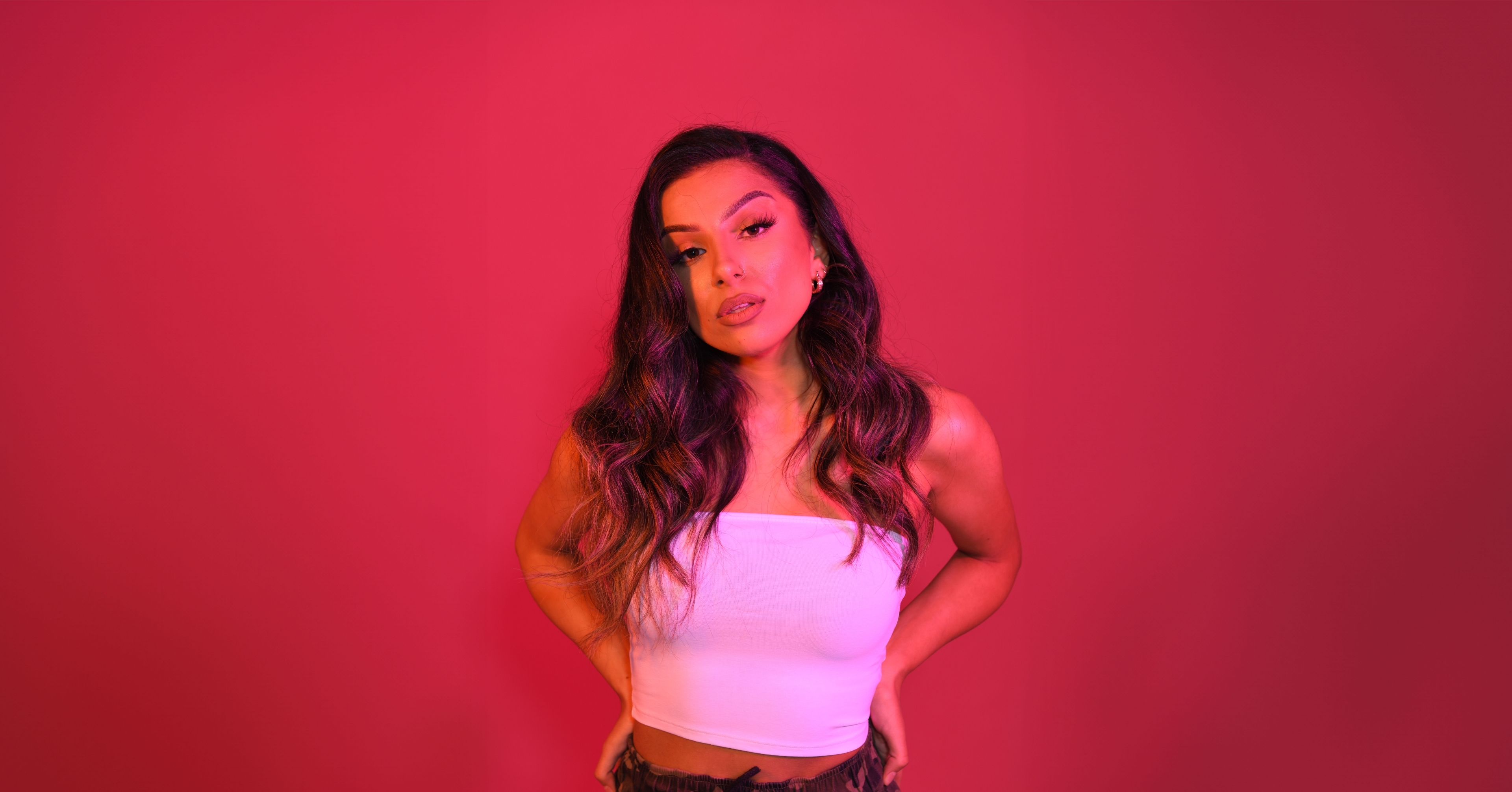
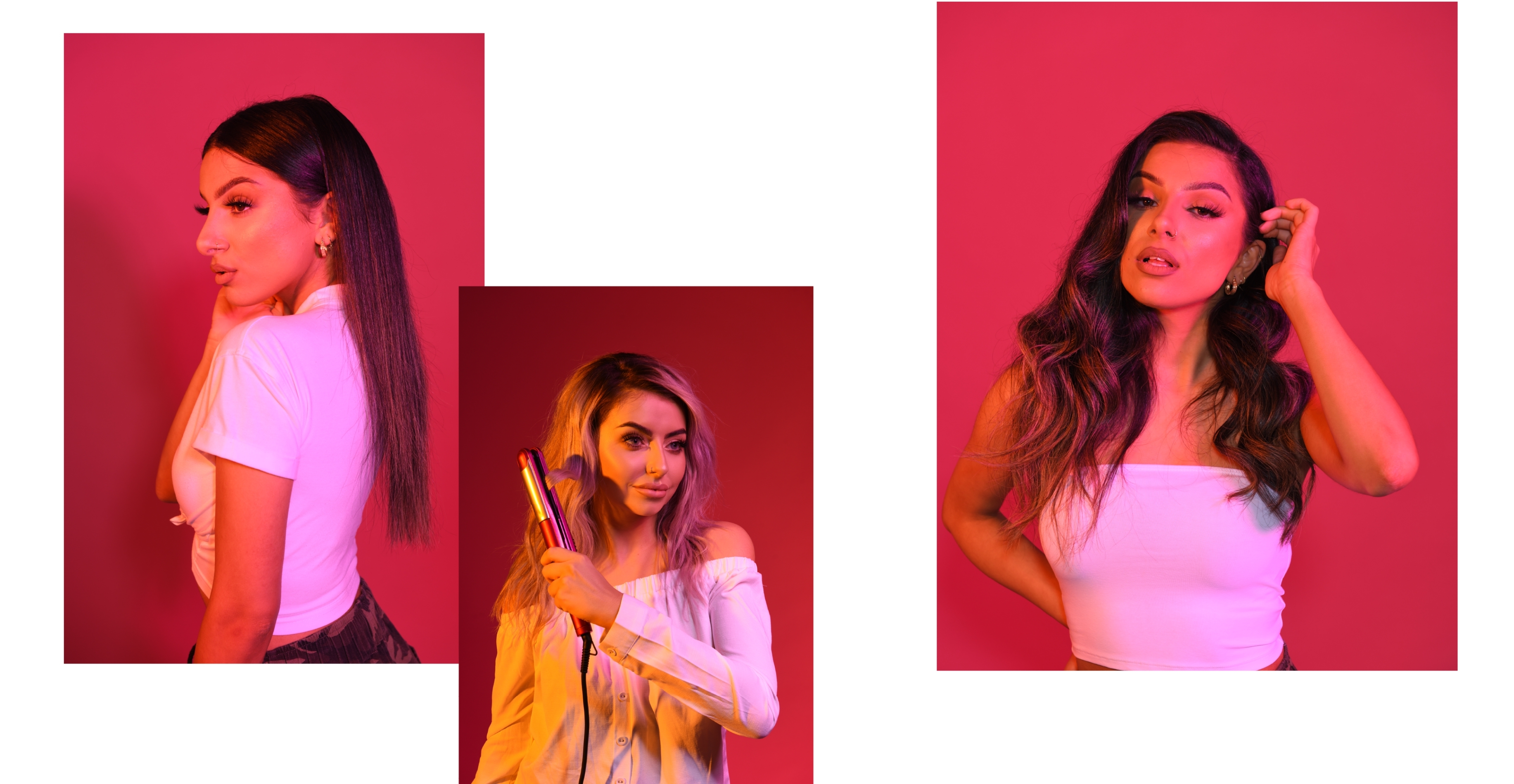
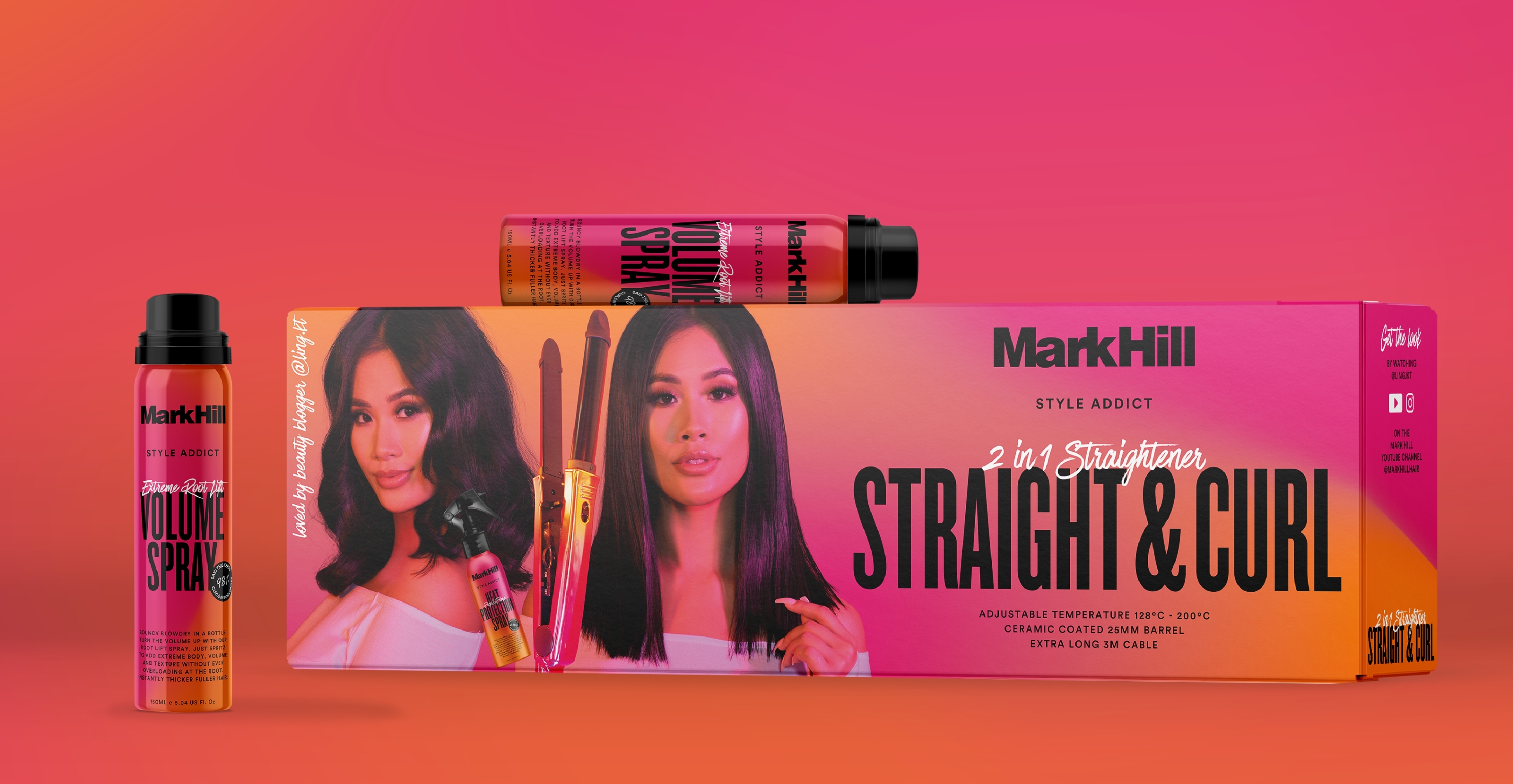
We explored the language and TOV, to engage Mark Hill consumers in a casual and current manner. Our presence at influencer photoshoots enabled us to art direct the photography for the electrical packaging. The goal was to highlight influencers who contribute to Mark Hill's stronger connection with their customers. We integrated the new pink and orange colours into the lighting to visually align the photography with the rest of the brand assets.
The Outcome
A modernised identity of the existing brand across all ranges, concurrently establishing a strong, recognisable, and user-friendly brand/packaging system. Fostering a stronger connection between the Mark Hill brand and new and future customers.
