Helping a wealth management app on their growth journey.

As a rapidly growing company in a crowded marketplace, Lumio approached BGN to develop their current brand. Redefining their brand to help secure their next stage of investment funding.
The Challenge
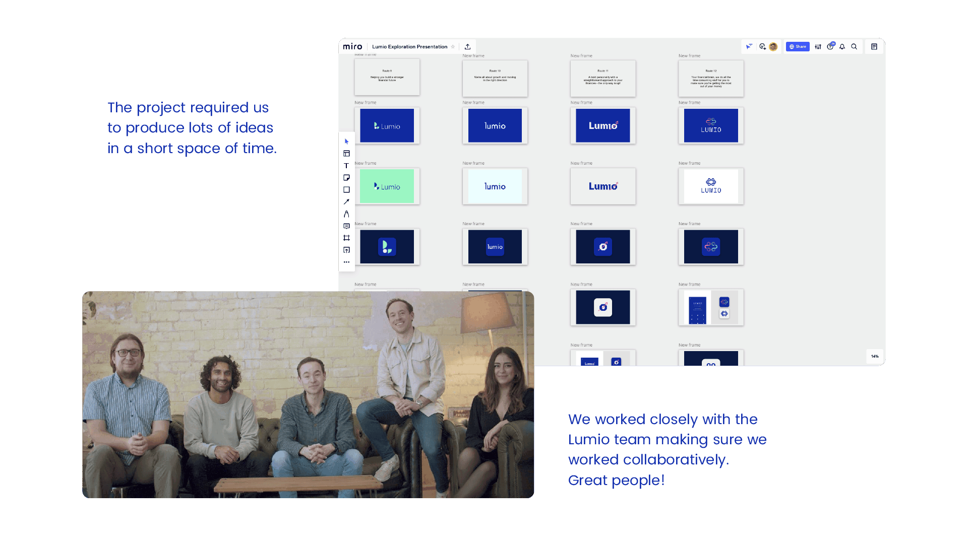
Lumio's offering is positively different to the rest of the market, we needed to find ways in which we could retain exisitng parts of their brand that have helped define them to this point, but at the same time push on, bringing to life their ideas & vision.
The Solution
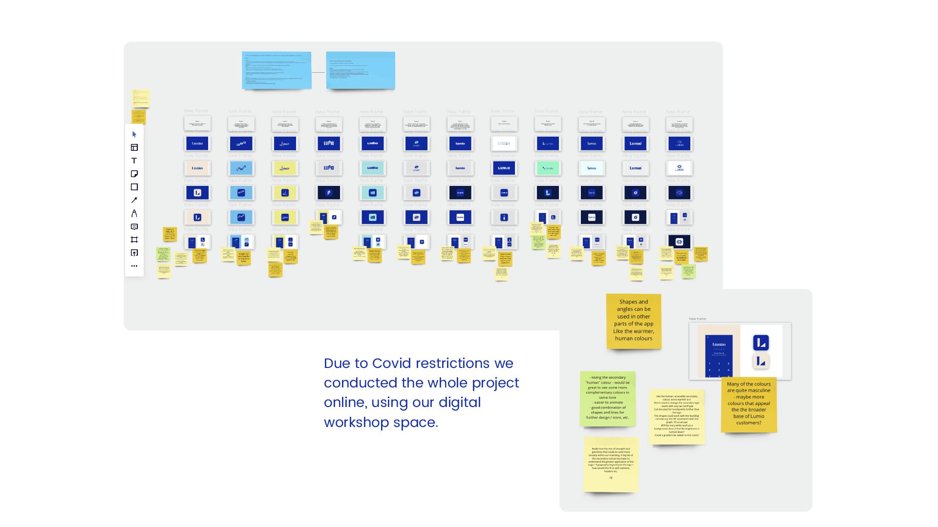
After consulting with the Lumio team, we decided not to throw the brand out with the bath water, but rather treat the current branding and identity with respect – after all, it's worked thus far. We didn't want to scare off current Lumio users, but we also wanted to look attractive to new users. So we picked up from where others left off, developing and refining the Lumio brand and identity, and providing them with those extras that add life and depth to a brand.
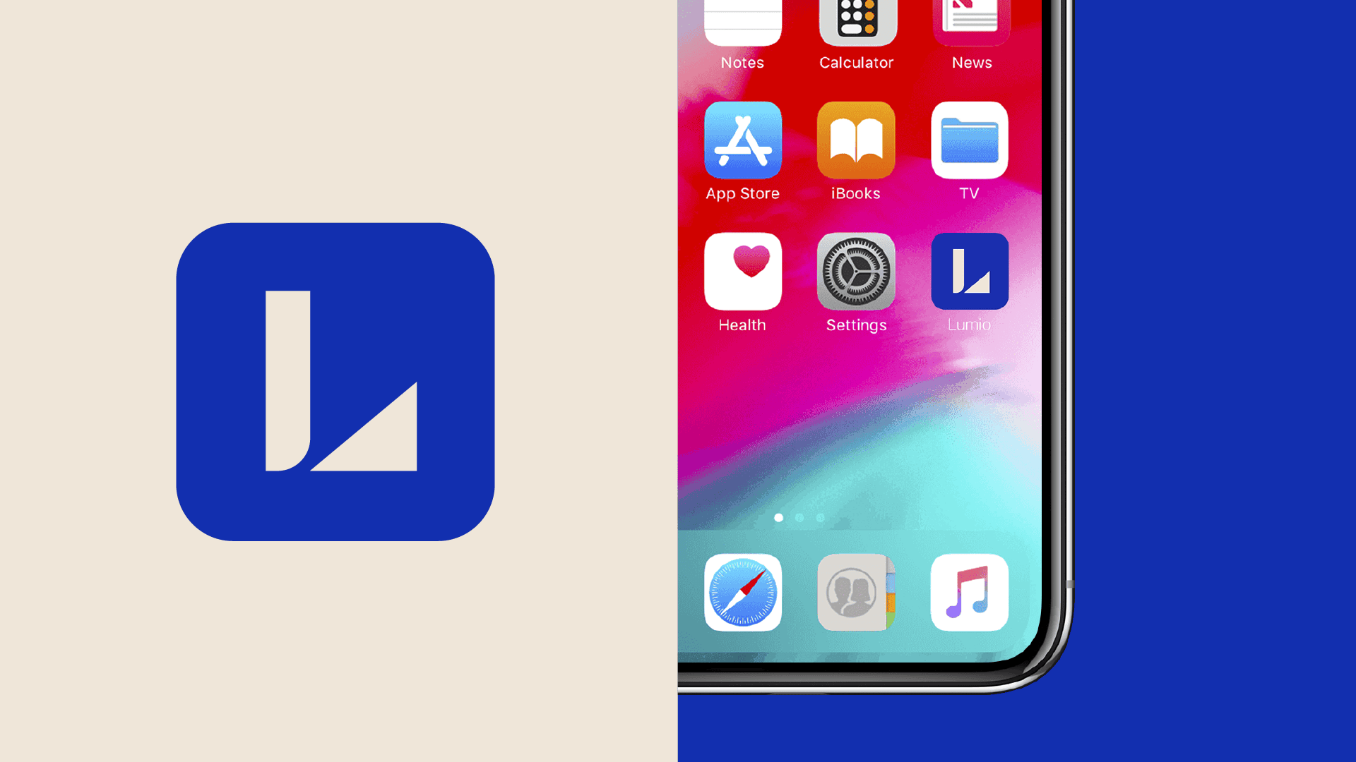
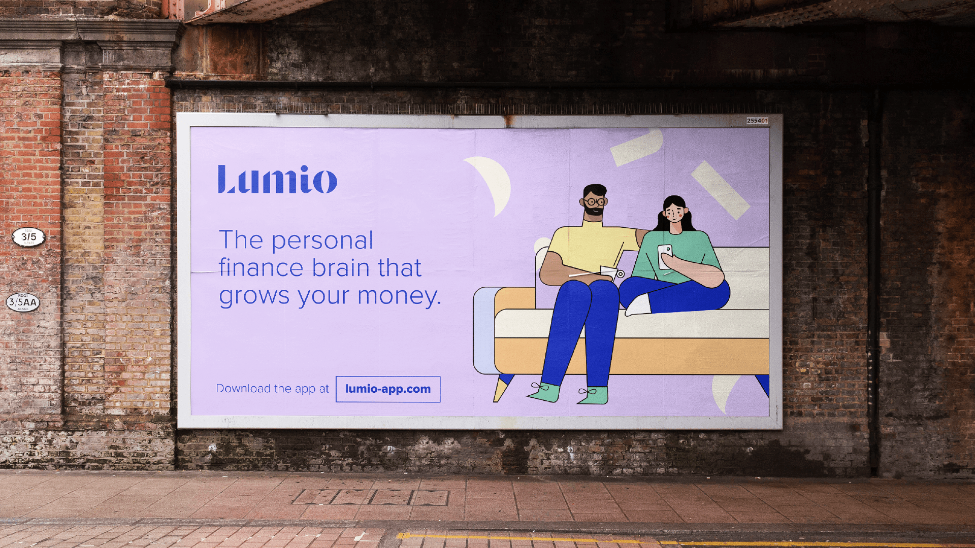
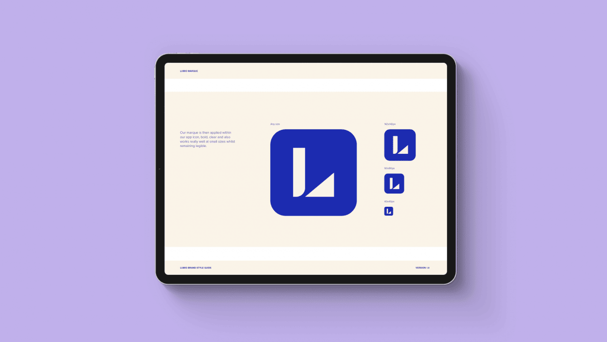
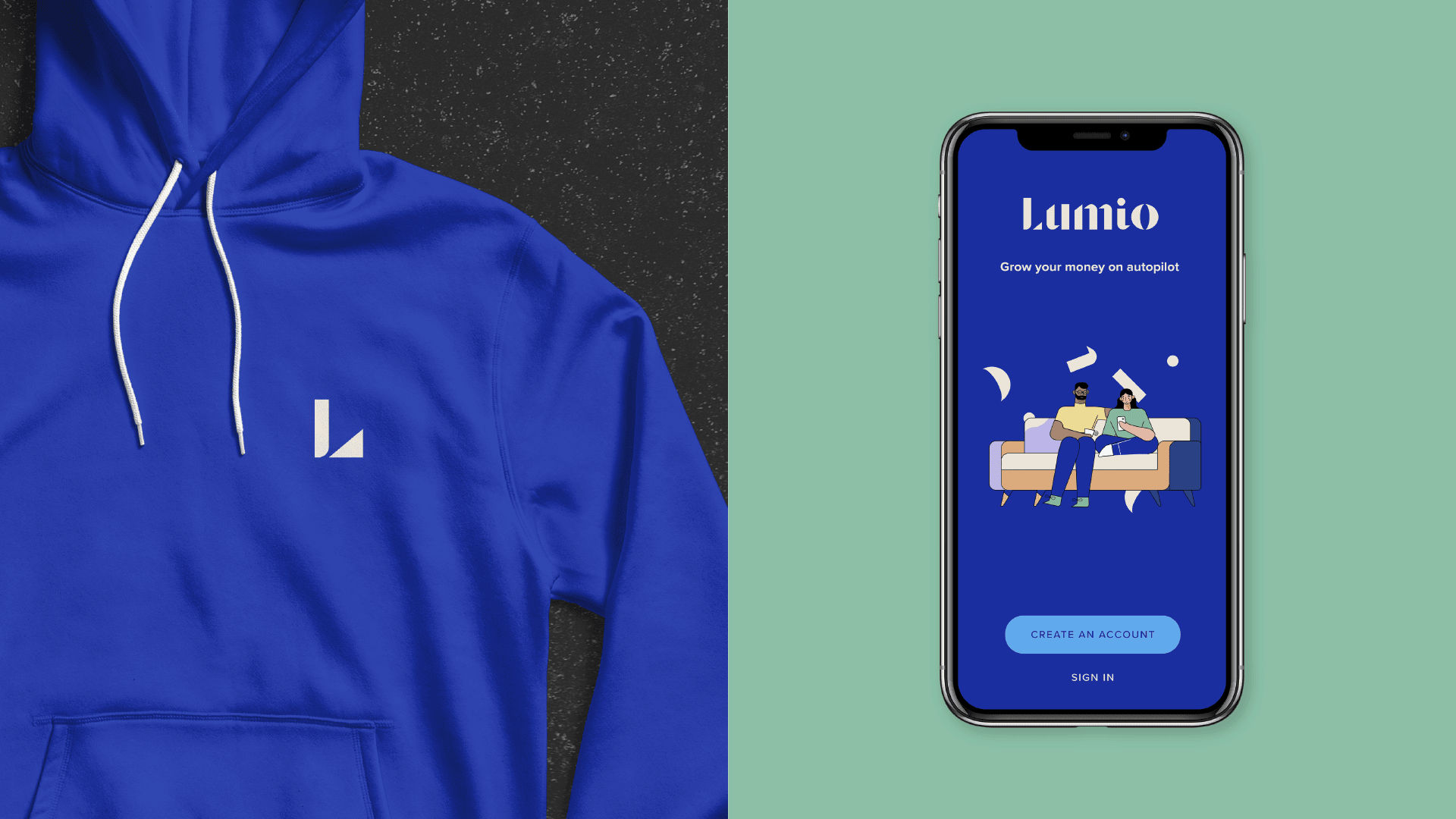
The logo was the primary focus of this project. Their old non-descript logo was fading into a swelling sea of fin-tech brands. With Lumio being a consumer based product, it had to stand out. It also had to remain sensitive to investors, so we pitched it at the intersection of consumer vs corporate.
As straightforward as the Lumio app is to use, we inherited that characteristic and interpreted it visually. We created a logo and identity which was cleverly simple, original and memorable. It had to stand out, especially on those app pages where you're pitched directly against other similar products. It's 'ease-of-use' comes though in it's calmness and considered 'togetherness'.
The logo is built out of lots of different parts, reflective of how they build and grow your money through utilising a number of growth avenues. It finally comes together to reveal the Lumio name.
Introducing Warmth & Humanity
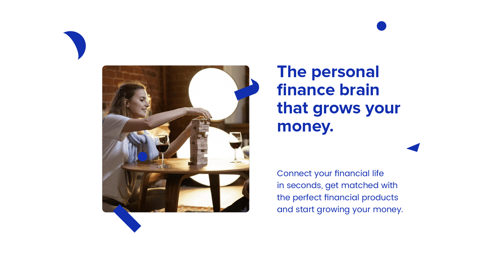
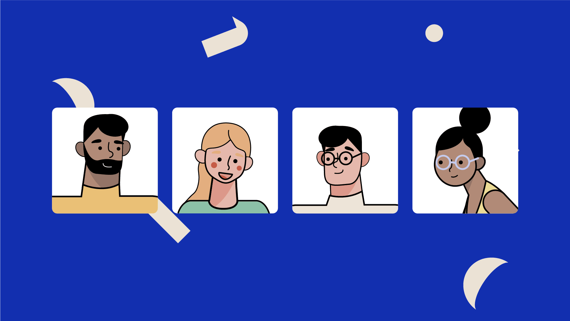
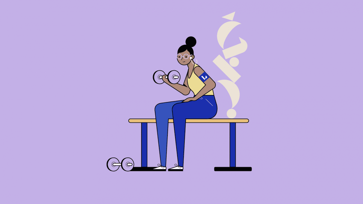
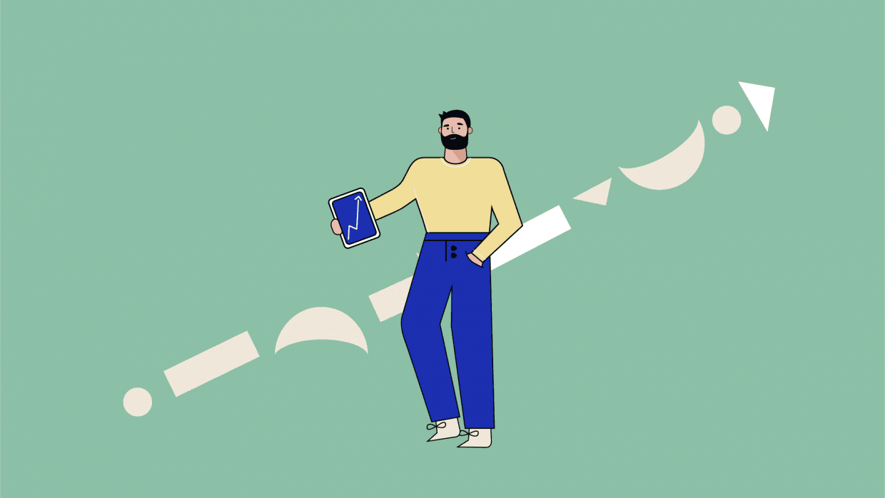
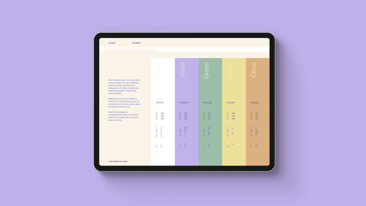
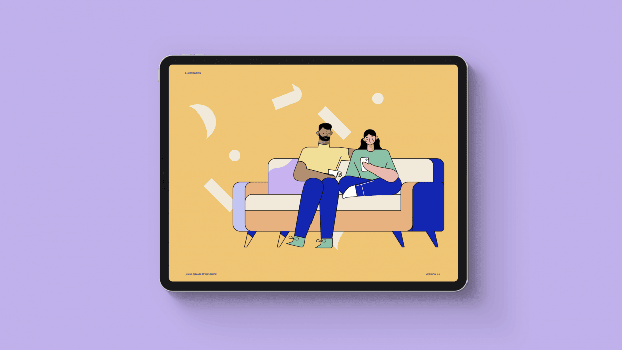
We decided to keep the Lumio blue, and this was the inherant visual indicator of Lumio to their current users. We added a secondary colour palette to bring warmth and depth and to help them when applying the brand. These colours fed into our newly developed human illustrations. The brand was missing a 'human warmth' and given where most people would view the brand (in the app), we had very limited space to play with. When developing the illustrations, we started off with faces of people that their users could associate with, then built them out into larger scenes that depict their lifestyles.

1 / 3
Designed for growth, designed for the future
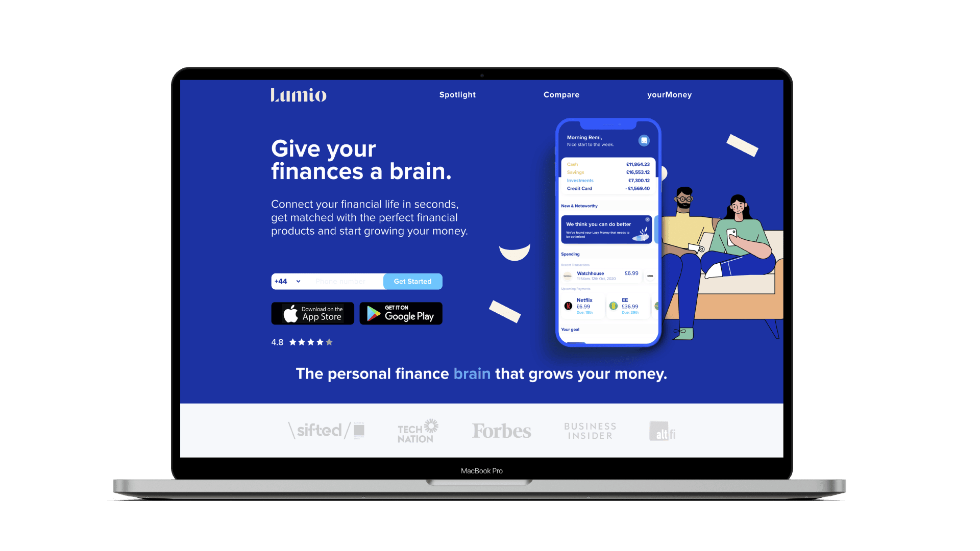
With rollout we were constrained to working within what they already had, like the app and website. We didn't have the luxury of a re-design, so we worked the new brand in to their exisiting website, app and other mediums.
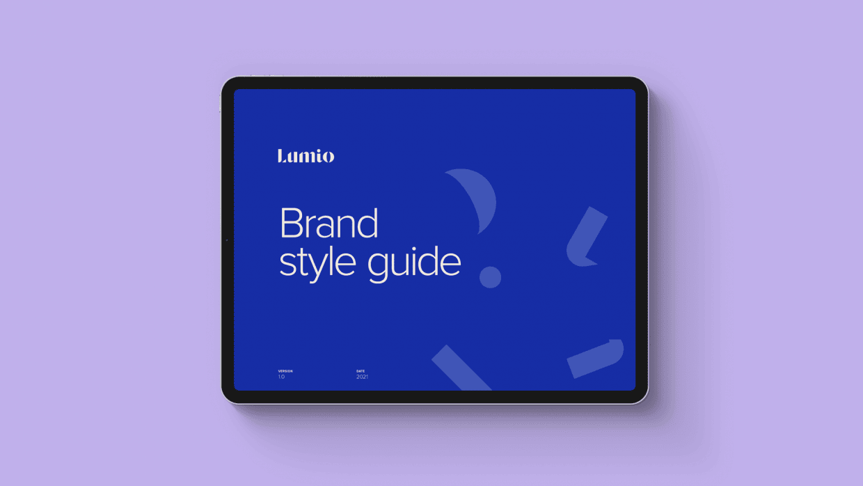
Like many of our branding projects, a Brand Guidelines is an essential part of the rollout. Without this it leaves the application and use of the brand up to interpretation. A new brand is sensitive, it needs to be cared for and nurtured, and that’s why we think it’s important to have these guides in place.
1 / 5
The Results
Our initial task was to develop the brand to a point that helped Lumio secure their next lot of funding.
The brand actually helped them surpass their initial target of £250k by 422% raising over £1.1M. Some projects require you to act with sensitivity and care, we believe this project is a great example of that. That's what we believe makes a good branding agency great.