Giving a distinctive reason to buy to an already popular product.
The Story
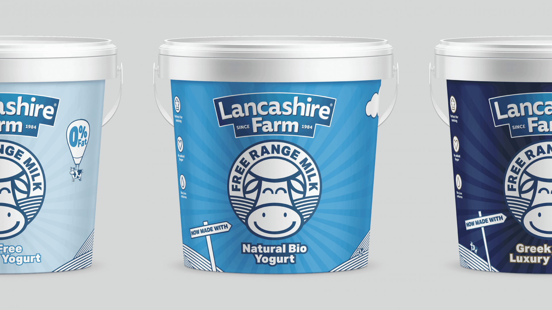
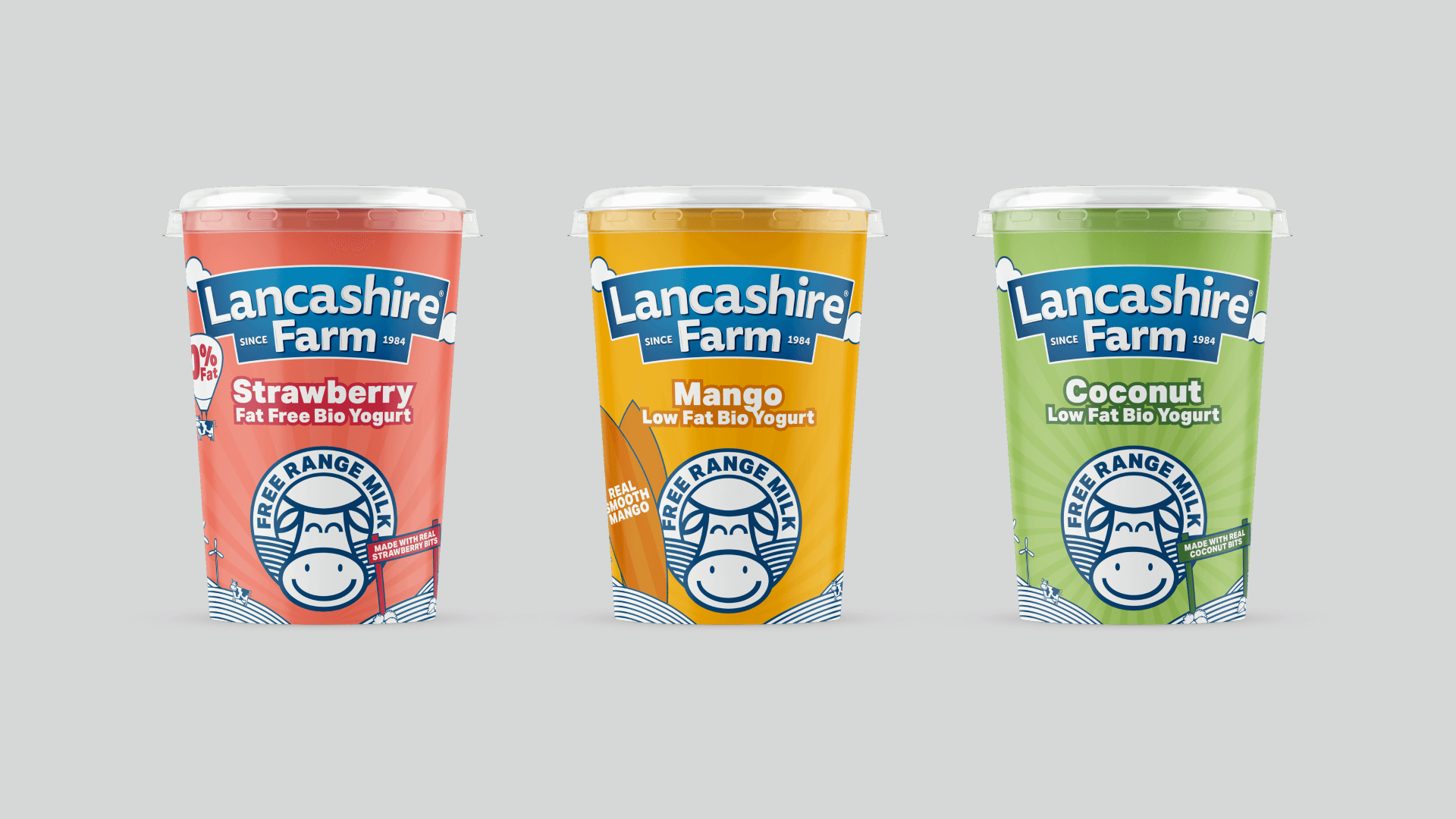
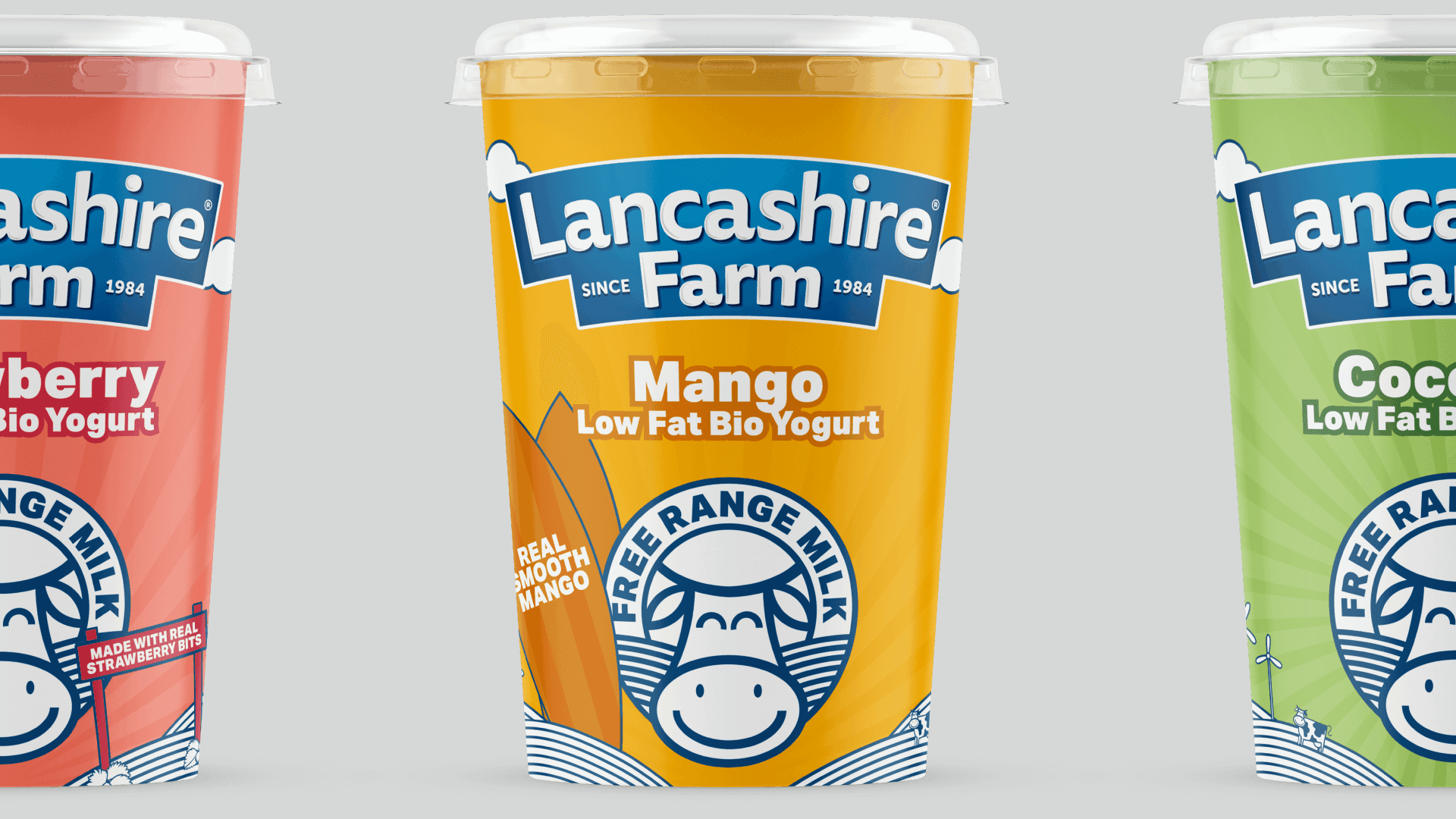
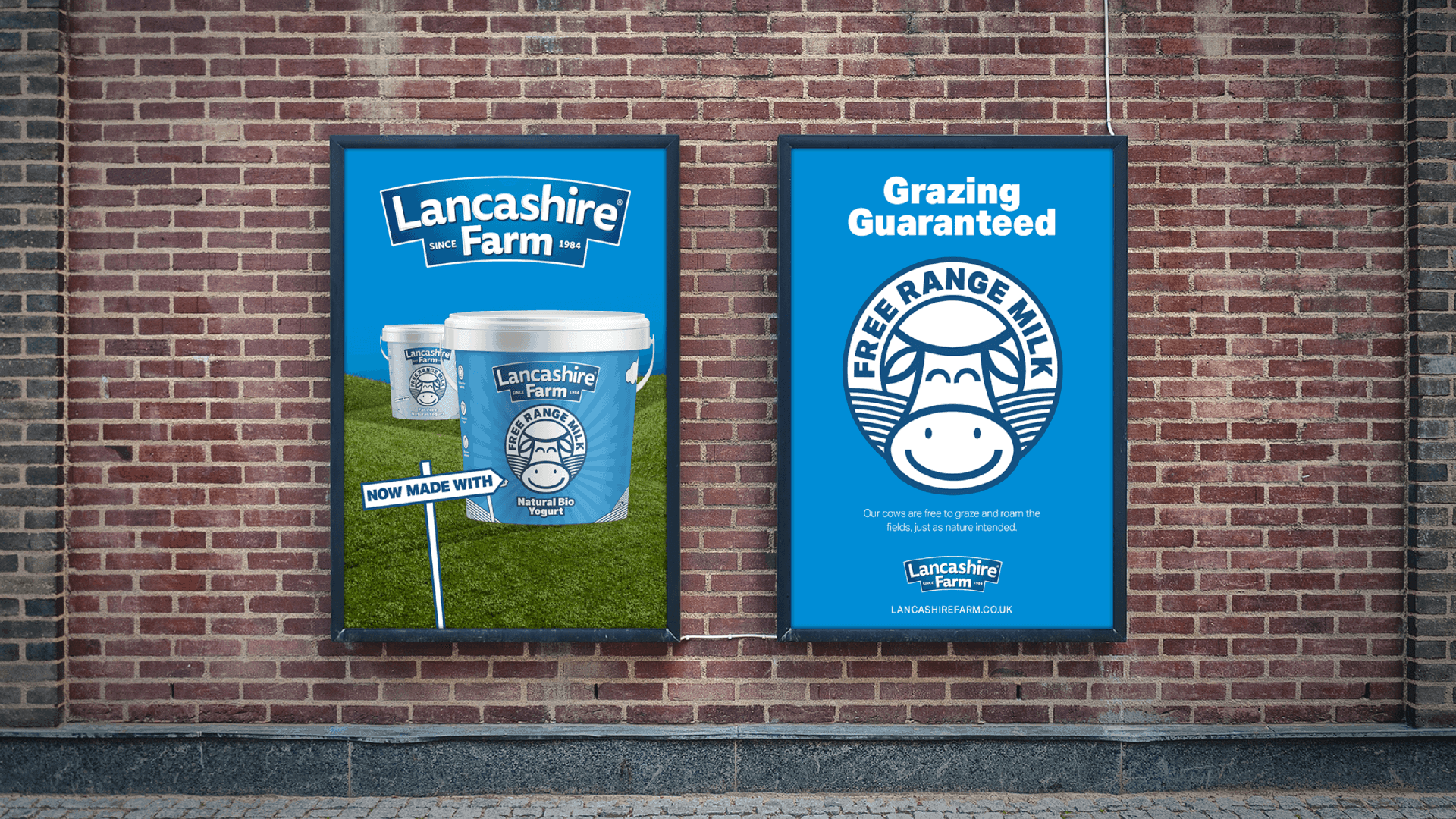
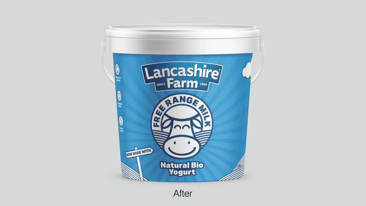
The dairy sector has seen lots of innovation over recent years, organic ranges and dairy free alternatives all vying for space in store. Free range milk was something that nobody had championed before and gave Lancashire Farm a reason to stand out in the sector and on shelf.
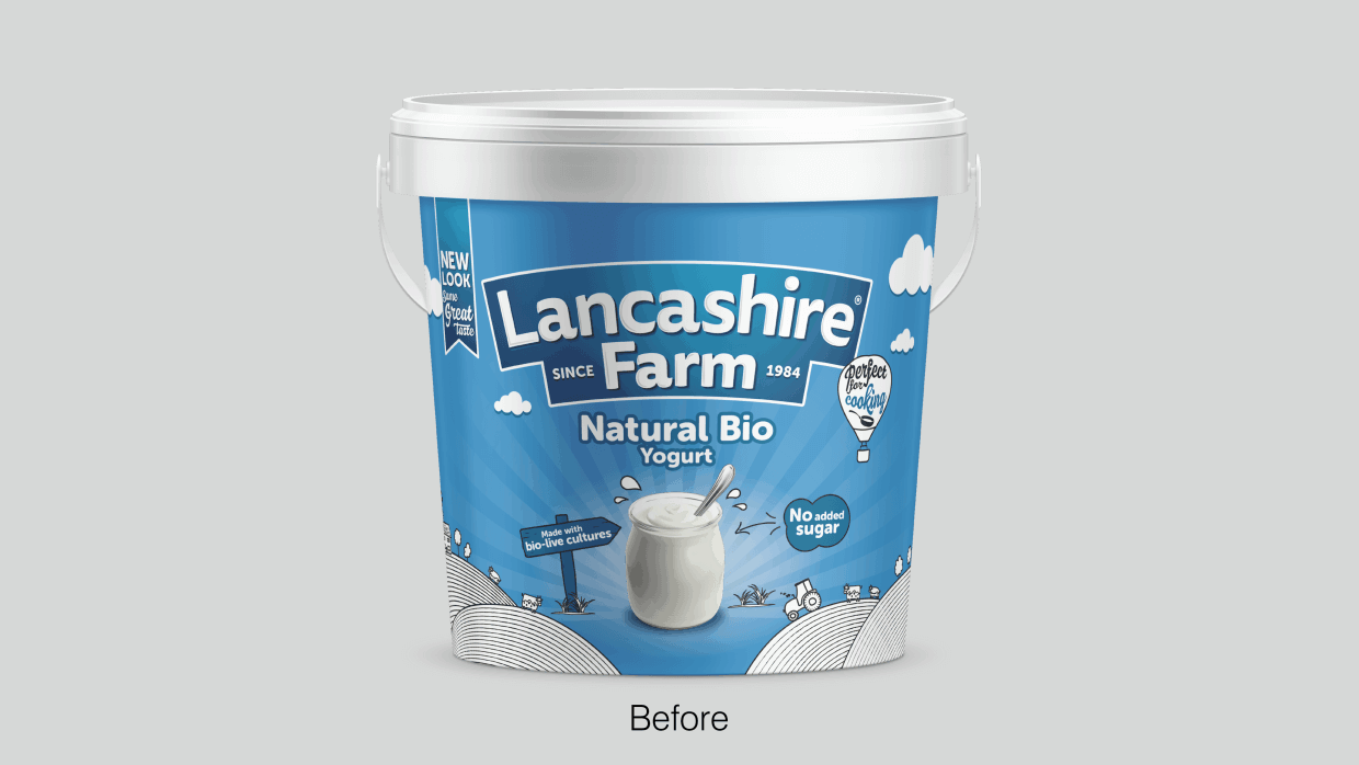
Lancashire Farm is a yogurt brand that has only gone from strength to strength since it last invested in a new brand identity, website and packaging. The brand is now firmly established in the natural yogurt sector, a force to be reckoned with at its very competitive price point. But of course, they were anything but complacent. The time was right to refresh the brand – streamlining and modernising every aspect of the Lancashire Farm brand overall.
Concept
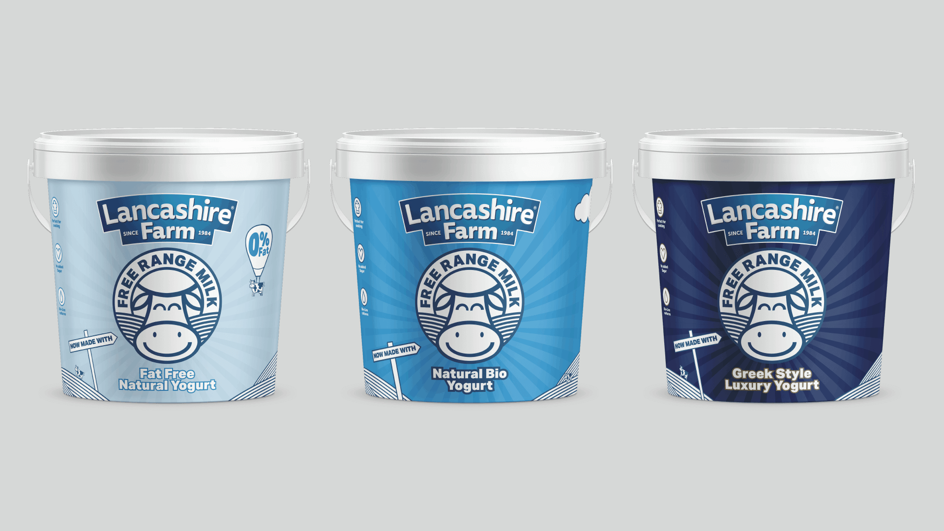
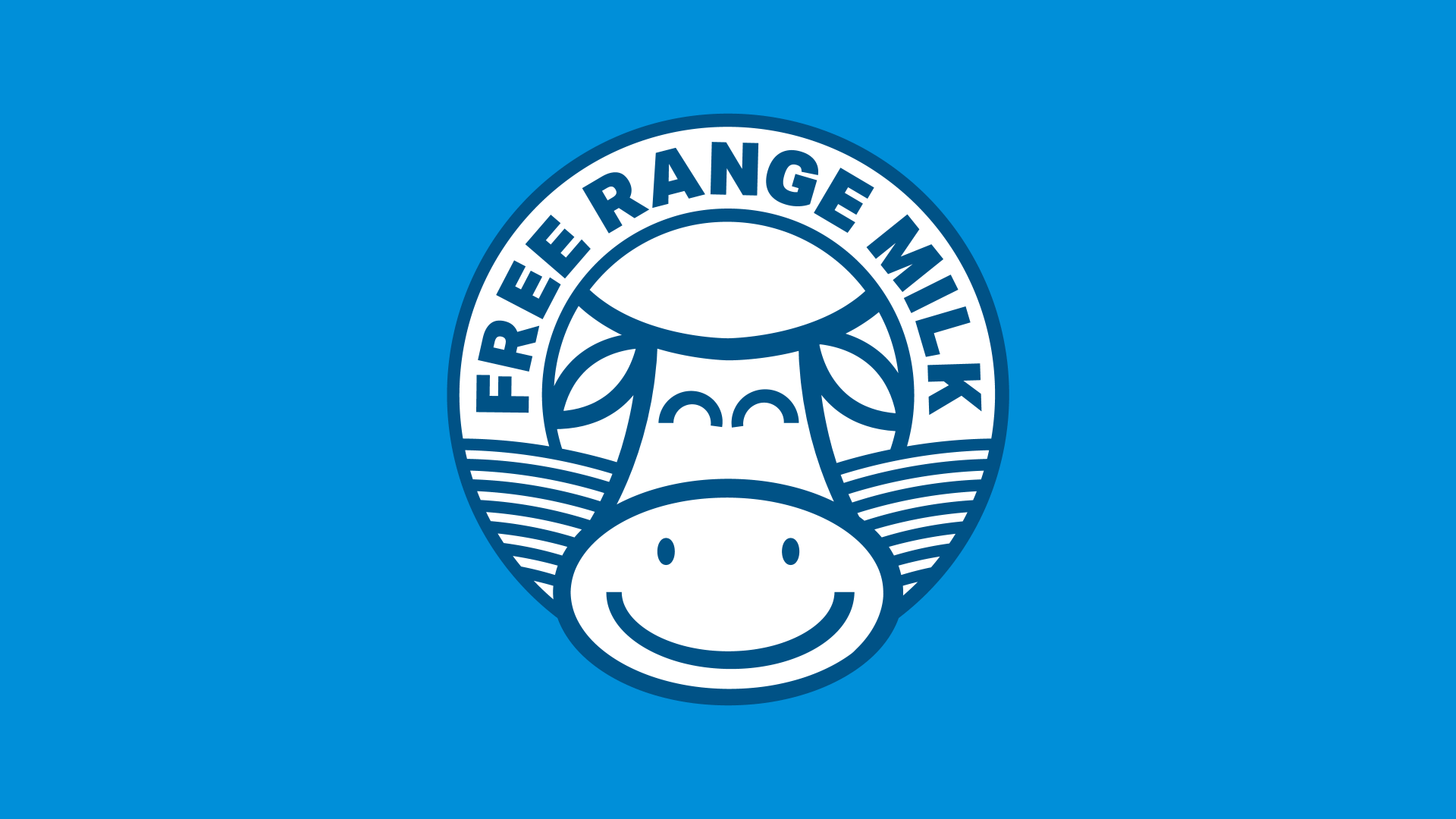
Free range milk is the latest seismic change in Lancashire Farm’s waters, and so it made sense for the packaging to make a feature of our newly-designed seal. From there it was an exercise in reducing clutter and making sure a customer’s attention is pointed exactly where we want it to be. Being more measured in our pacing of information and not trying to tell customers too much at once is an altogether more confident and appropriate approach for the Lancashire Farm of 2018 onwards.
Execution
Our refined identity and packaging is altogether more bold, setting them apart, not just from their previous identity, but to the majority of their competitors too. This refinement was by no means a quick process, however, requiring new illustrations, refined copy and new typefaces alongside the free range milk logo mentioned earlier. This is an exciting next step in Lancashire Farm’s journey, and we can’t wait to update this case study with statistics further down the line to see just how much of a difference the new packaging has made.
1 / 2