To set the standard in infrastructure planning.
The Story
Helix has the power to track and log progress on major rail, power, and highway projects, increasing efficiency and providing peace of mind to everyone involved. Traditionally, infrastructure projects across the UK have been tracked and managed through outdated methods such as faxing, physical paper documents, and email threads. This, as you can imagine, is an outdated process and can leave room for errors.
Helix Workflow aims to redefine the industry with a technologically driven platform that brings together all areas of a project in one place. Helix initially came with almost no visual identity. They wanted to look and feel like an exciting technology company, ready to make an impact in the industry. They desired a brand that was exciting while also being simple, slick, and innovative.
The Process
Throughout the course of the Helix project, we maintained close collaboration with the client, with our primary focus placed on the development of an effective strategy. This involved conducting collaborative workshops to identify and address the specific needs and aspirations of Helix as a growing business. Our efforts culminated in the creation of a robust brand model, encompassing their vision, values, persona development, and overall positioning. Additionally, we devised a comprehensive brand architecture.
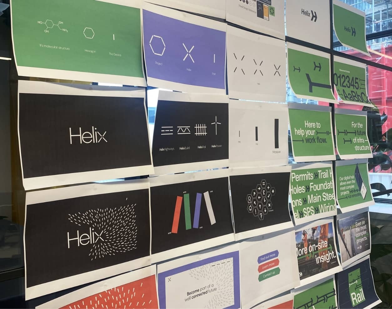
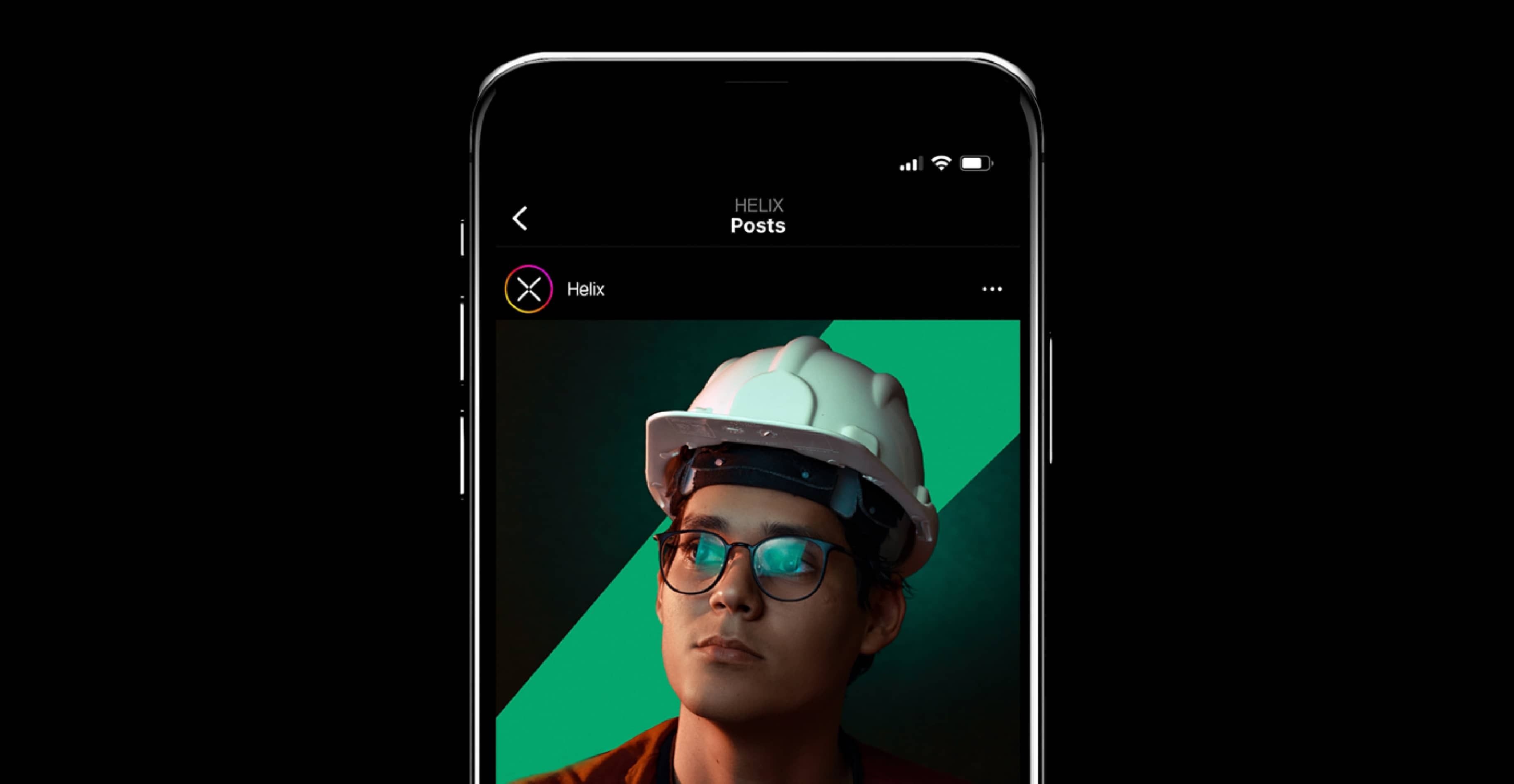
Building upon the established strategy, our team generated several creative territories and core positioning lines. These three territories were then transformed into three distinct creative routes. Through iterative feedback and refinement cycles, we narrowed down the options until Helix was presented with a concept that truly resonated with them. Subsequently, this concept underwent further refinement, leading to the development of a range of creative assets. Our motion and development team also collaborated on the construction of a customised website for Helix.
Execution
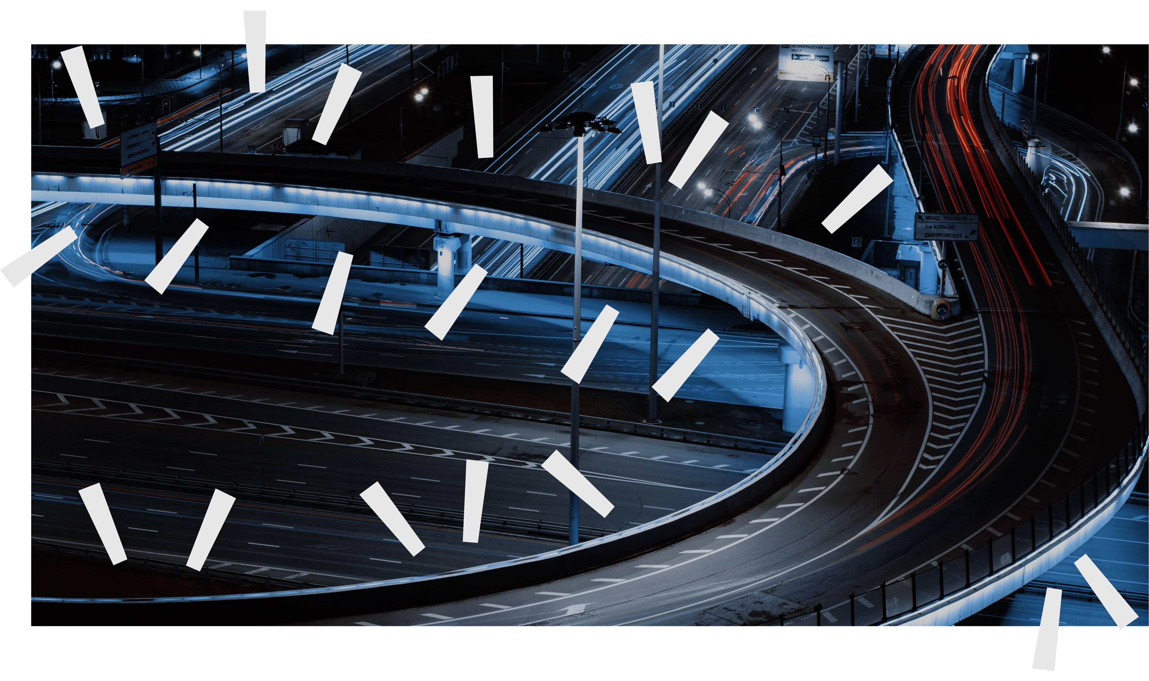
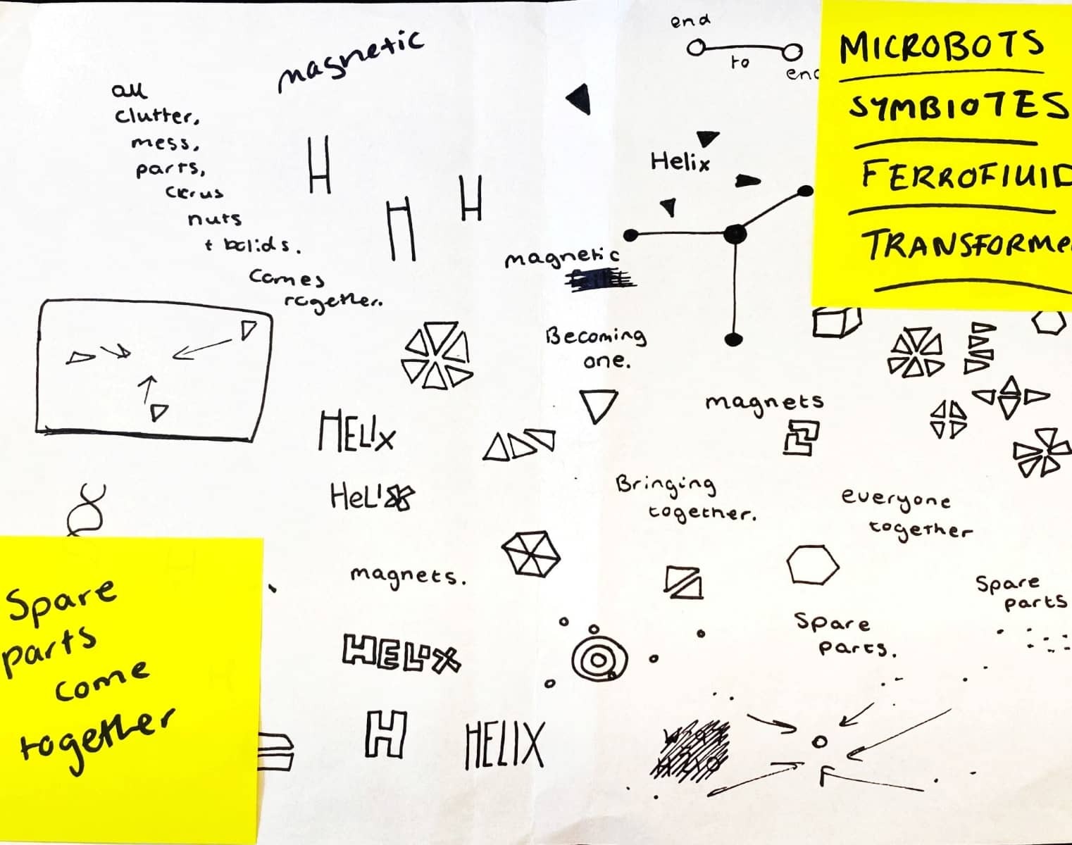
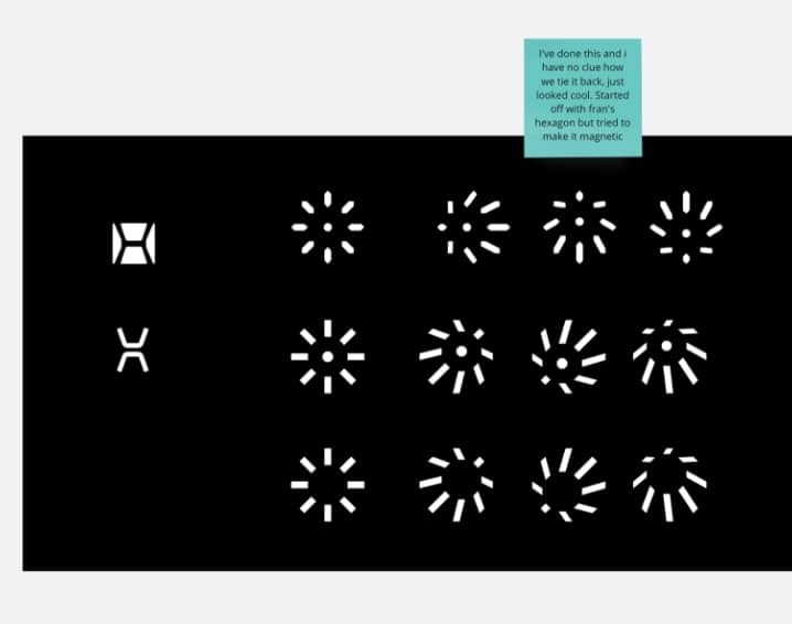
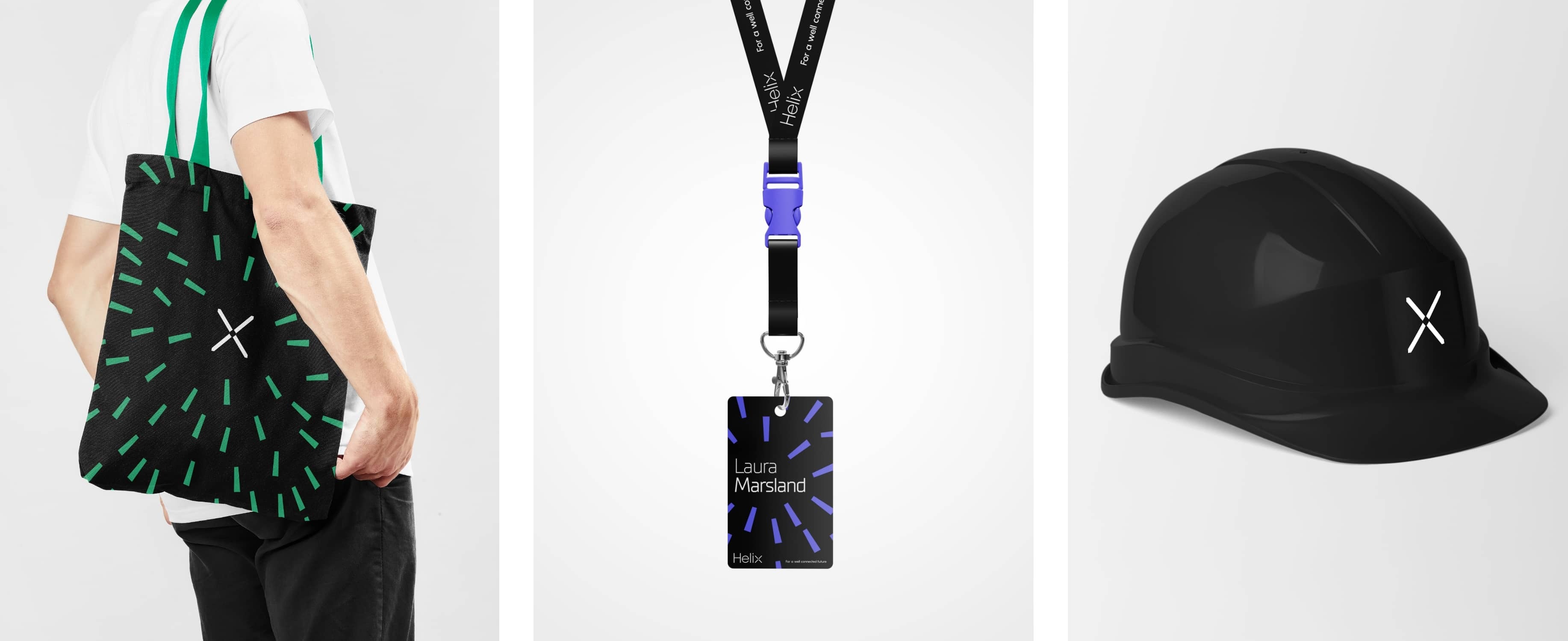
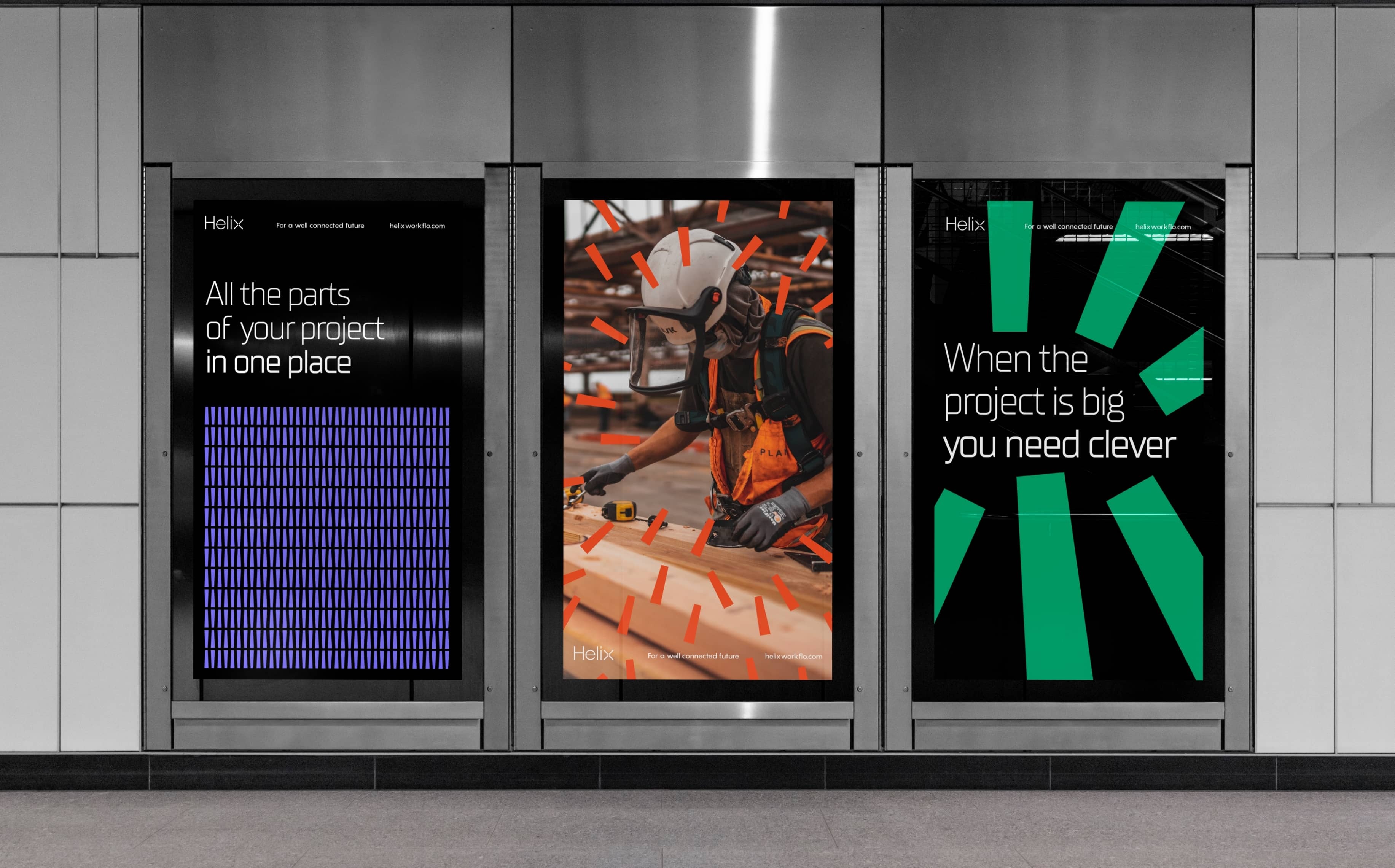
The core concept of Helix takes inspiration from the platforms core benefit: seamlessly integrating all the elements of a project. With Helix, you can conveniently store and access papers, forms, people, processes, and pictures within a unified platform. The concept draws inspiration from the metaphor of a powerful magnetic force, symbolising Helix’s ability to attract and consolidate these diverse components into a single location. The magnetic force idea resonates throughout the brand, from the logo design to every rollout asset. The visual aesthetics are influenced by many sci-fi concepts such as the ‘Symbiotes’ portrayed in the Spider-Man comics as well as the ‘microbots’ seen in Big Hero 6.
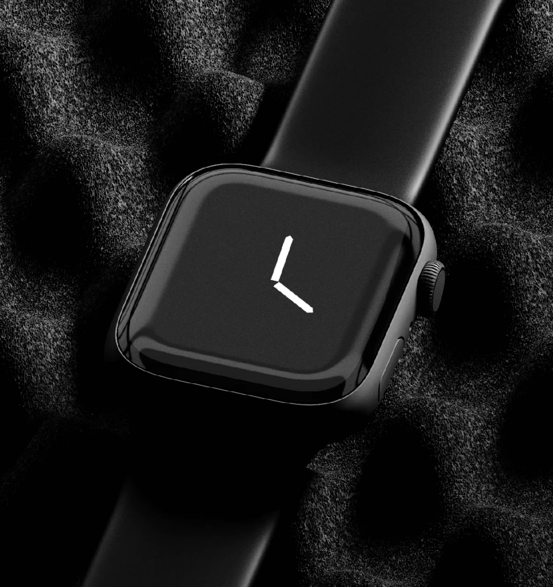

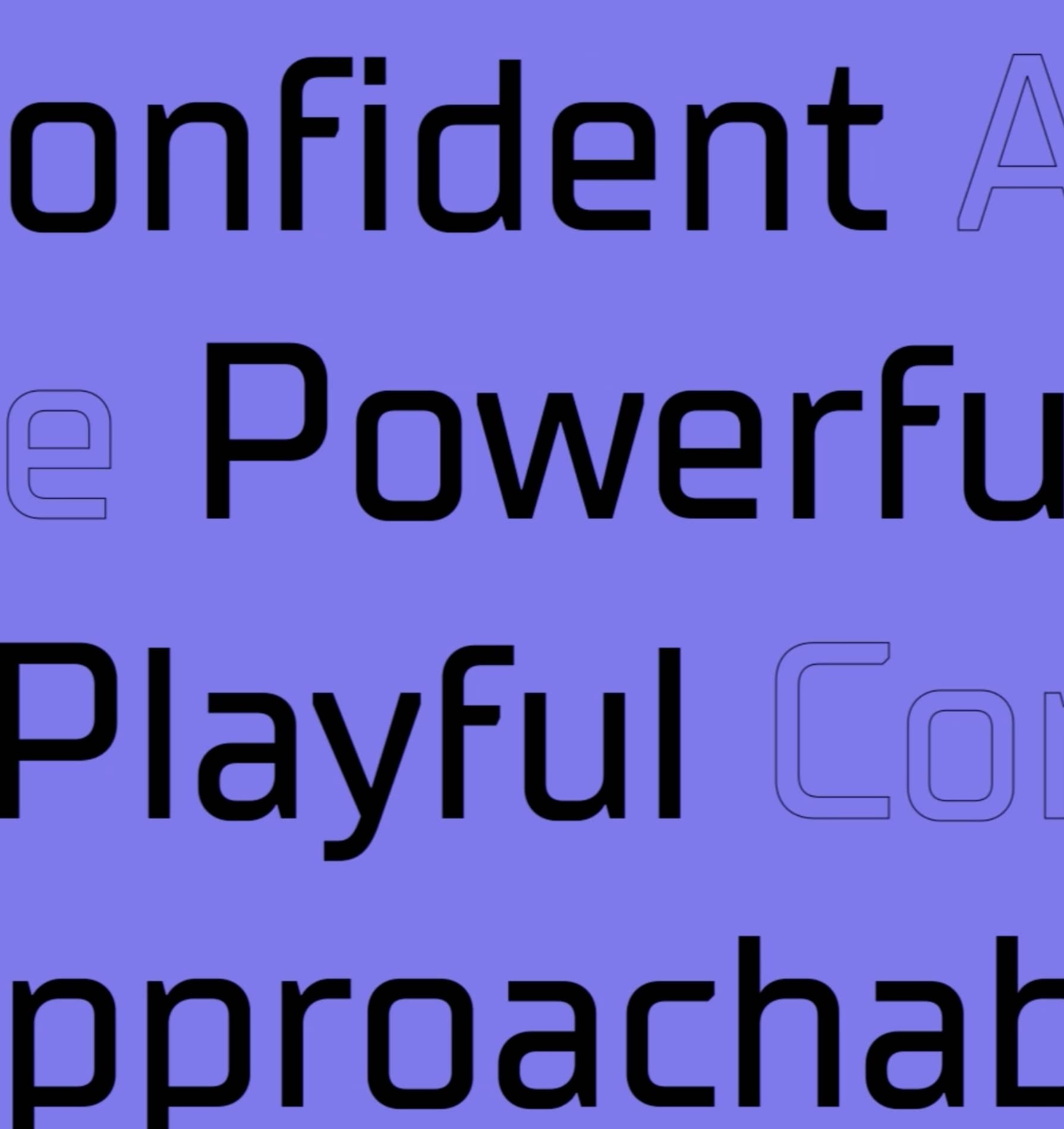
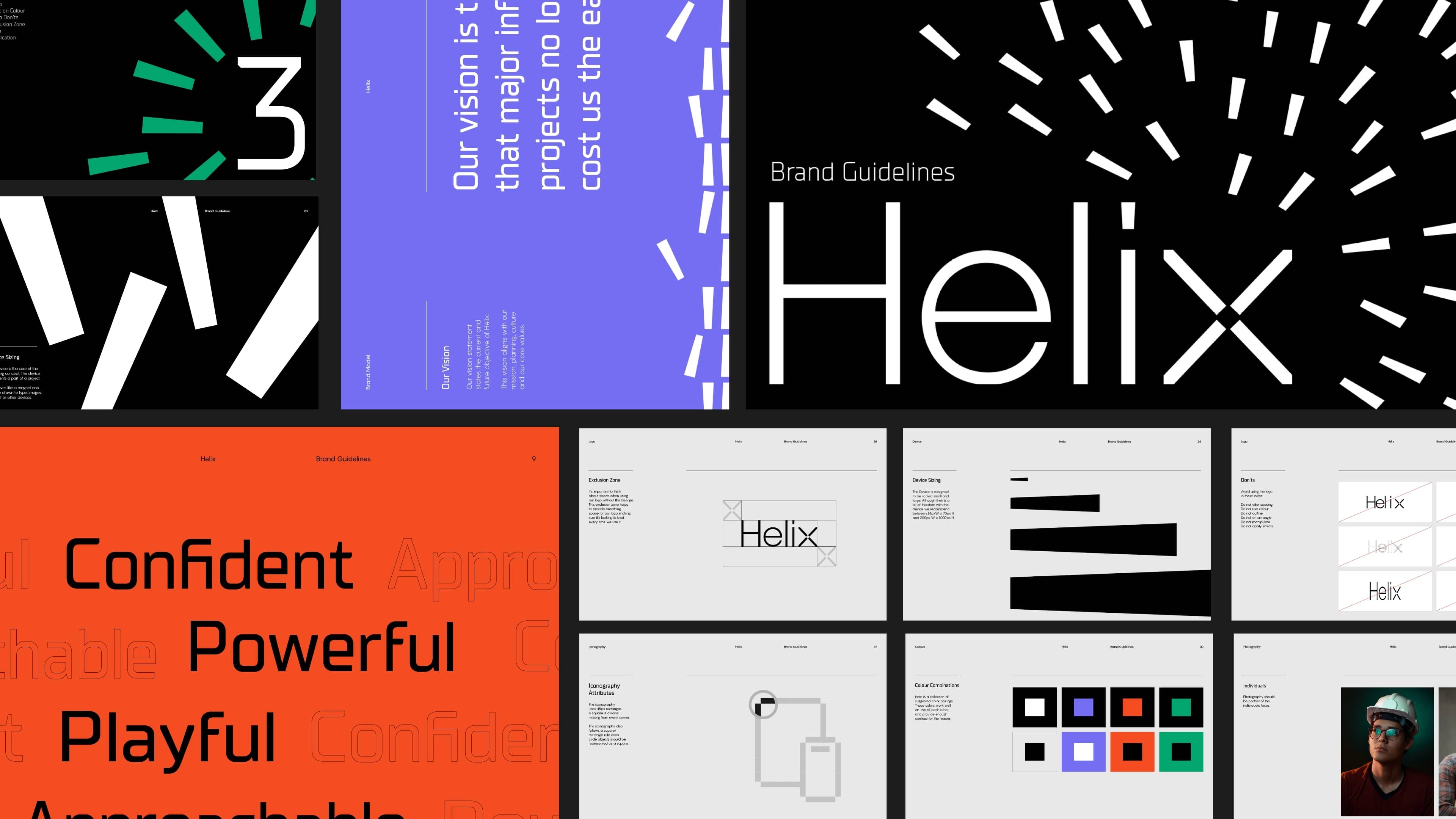
Every aspect of the brand was crafted and considered. We created a bespoke iconography suite, with each icon being uniquely animated. The designs were intentionally built upon straight lines, devoid of any rounded shapes or corners, resulting in a distinctly sharp and sleek brand aesthetic. This design philosophy was consistently applied throughout the brand’s identity and website, evenextending to the typography, with its angular edges.
“It’s exactly what we wanted but couldn’t envisage or describe ourselves, you have done an amazing job! Thank you for all of your support and patience throughout the process and we look forward to our next project together.”
Co-Founders