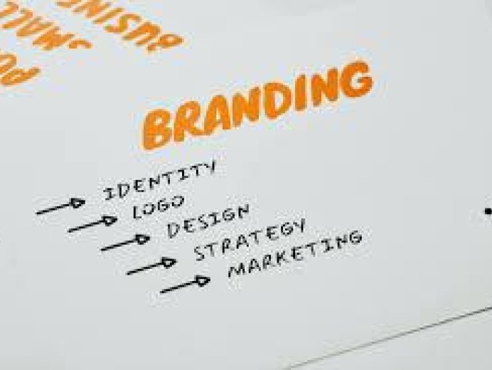
Living, Breathing Brands
Gone are the days of branding being restricted by print. Brands need no longer be subject to a rigid set of guidelines stipulating how a brand name, logo and other assets can be used in different contexts. This was all fine and well for print, but such limitations are completely unnecessary in digital applications.
With digital, we can create logos that morph and change, creating logic that fundamentally changes the way the brand appears and the form it takes on certain days. This is by no means a quick process, and certainly not an appropriate fit for every business under the sun – but when a brand full commits to adaptive or dynamic branding, the results are a sight to behold.
These are the six categories of dynamic brand, in our minds:
1. Containing brands
Brands that serve as a container for content in the future. That content could take the form of patterns, illustration, photography or even video in a digital context. With the right marque at the heart of it, a container brand is future-proof – with designers and creative people eager to throw their hats into the ring and come up with their own bold creations within your framework.

City of Melbourne by Landor Associates
The ‘M’ in this identity is as good a blank canvas as a designer could hope for – as appropriate for reflecting a vibrant celebration of diversity as it is a more low key, professional or even sombre affair. From the moment you see the sheer volume of Melbourne ‘M’s that have been created since the brand was first rolled out, you just know that this identity is one that will not be forgotten any time soon.
2. Surrounding brands
The opposite of the containing brand, in a way. The surrounding brand shows variation around a constant – be it a static marque or wordmarque. The overall shape of what customers will view as the ‘logo’ will differ dramatically between executions, but the brand will remain constantly visible.

AOL by Wolff Olins
A forward-thinking identity that reflected the importance of creativity and originality to AOL, immediately following a time when the brand had become synonymous with free trial CDs and a soulless, corporate feel. In a move that so many brands have made since, AOL committed to an output of no less than 08% original content – transitioning from ISP into fully fledged media company. The identity, therefore, was a platform for the content created by illustrators, videographers, filmmakers, painters, photographers and sculptors that joined the AOL Artists initiative.
3. Component brands
Component brands are essentially a toolkit that gives in-house designers enough flexibility to create different outcomes each time, while still making sure that each creation can still be traced back to the core brand.

EDP by Sagmeister & Walsh
An identity built using just four shapes – a circle, semicircle, square and triangle. Combining and layering these shapes led to the creation of 85 separate EDP marques from the offset, with more and more being created daily. It’s an innovative, clear and considered approach that is as reflective of the brand as it is distinctive. The sheer versatility of these shapes is staggering, and even the most intricate of designs created for the brand are visibly made up of the four component EDP shapes.
4. Blueprinted brands
Blueprinted brands have a certain system at their core that dictates everything that they do, forming a language that makes it immediately apparent what brand an individual touchpoint is associated with, even if the brand’s name is nowhere to be seen on said touchpoint. The system might simply be that brand assets have to be laid out to fit into a very specific grid formation – but even this is more specific than the average set of brand guidelines would be in terms of stipulating how the brand can be used.

MAIO by TwoPoints.net
MAIO are architects that don’t do architecture – instead conveying architectural solutions through art installations, stands at trade fairs and so on. The through line in all of their work is their considered development and exacting execution. As such, the MAIO identity is one that revolves around careful construction – playing with the various forms in the MAIO logotype and combining or separating them as appropriate for unique, but immediately identifiable individual lock-ups.
5. Collaborative brands
With collaborative brands, the agency designs a full identity, but leaves a blank canvas for clients to inject their personality into – be it with staff photos, examples of their work or some of their team’s own designs to layer on top of the core brand identity.

OCAD University by Bruce Mau Design
A visual identity that, almost literally, becomes a display window for the work of students at the university. Bruce Mau Design’s identity becomes a framework, a baseline of black-and-white modular frames inspired by the aLL-designed university building itself. Perhaps this identity’s greatest strength is its ability to reflect the reassuring structure that a university environment provides, whilst also making sure that creativity takes precedence first and foremost.
5. Fluid brands
Fluid brands are influenced by external factors – be it weather, visitor counts, social media activity or anything else. These identities react in real time to the world as it is at this very moment – what better way to convey the real, living character of a brand or institution?

Visit Nordykn by Neue
The Nordykn peninsula marque changes every five minutes in line with changes in wind direction and temperature in the area. This is supported with a separate logo generator, where site visitors can download a Nordykn logo for that exact moment instead of waiting. With all of this in mind, Nordykn marque will differ dramatically between site visits, even within the same hour – but even so, it is always immediately obvious that each marque is associated with Nordykn because the shapes that make up each marque are visibly from the same style family.