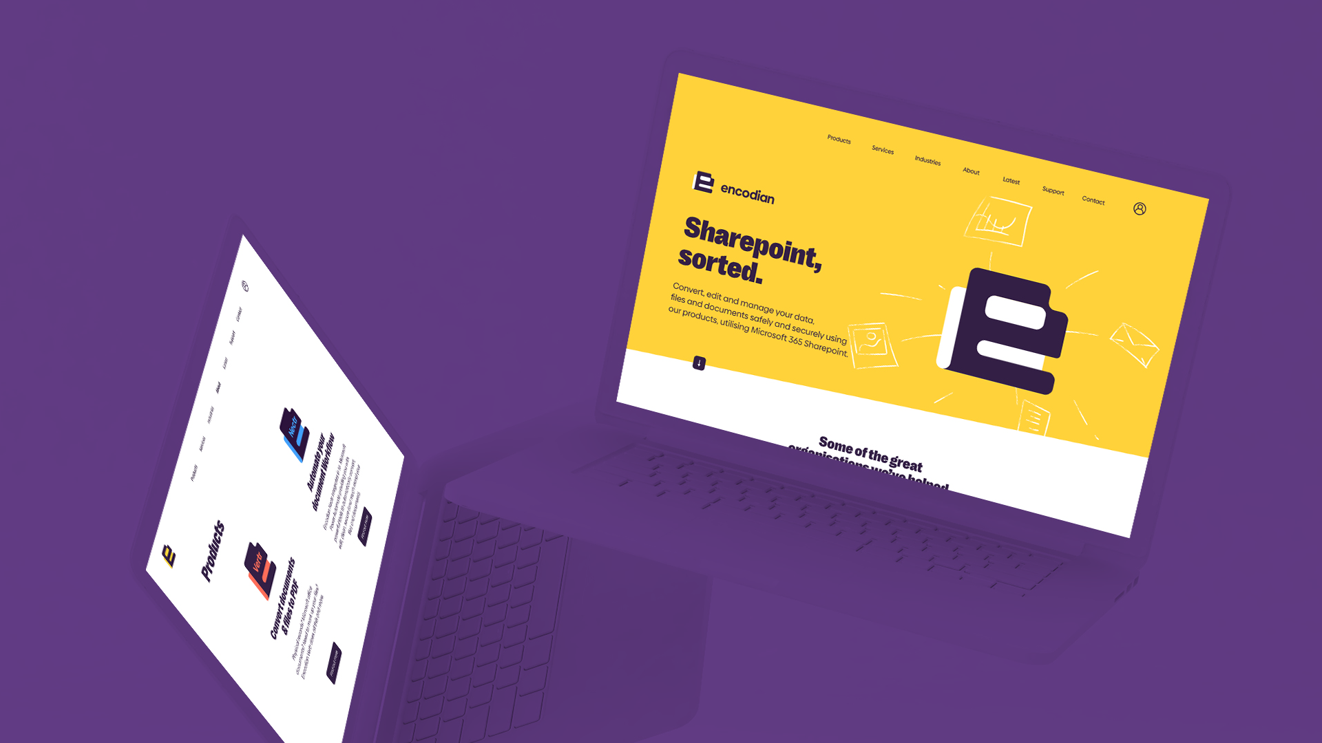
A brand that challenges the norms of Sharepoint? Sorted.
More and more organisations are increasingly understanding the benefit of data automation. Industries such as healthcare and government are using Microsoft Sharepoint and the Encodian family of products to house masses of data, enabling it to be stored, converted, edited and shared automatically.

The Challenge
After our immersion sessions with the Encodian team, it became clear that they wanted to challenge the norms of the industry. With that in mind we set about exploring directions that would achieve this, capitalising on what others have failed to do and transforming the way Encodian looked and how they're perceived.
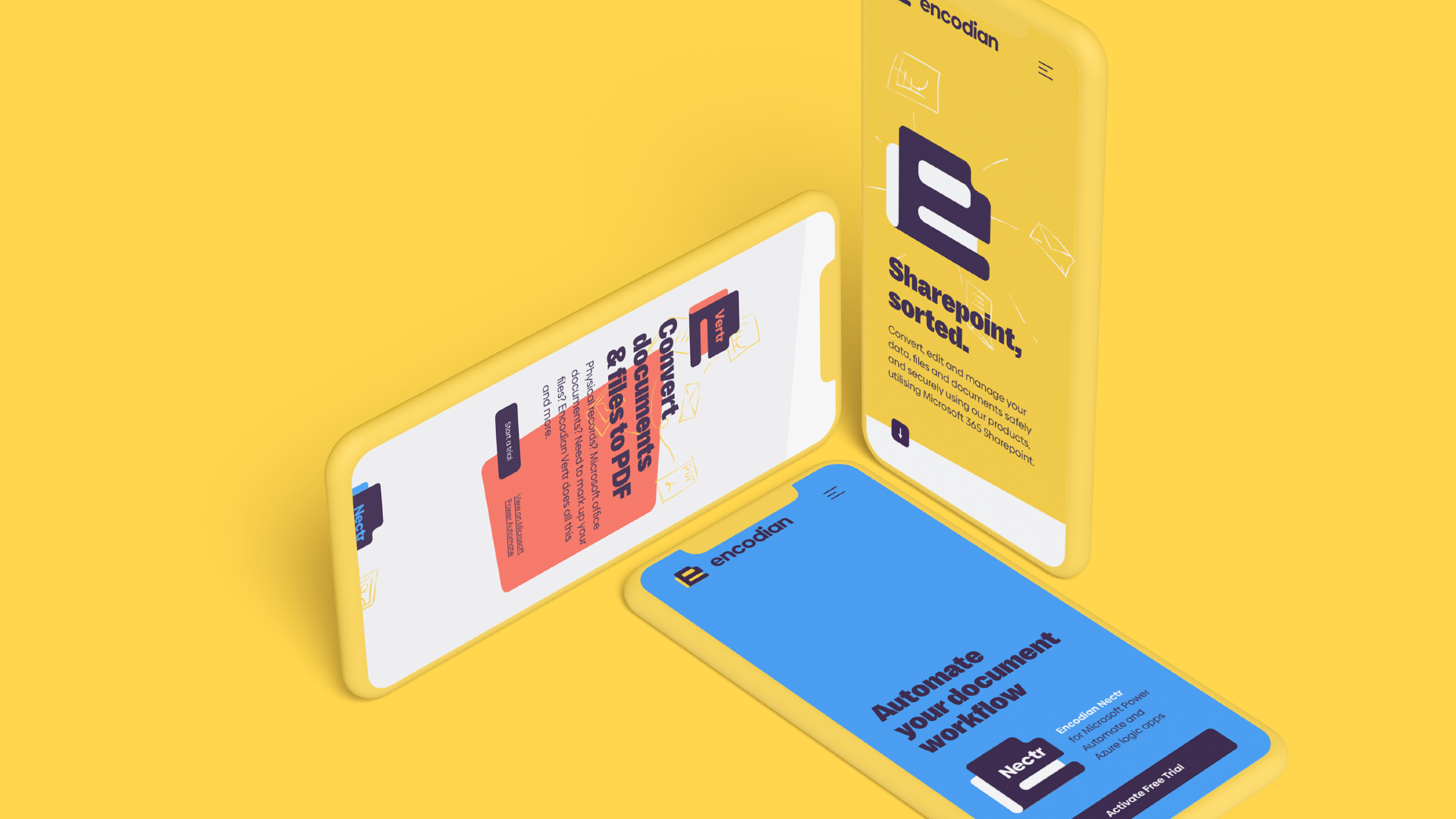
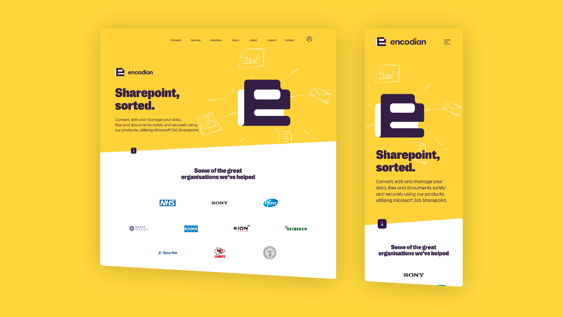
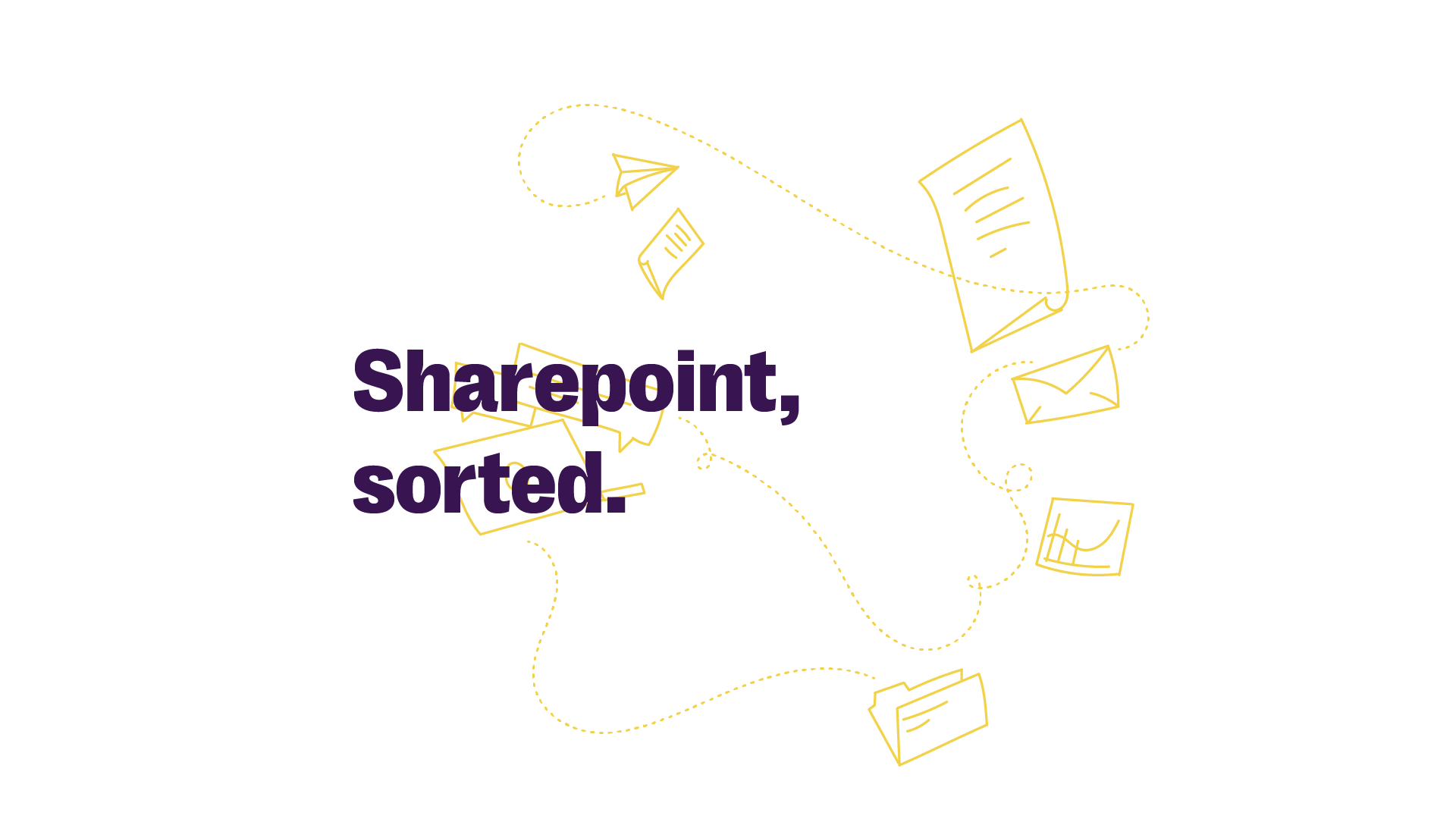
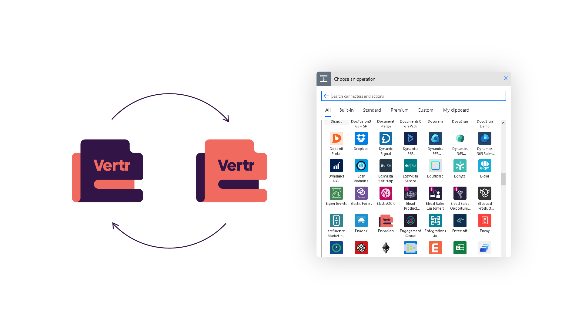
With a sea of brands and products awash with the colour blue, we went for something different – a warm punchy yellow. Colour is a key differentiator in their world, where a lot of the time a brand or product is only seen through a small icon within the Microsoft eco-system. The ease of use of their products is reflected through the confident and to-the-point style messaging. Simply reading "Sharepoint, sorted."
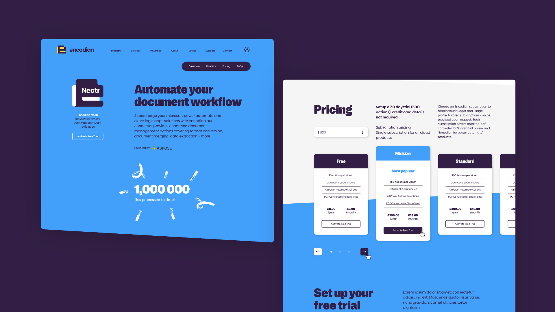
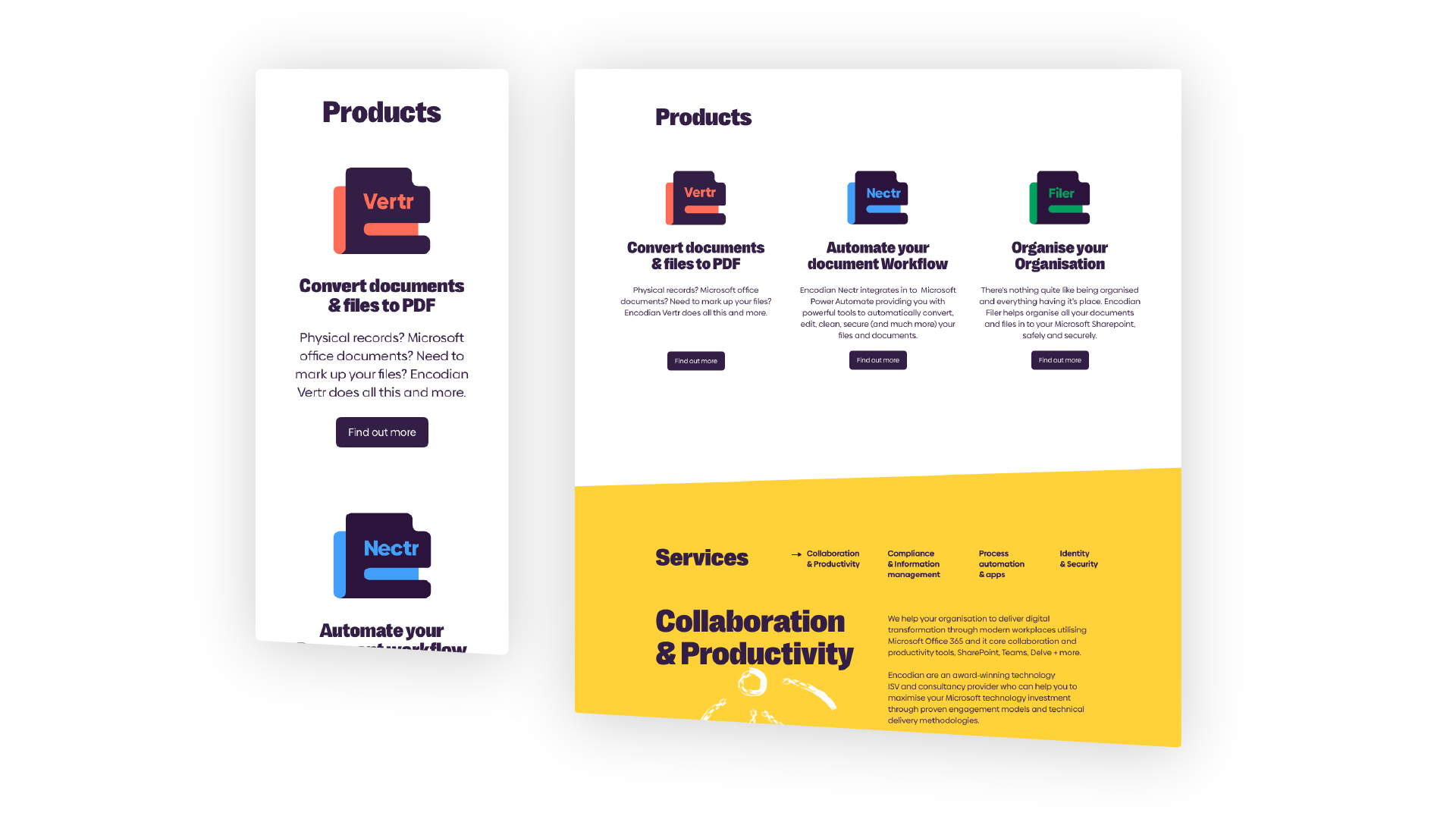
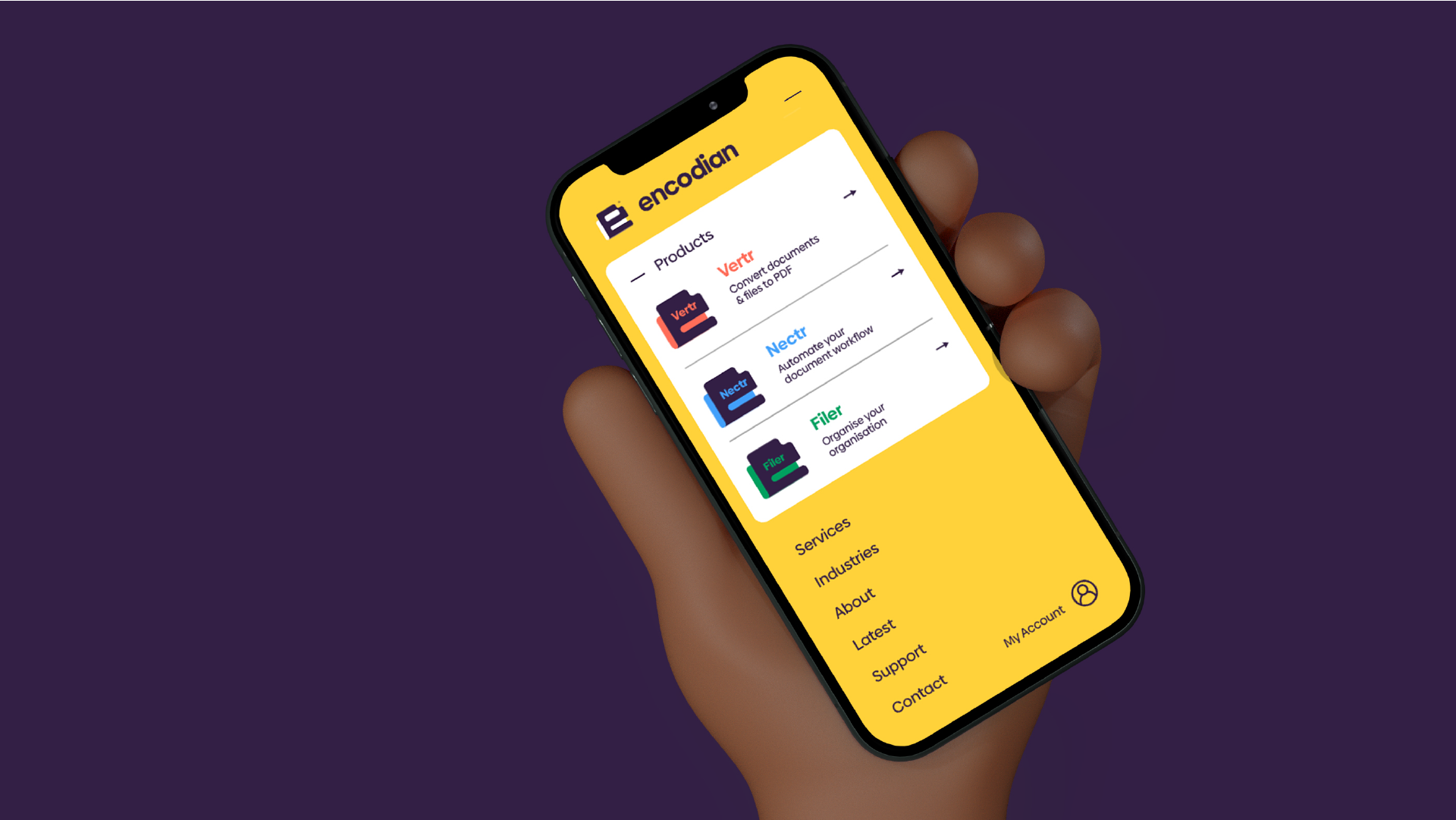
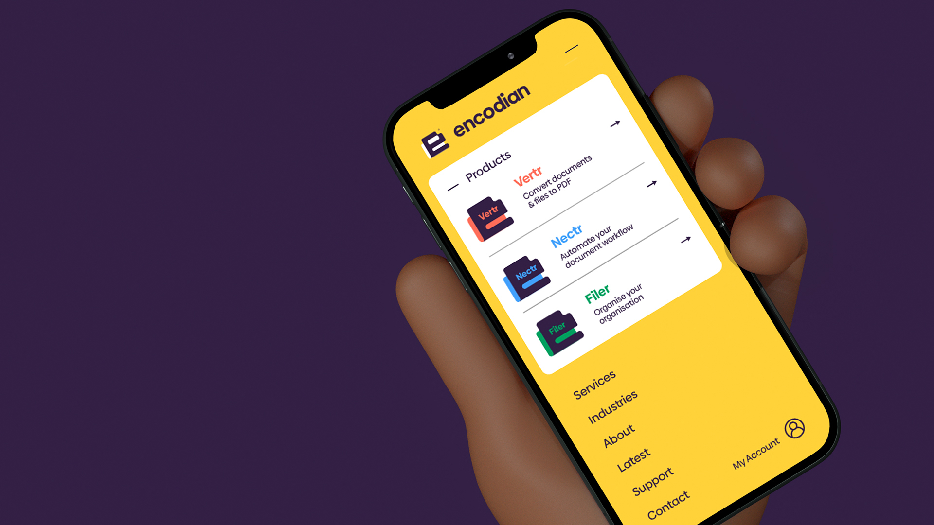
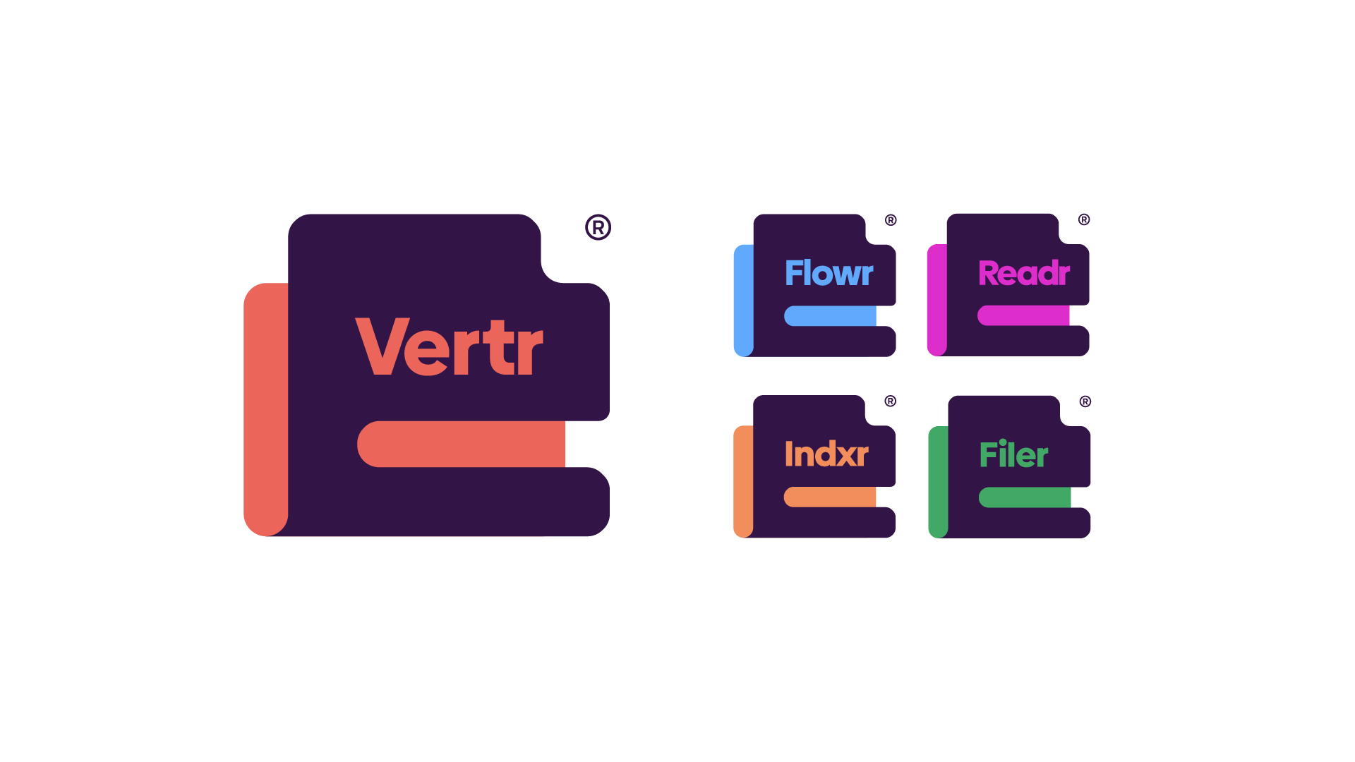
One of the major challenges when developing the brand was how their products should be branded. We discussed and developed various methods of how to structure their products under the brand name (House of brands Vs a Branded house). We opted for a branded house, with product icons borrowing the silhouette from the main logo, introducing colour for each product and then developing names for each of them. They needed to be snappy, memorable and short enough to fit in the space of the window, shaped as the 'e'.
1 / 3
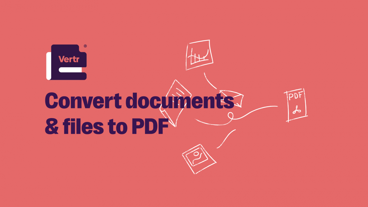
We developed a youthful illustration style to bring a lightness to the brand identity that helps symbolise what Encodian and each of their products do.
We then set about applying the brand by designing a new website. This needed to be clear, easy to use and simple to understand, but reflective of their innovative nature - again challenging the way things are usually done in their industry.
