Redefining a market leaders’ approach to wholesale.
We’ve all heard of Carlsberg UK. Even people that don’t drink have heard of Carlsberg. The wholesale side of their business is, unsurprisingly alien to the vast majority of us. However for the uninitiated, Crown Cellars are one of Carlsberg UK’s wholesale brands, alongside Crafted and Tapster's.

The Brief
The Crown Cellars brand was established in 2012 (although Carlsberg UK have been selling wine for over 30 years), and it was time to review where they stood in the market.
It became clear that very few of Crown Cellars’ customers know how broad the brand’s offering was. As far as they were concerned, Crown Cellars were wine merchants – ignoring their expertise in spirits entirely. It was time to create a brand that complemented the Crown Cellars' brand, without being beholden to it – a standalone brand that gave Carlsberg UK a more pronounced specialism in spirits wholesale specifically.
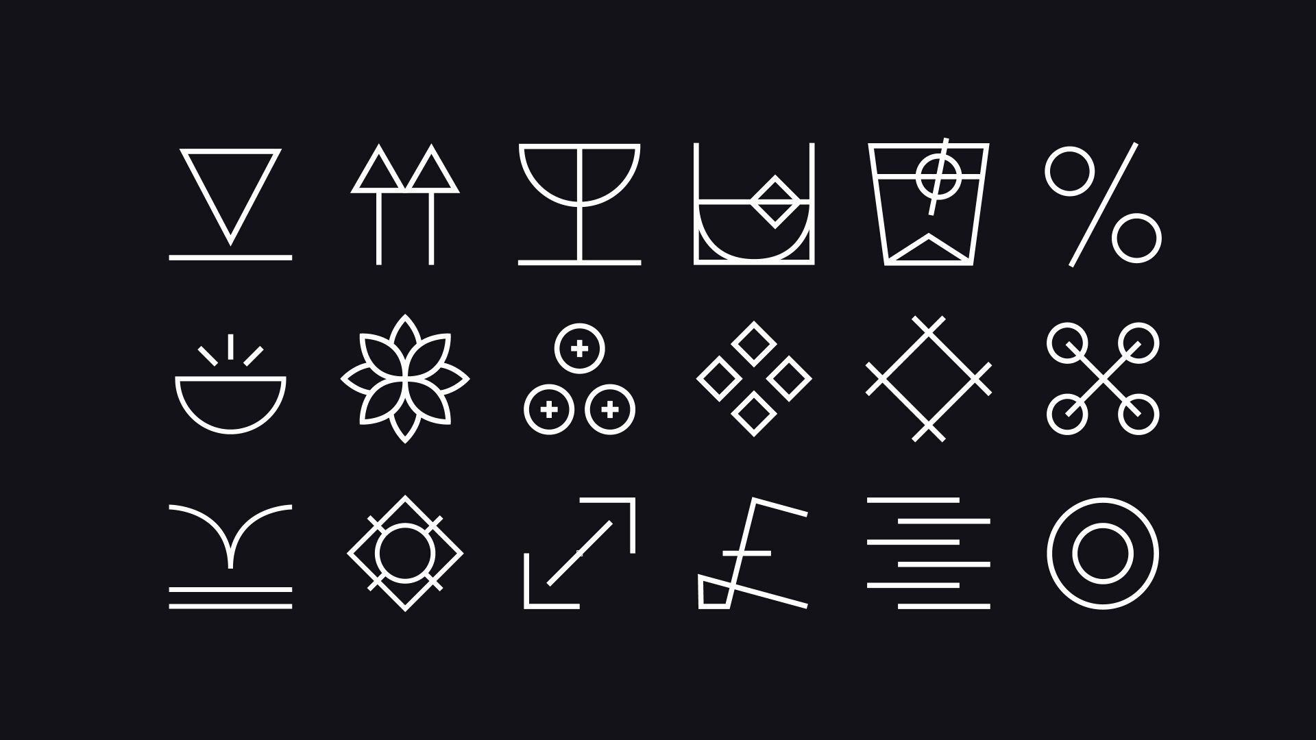

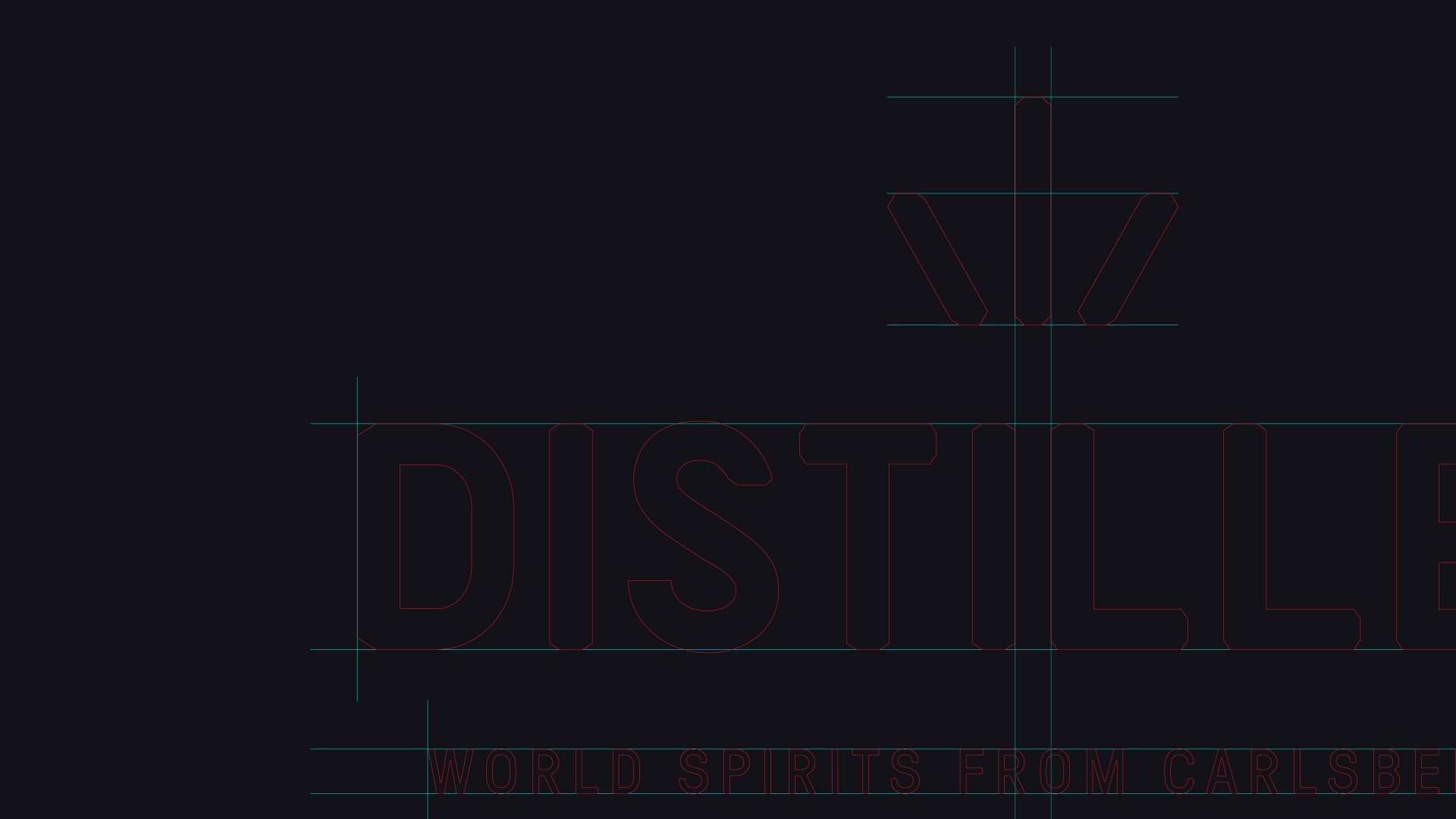
Concept
Our objectives in this project were twofold: Positioning the new brand as a premium spirits wholesaler (with a name to match) and appropriately leveraging the Carlsberg UK brand for a smooth launch.
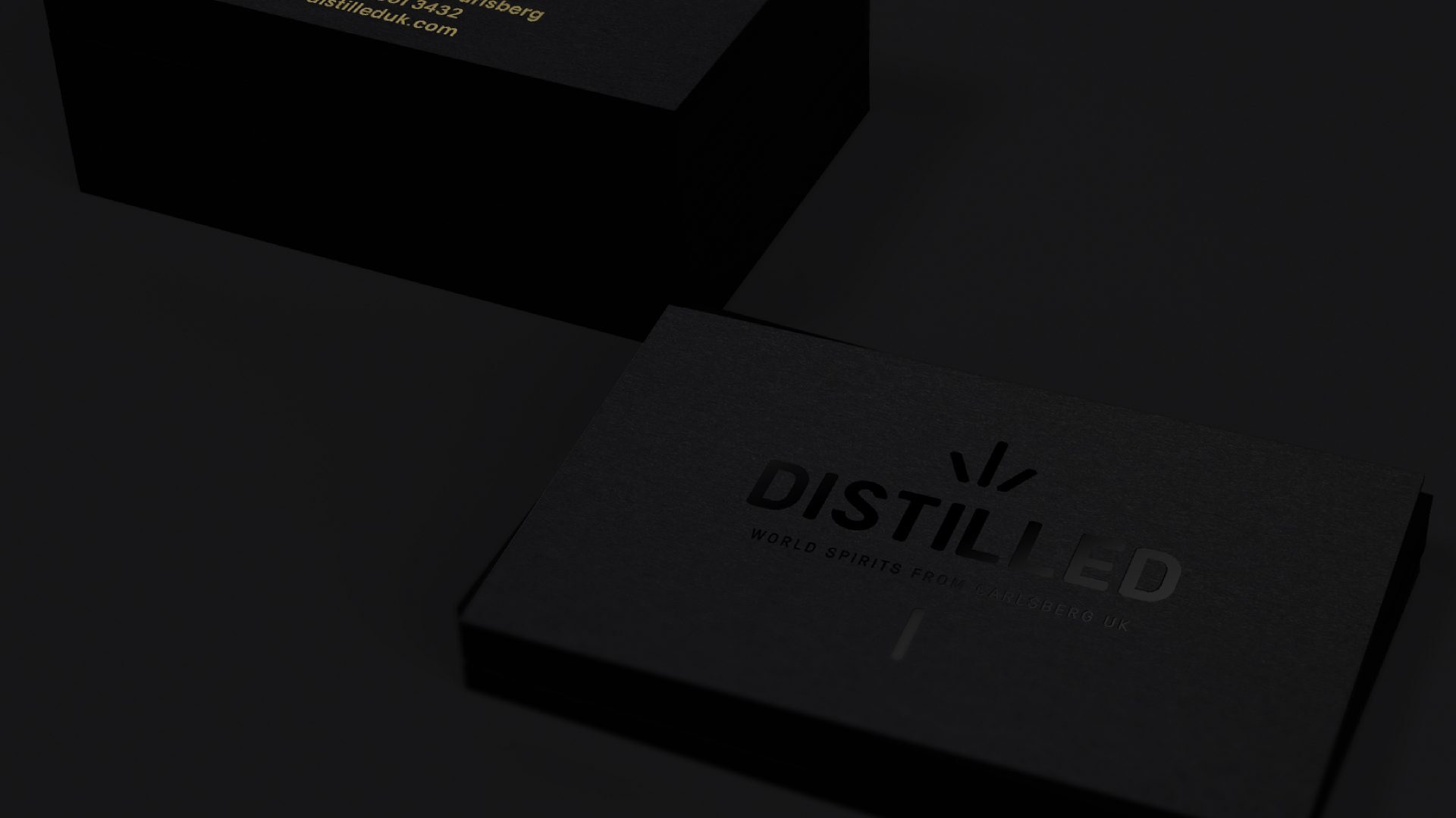
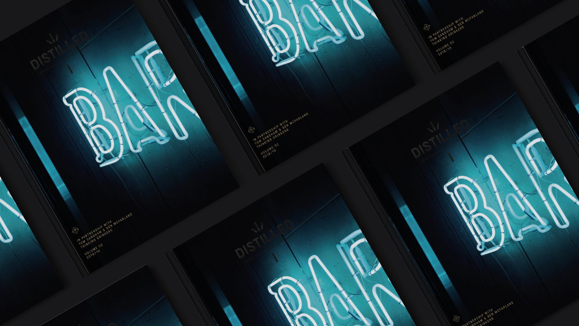
Distilled was the name agreed upon early in the project – a conclusion we both came to independently, one that sat perfectly alongside Crafted, Carlsberg UK’s dedicated craft beer range and accompanying handbook. The identity needed to follow suit with the name, therefore – clean, clear and refined. Communicating the confidence that can only come with the team’s decades of expertise, and the might of Carlsberg UK behind them.
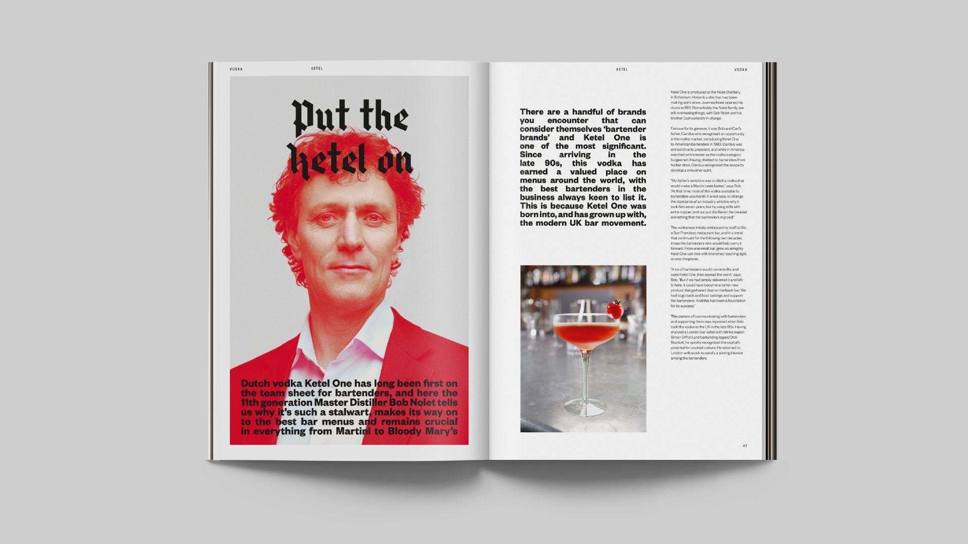
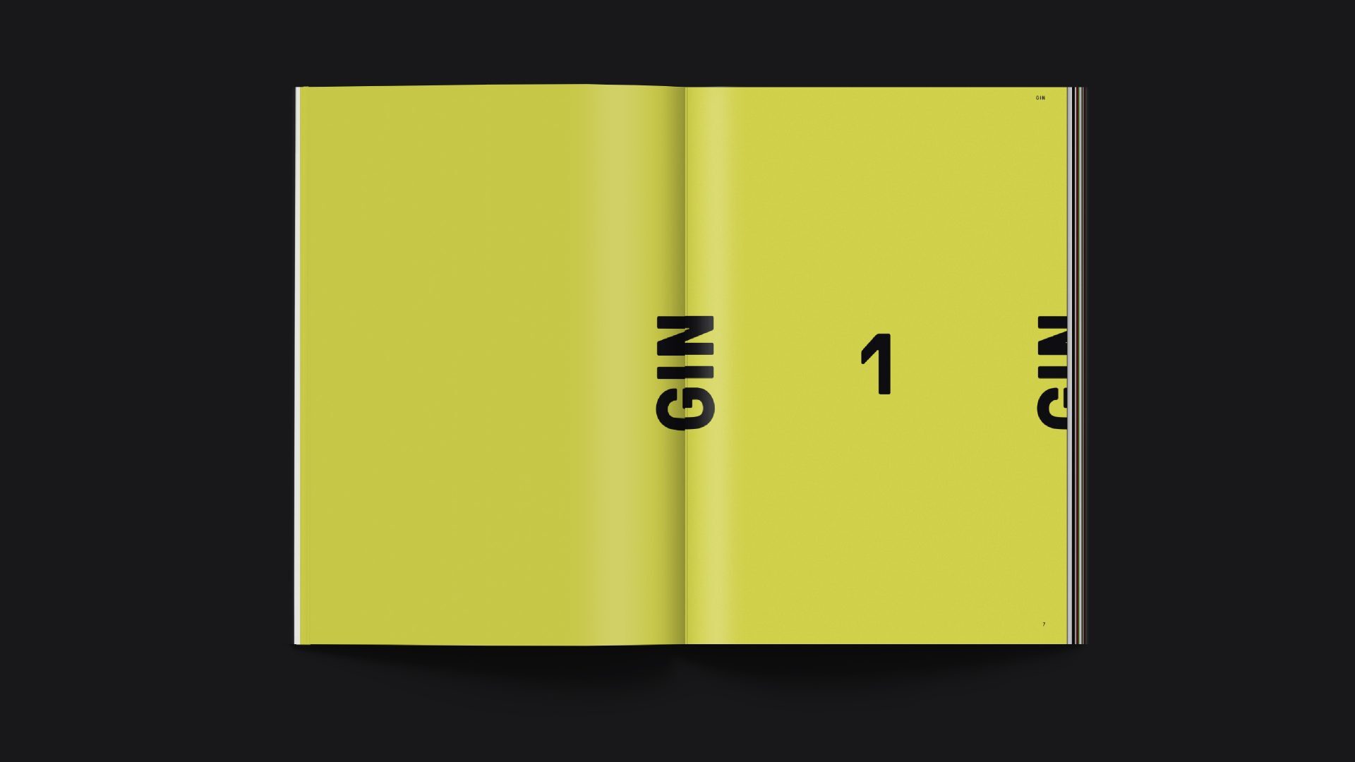
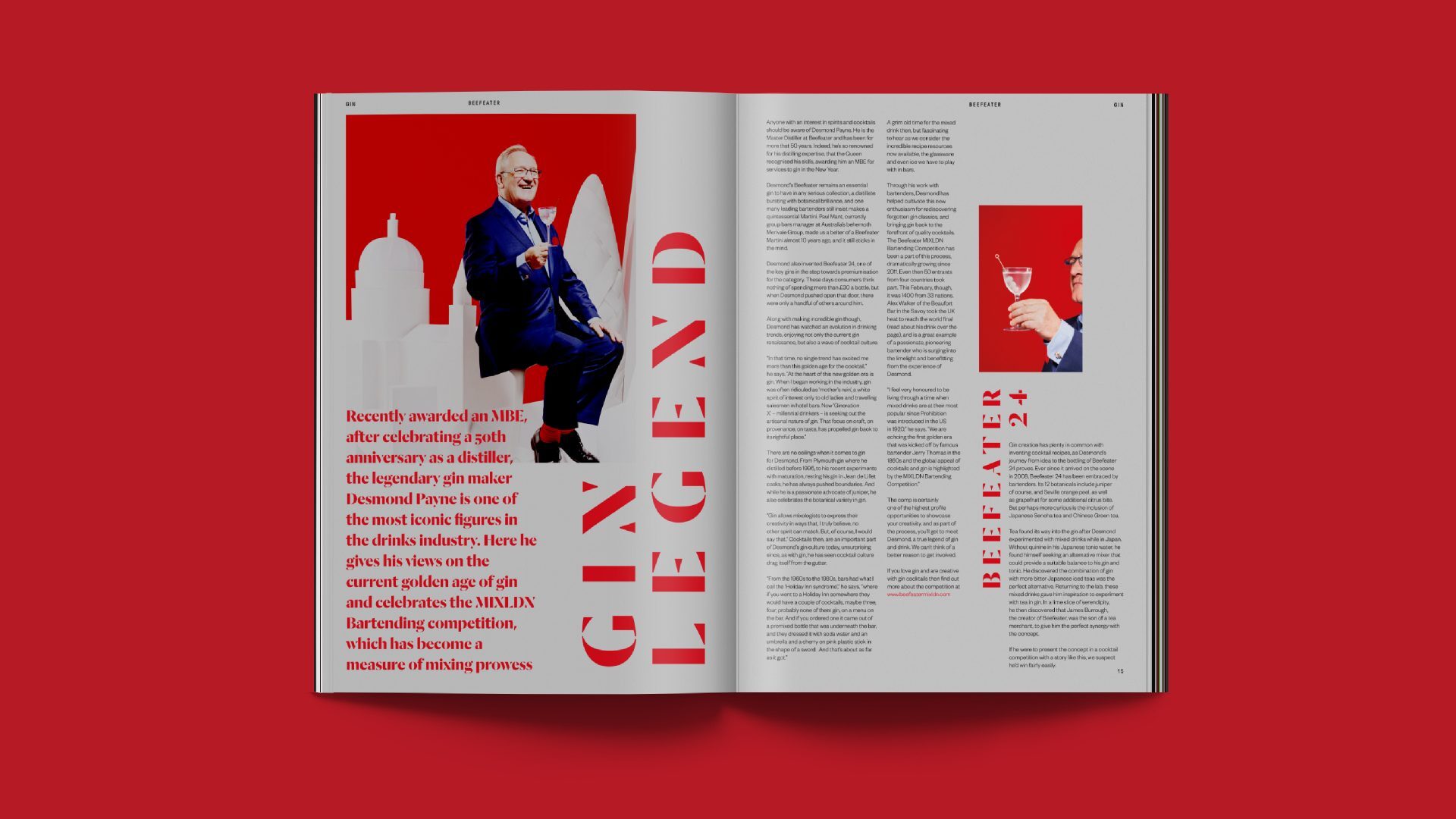
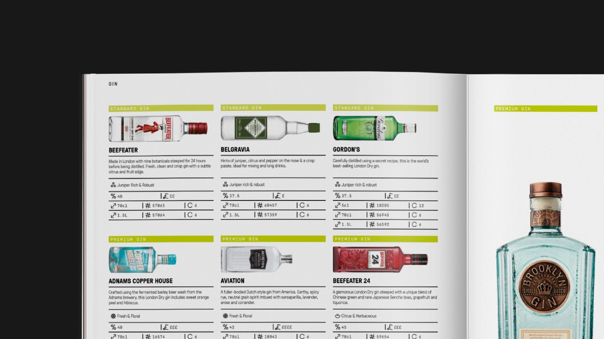
Execution
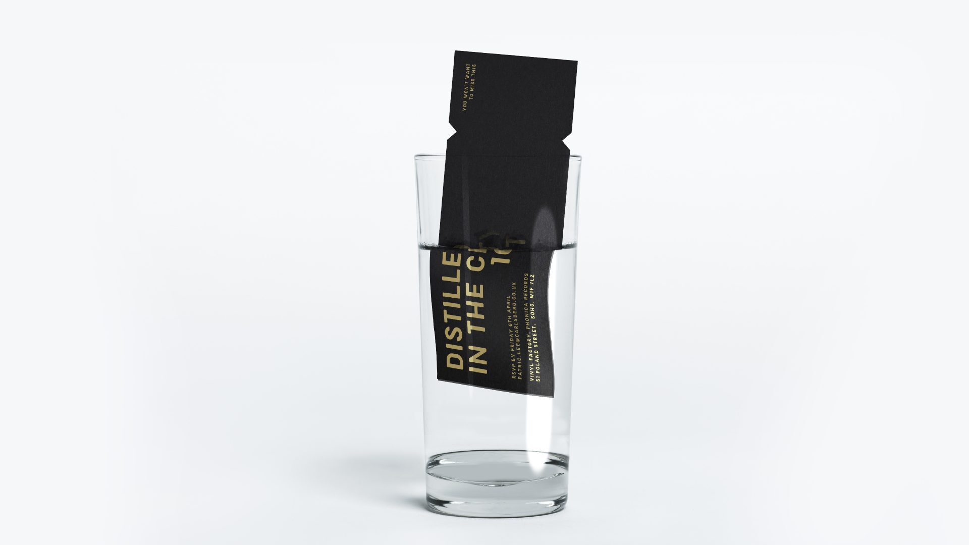
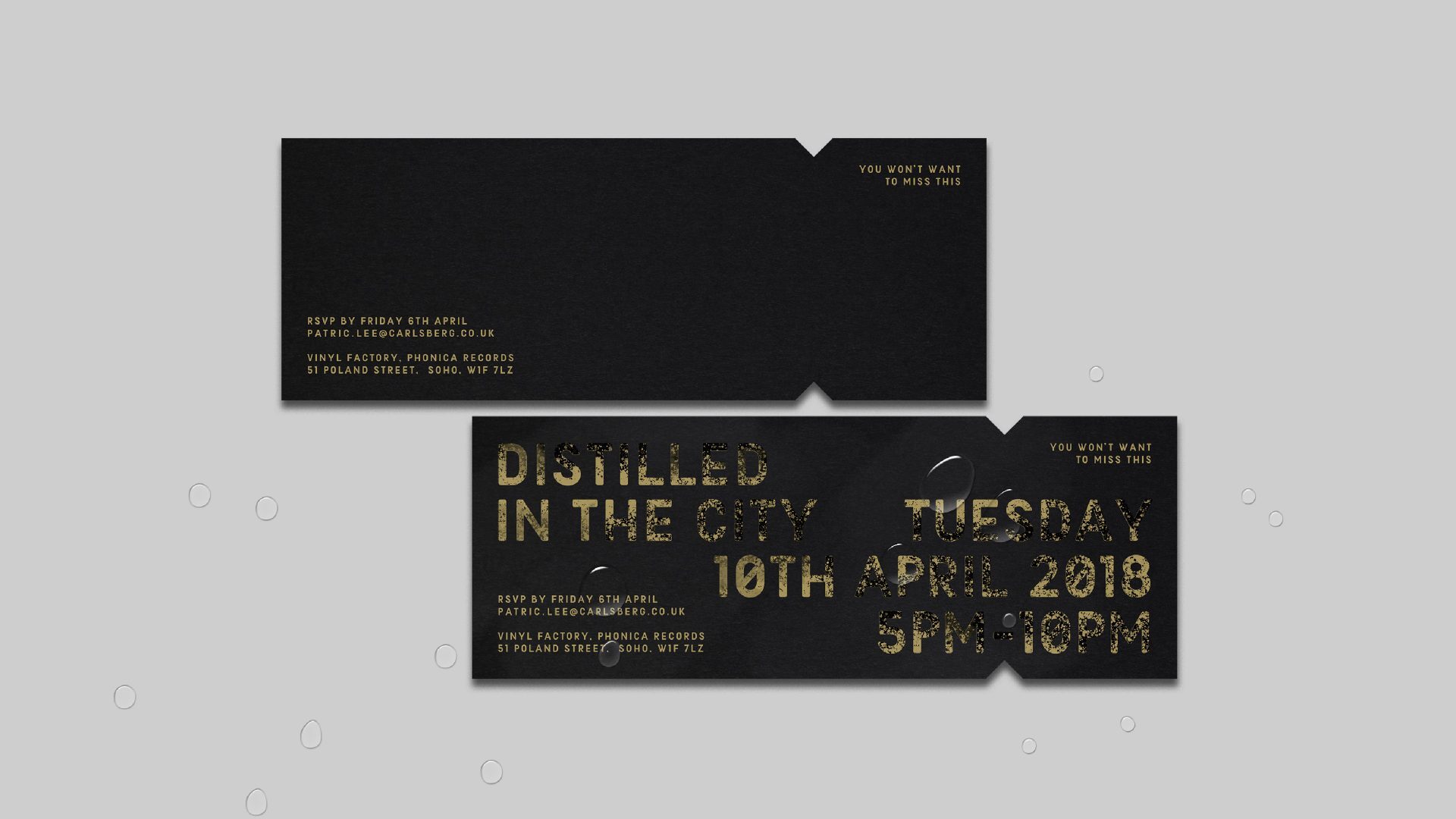
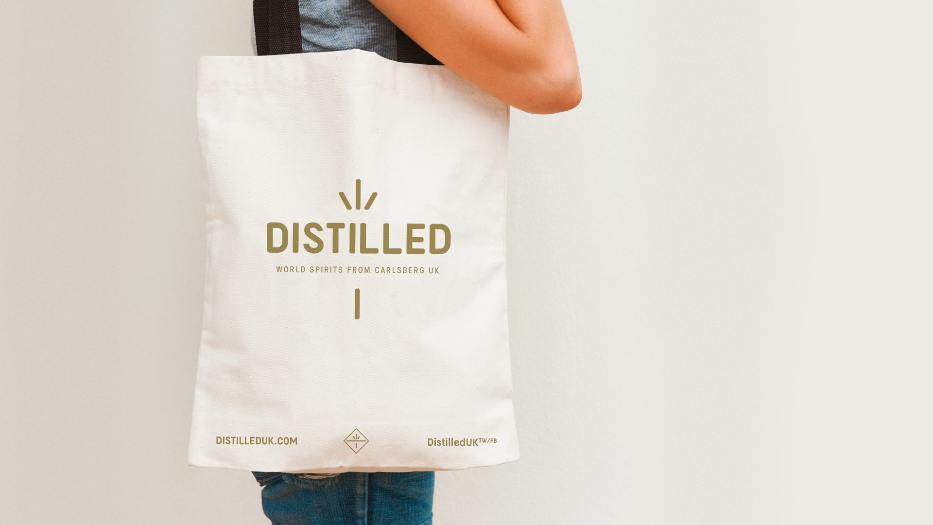
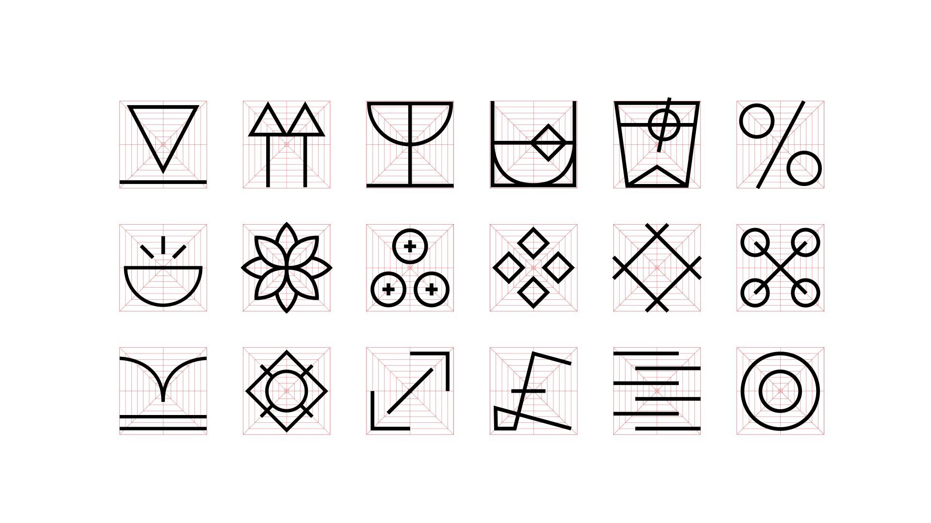
With the brand designed and refined based on exhaustive competitor analysis and regular meetings with key decision makers at Carlsberg UK, the results speak for themselves.
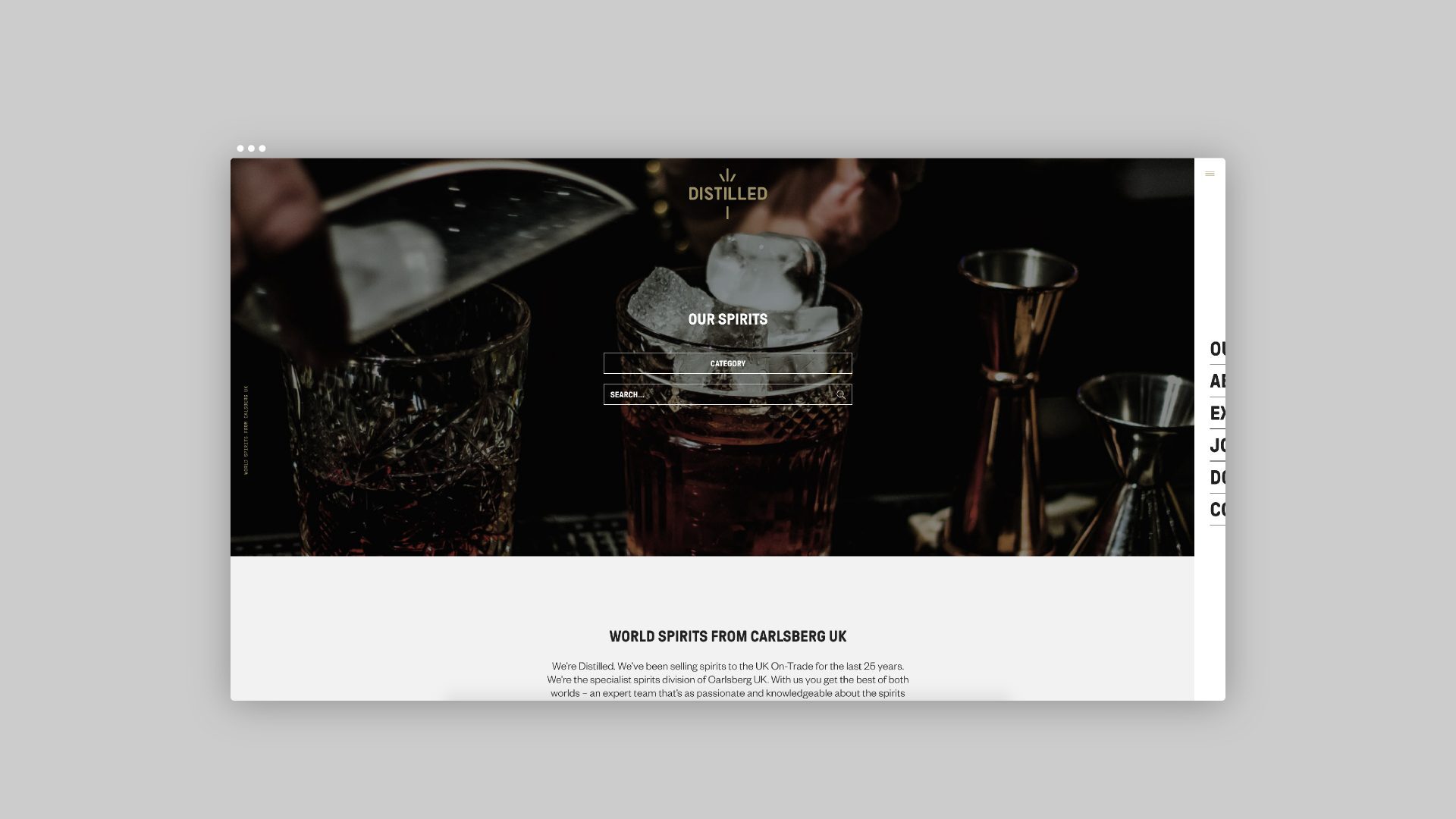
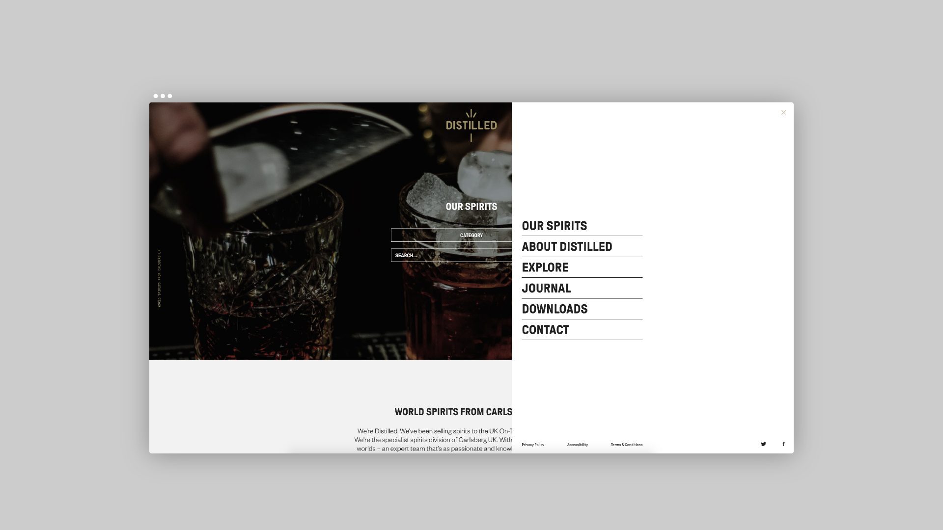
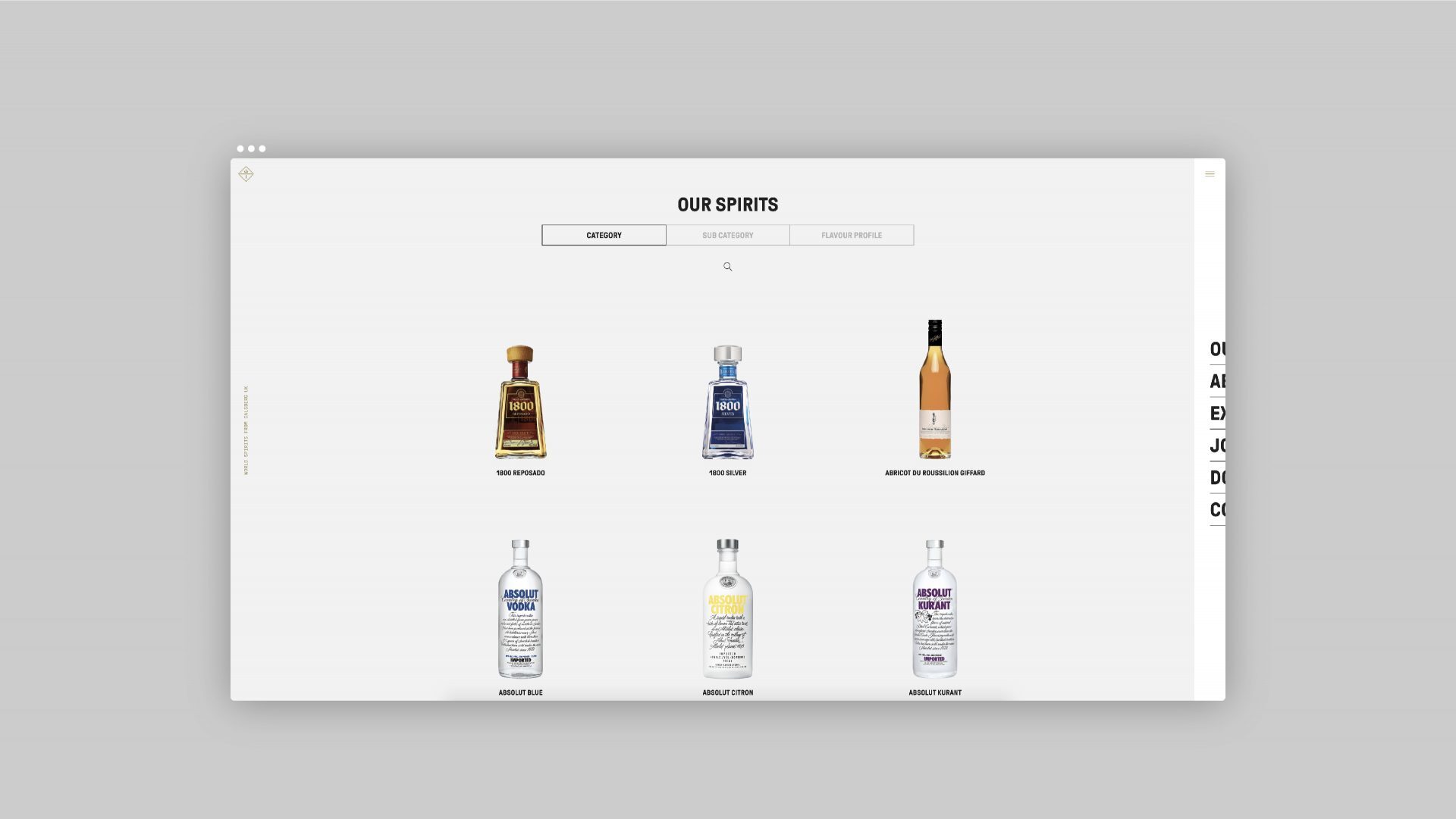
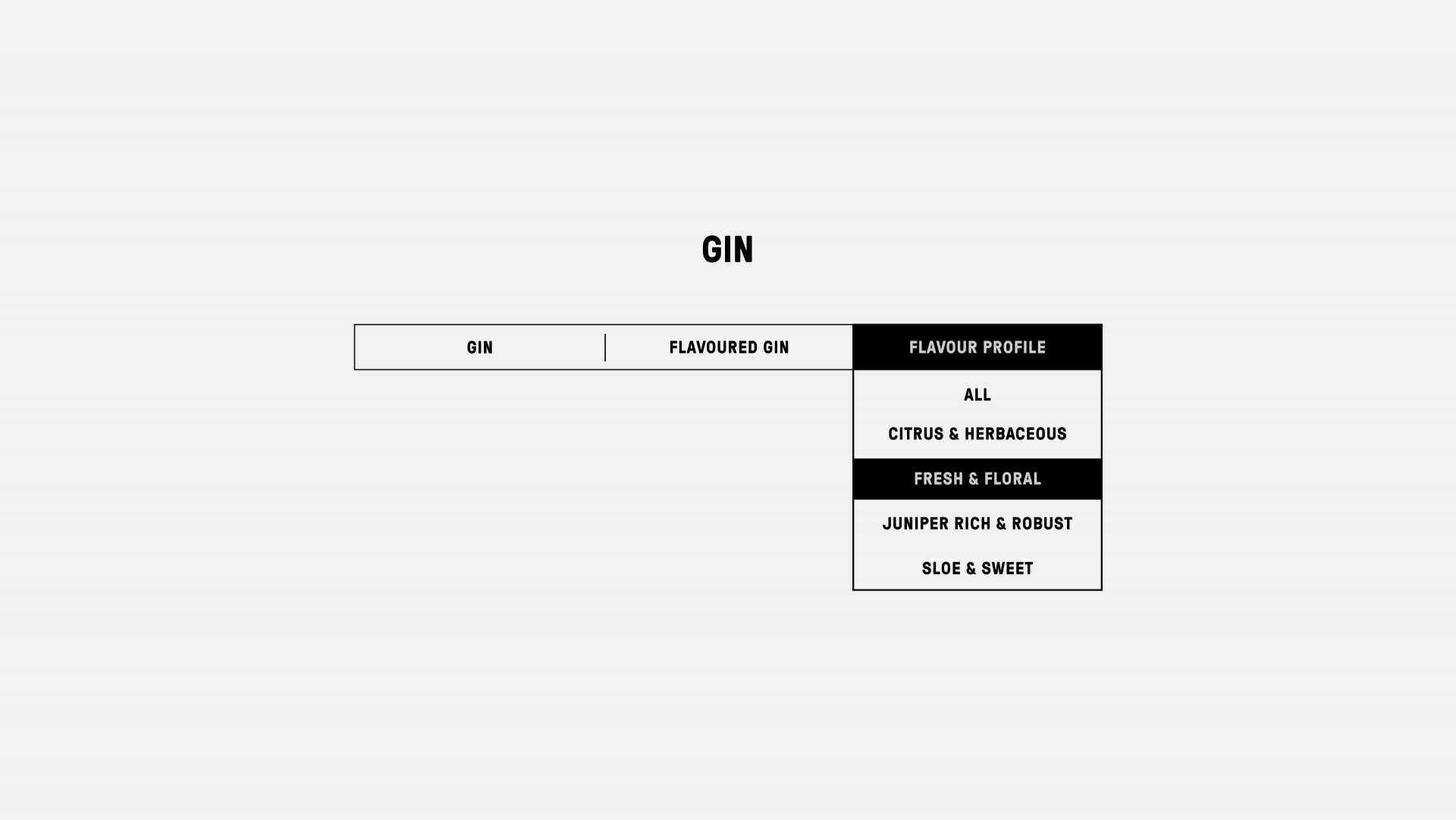
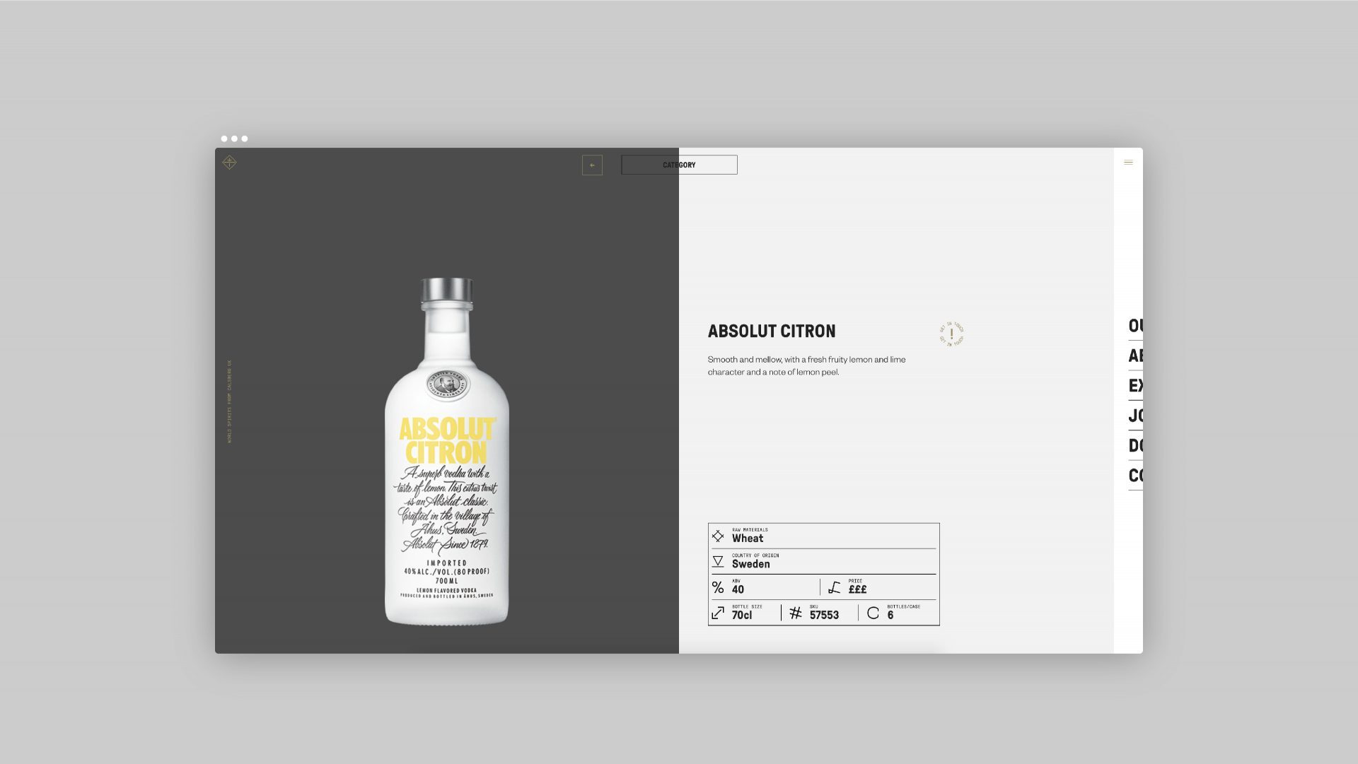
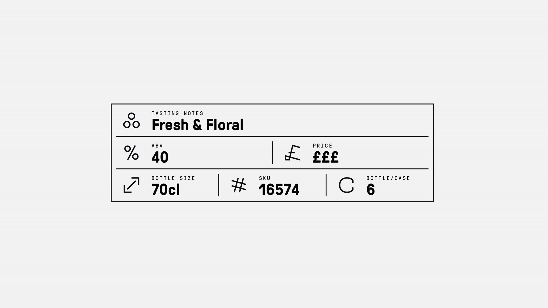
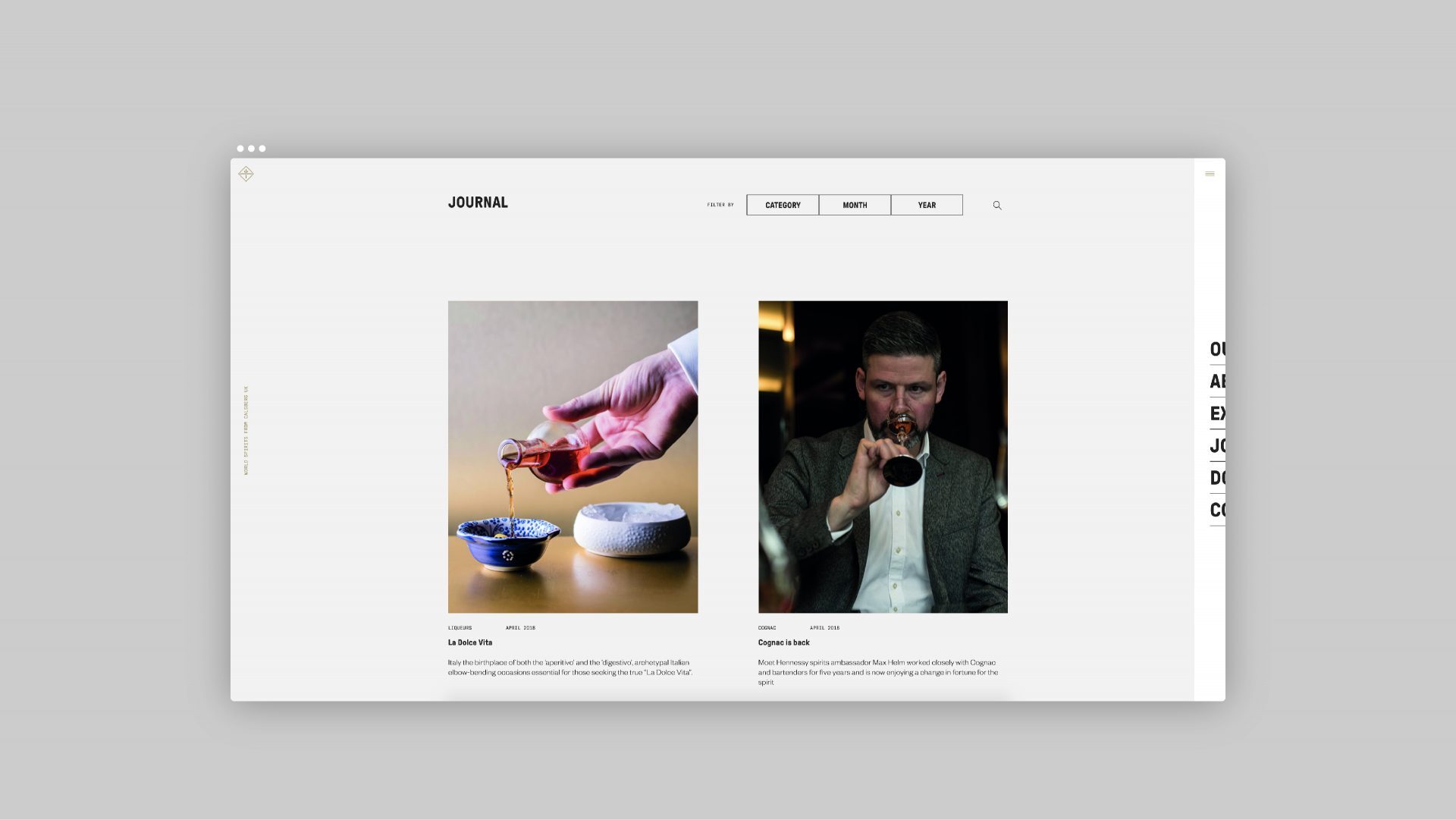
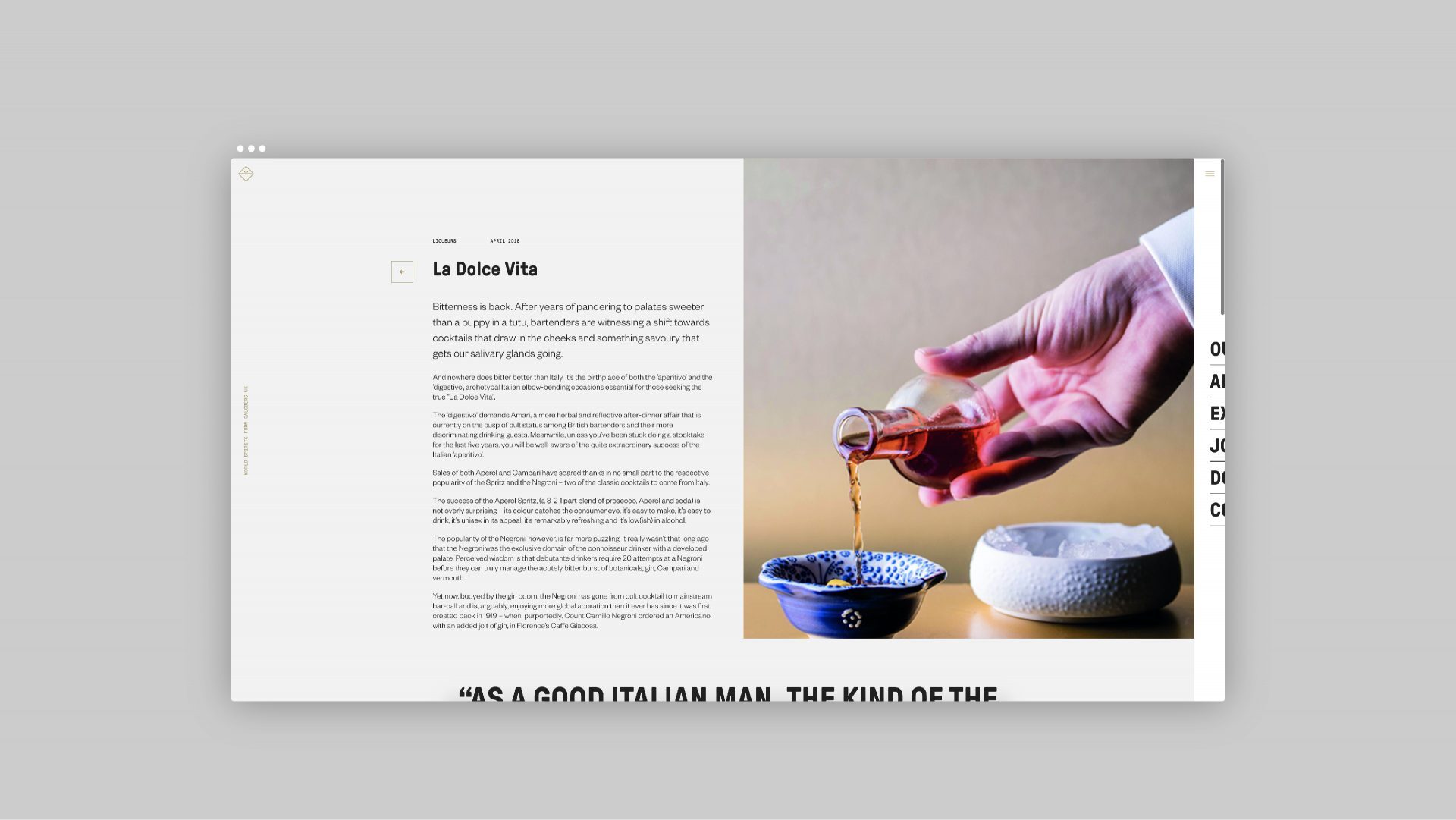
As well as the print pieces, we designed and developed the Distilled website. Creating the digital presence of such a key tentpole in Carlsberg UK’s wholesale operation wasn’t something we took lightly. Looking to the websites of competing wholesalers, we explored outside of the sector for inspiration too. Arriving at a clean design, with sensible use of typography to make the hierarchy of information absolutely clear – even to a technophobic (or at the very least, technohesistant) demographic. Quick product filtering was absolutely essential, giving the Distilled website a noticeable advantage over the physical annual brochure that bar managers will be provided with as a matter of course.
