Putting a spring in the step of Burgess dog food.

The Story
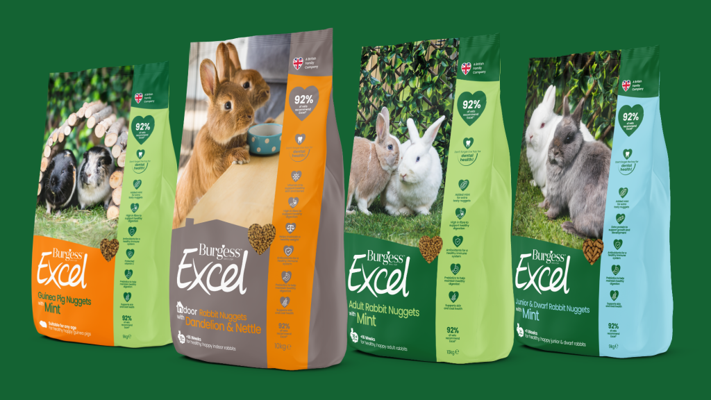
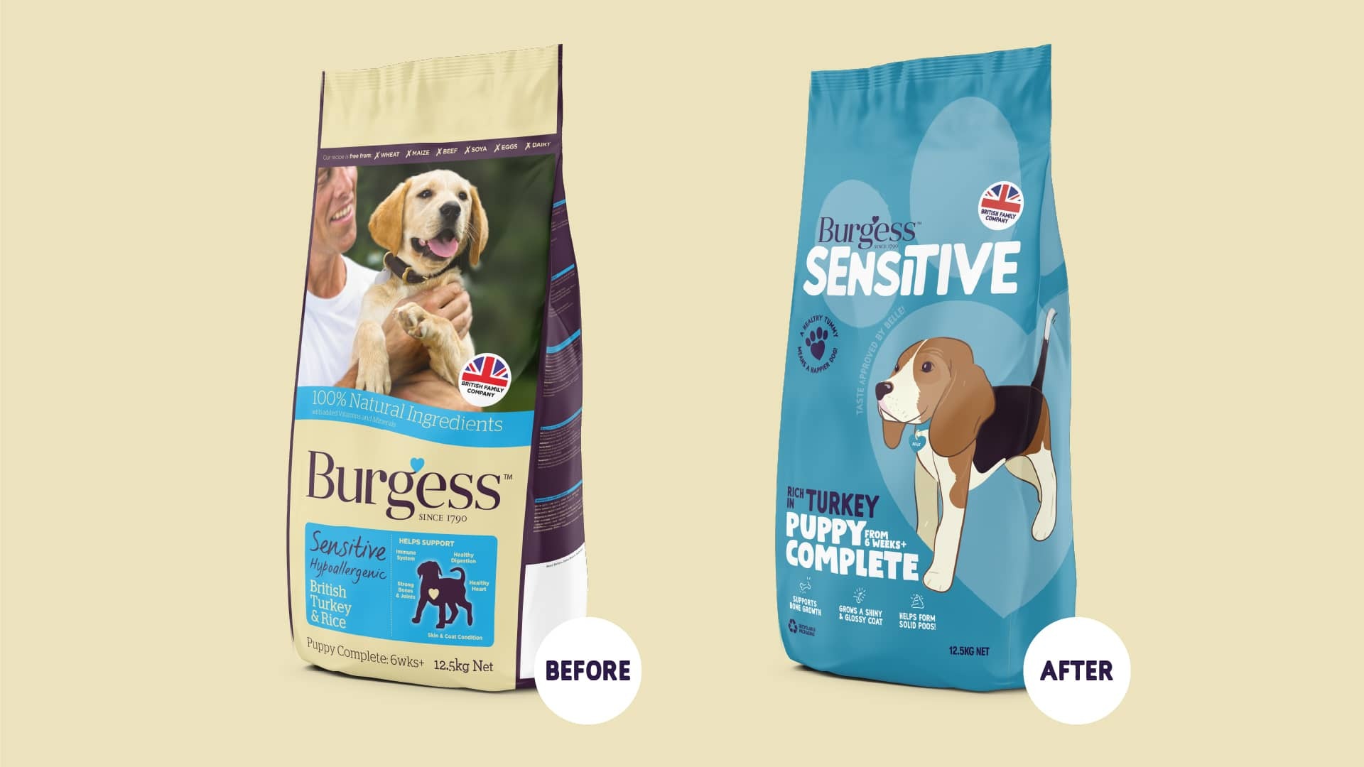
Burgess are a well established and trusted pet food supplier in the UK. One of their existing dog food brands, Sensitive (for dogs with sensitive tummies), needed a rebrand and new packaging, to help them stand out both in-store and online.
The Process
The UK has seen a huge rise in dog ownership, with many owners unsure as to what food to feed their dogs, which will give them everything they need. Insight revealed that current dog owners see their pet as a human (a ‘fur baby’), part of the family and genuinely care about what their pet is consuming.
Within this expanding dog owner market, we identified a growing audience concerned with their pet's health as our primary targets. By analysing category conventions and uncovering opportunities within this rapidly growing sector, we proceeded to develop creative territories, formulate a strategy, and establish a brand model.

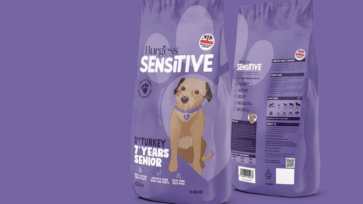
We focussed on creating an identity that could be easily understood and remembered, and would fill the canvas (in our case, the top of a pack) to ensure stand out on listing sites and in-store. Our final word marque gives a friendly feel, with its soft edges and the slight customisation means that the Burgess logo really feels like a part of the product brand, not just a sign-off.
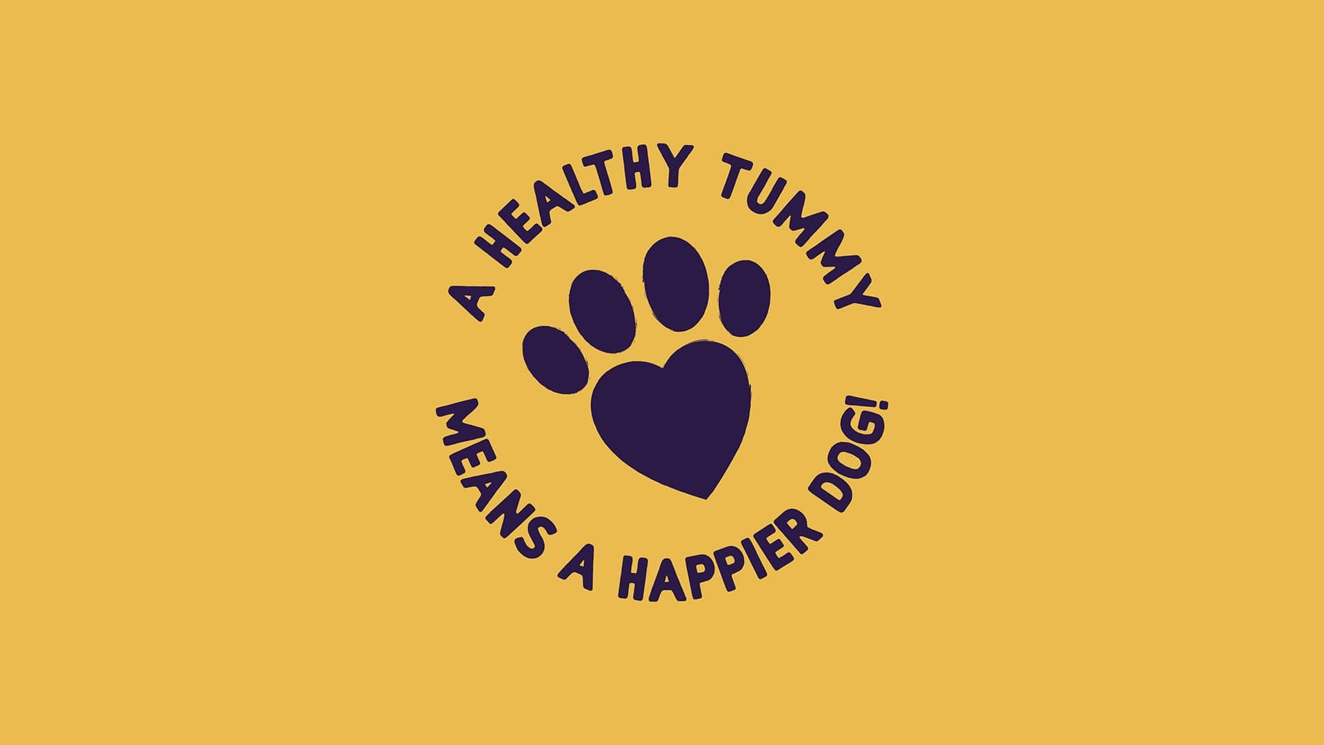
Our brand essence of 'Food that puts a spring in your dogs step' led us to the strapline; 'A Healthy Tummy Means a Happier Dog', addressing the insight that our health conscious dog owner audience really cares about what they are feeding their loved ones. Furthermore, hinting at the fact that if their dogs could talk, they would tell them that they wanted Burgess Sensitive! Our brand roundel features the strapline around a custom paw print/heart graphic, again a light nod to the love our owners have for their dogs, and how they show it by feeding them Sensitive food.
Execution
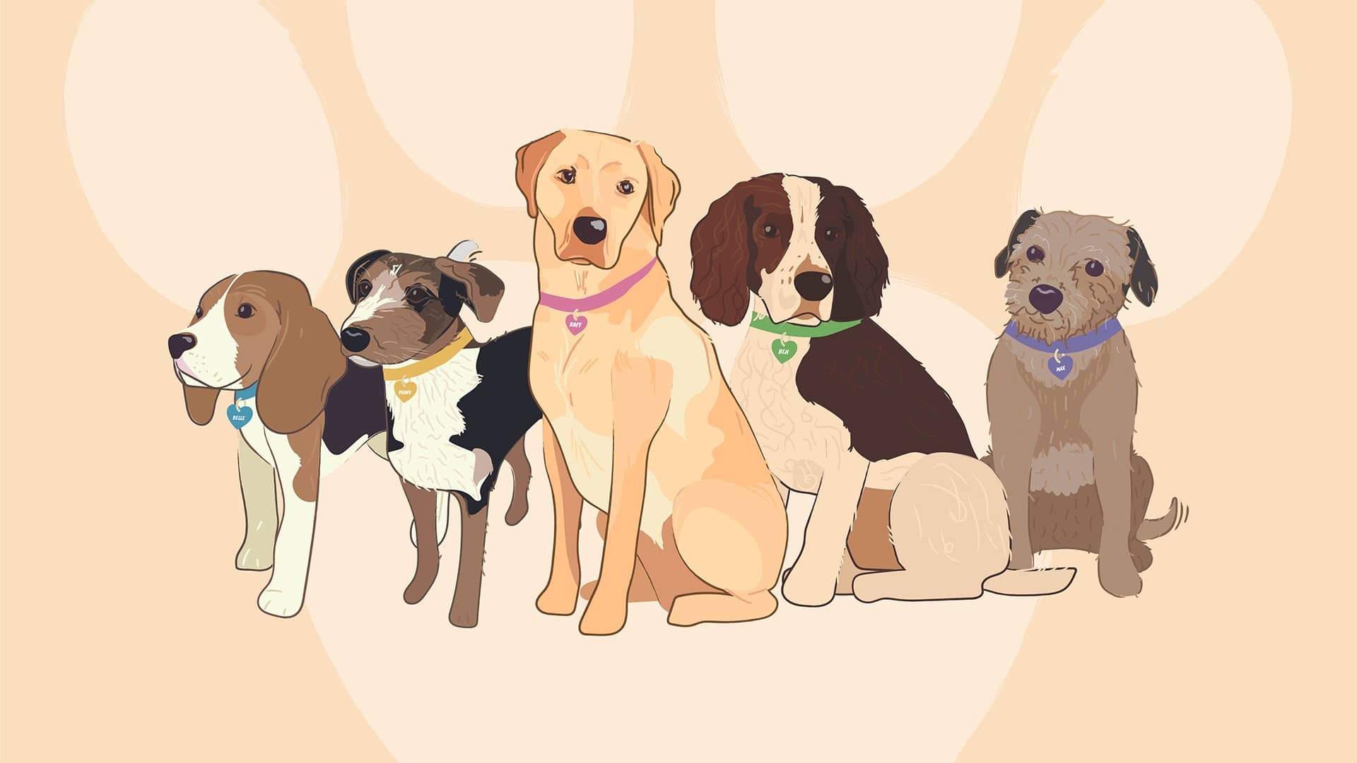
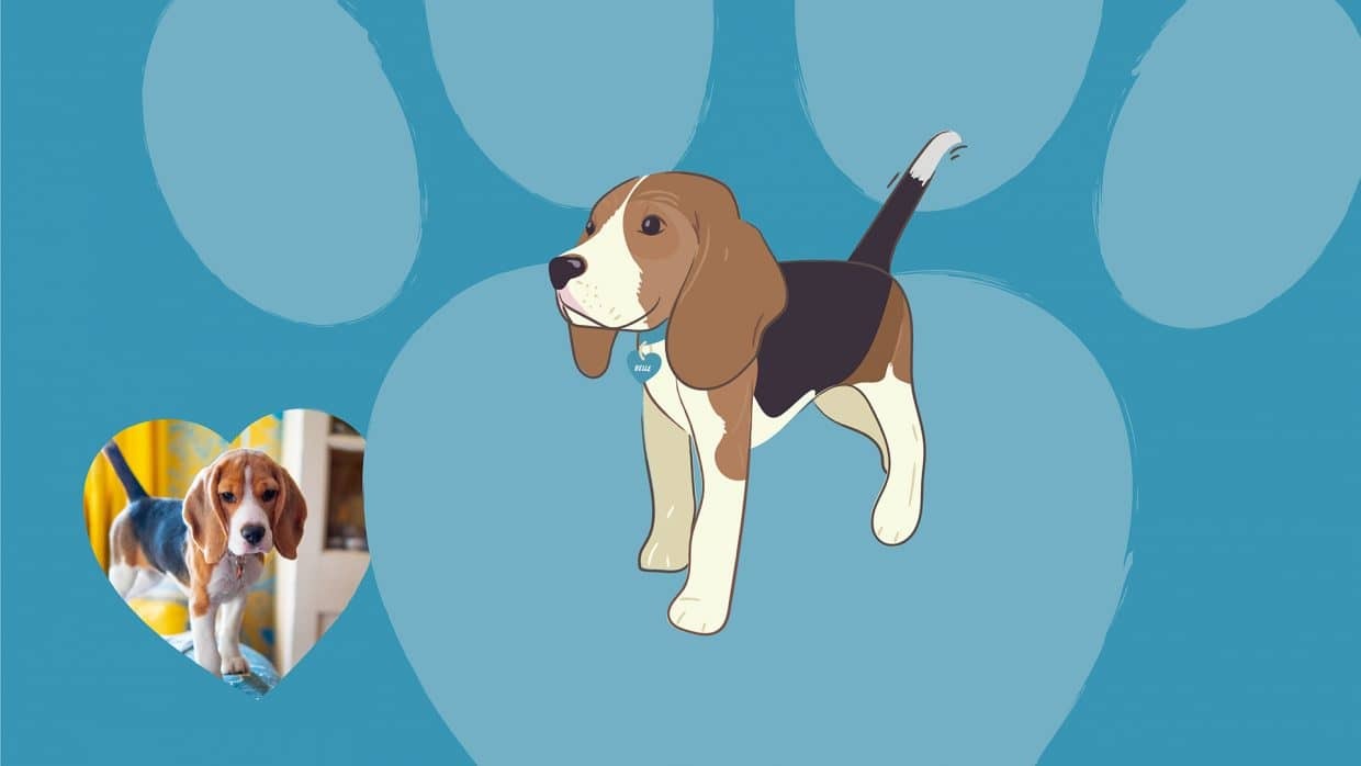
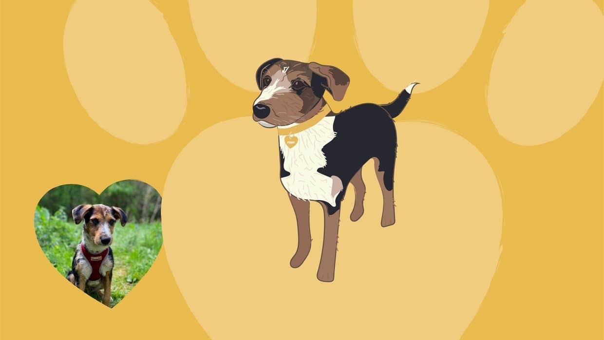
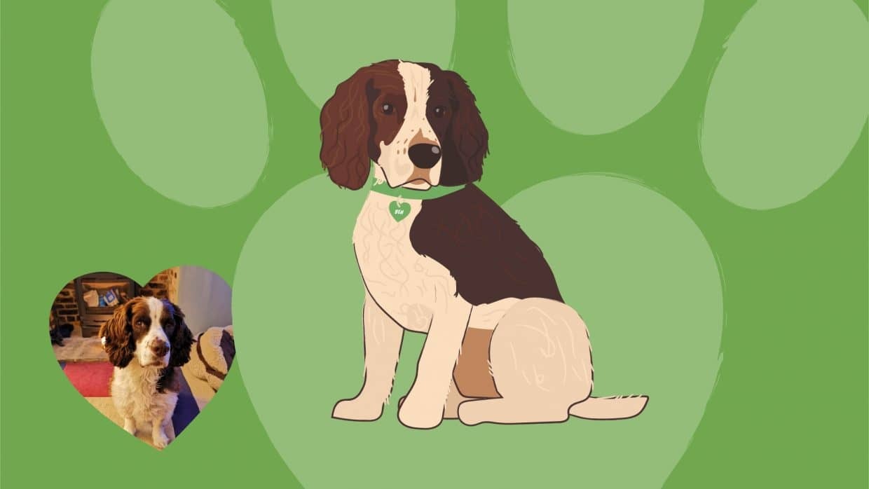
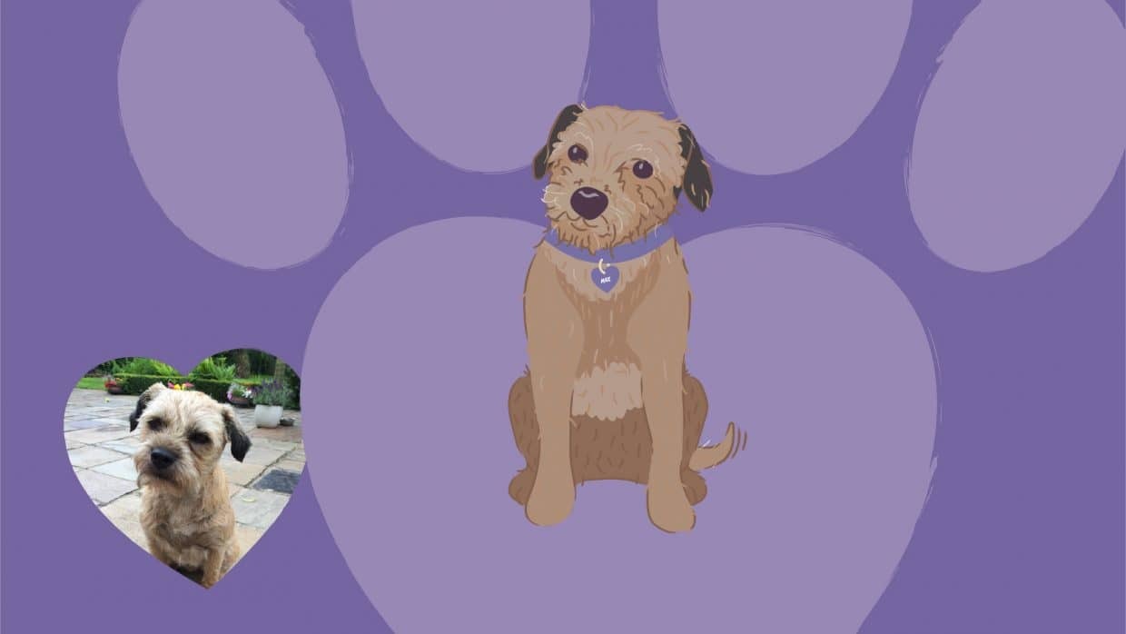
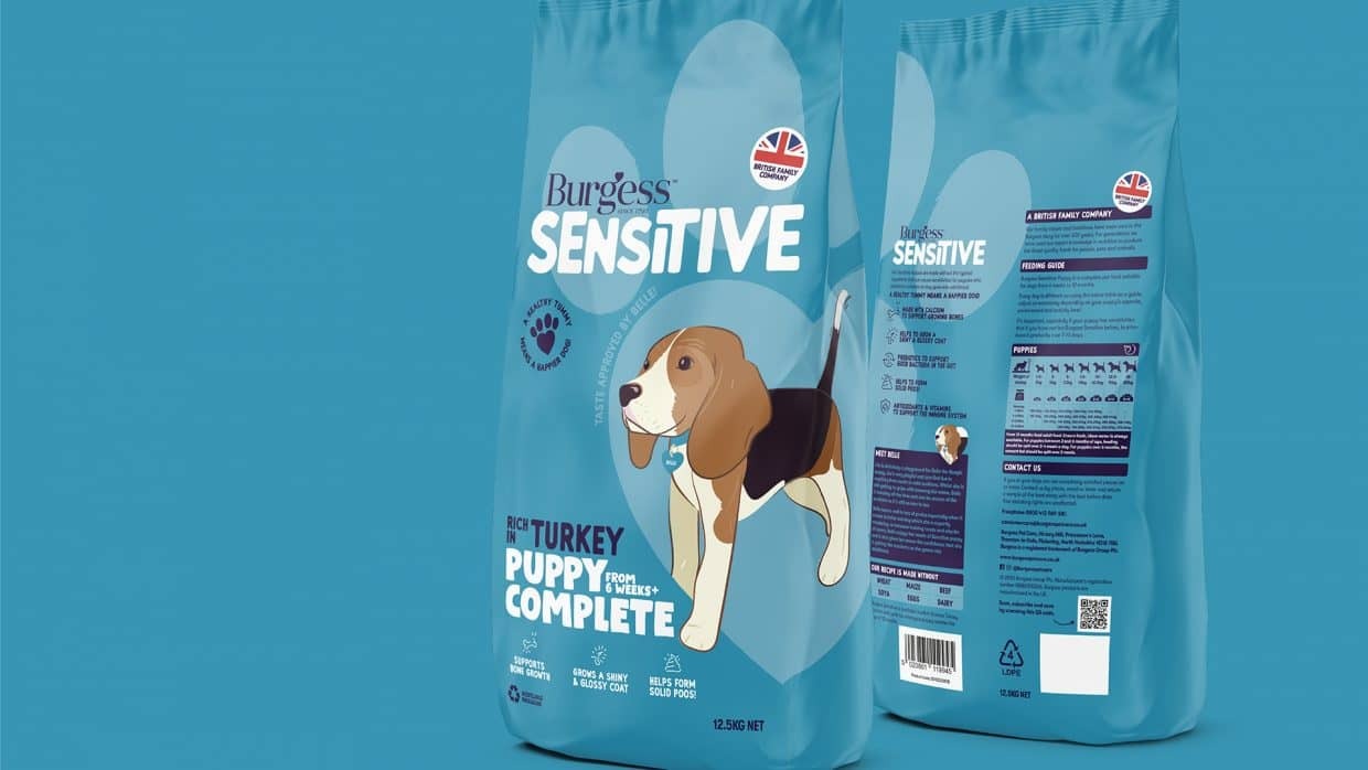
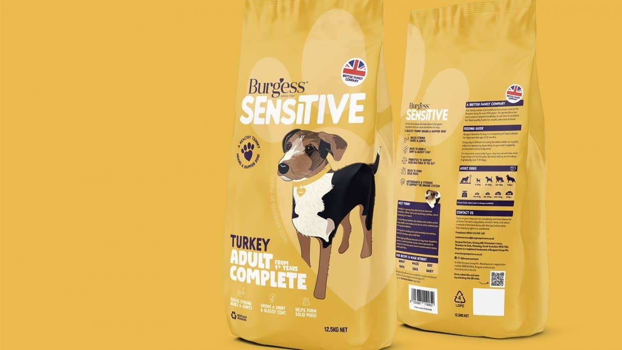
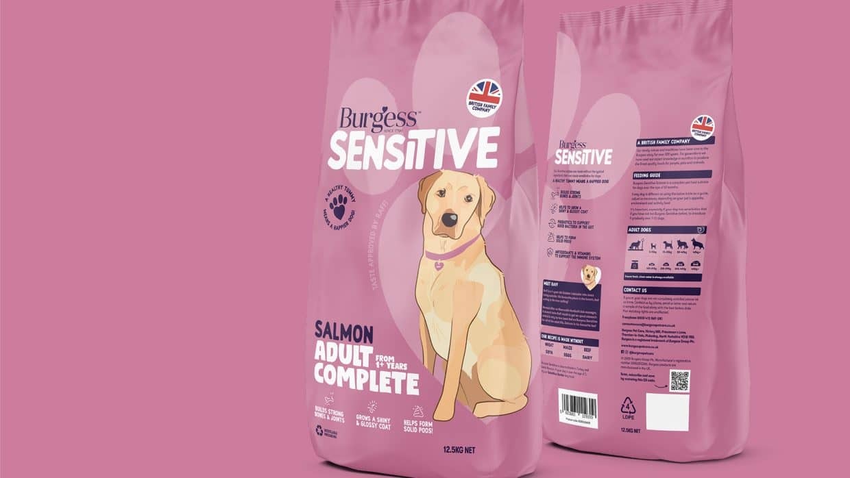
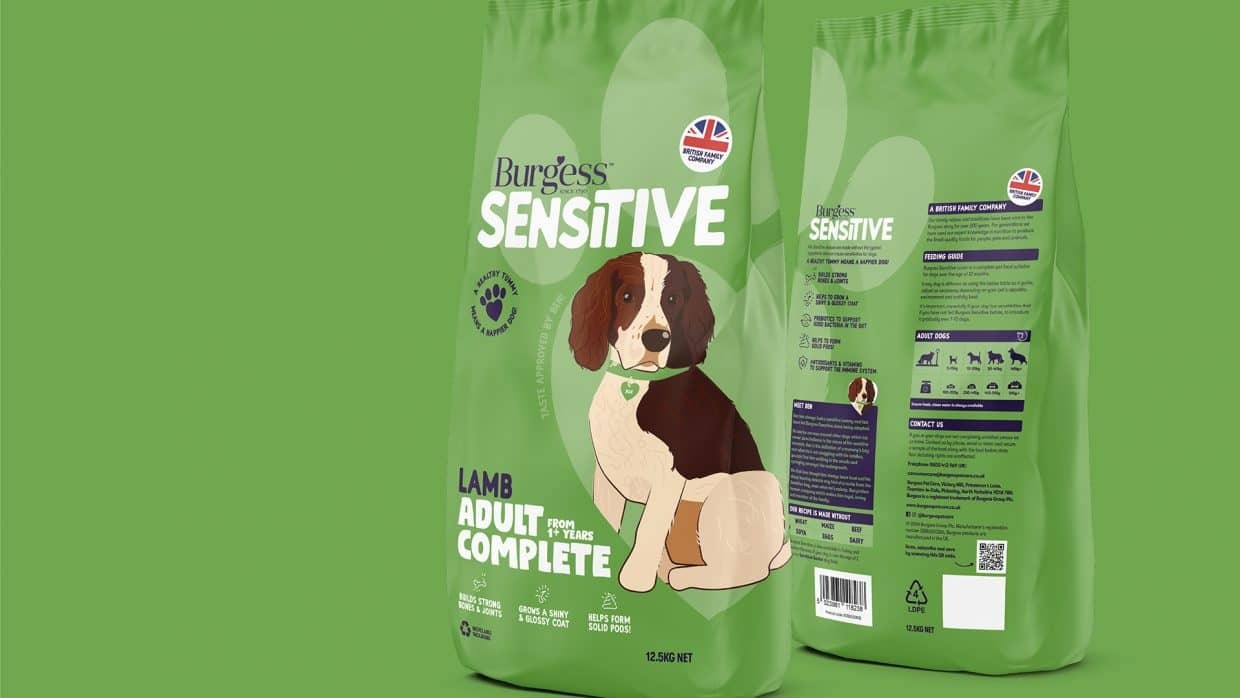
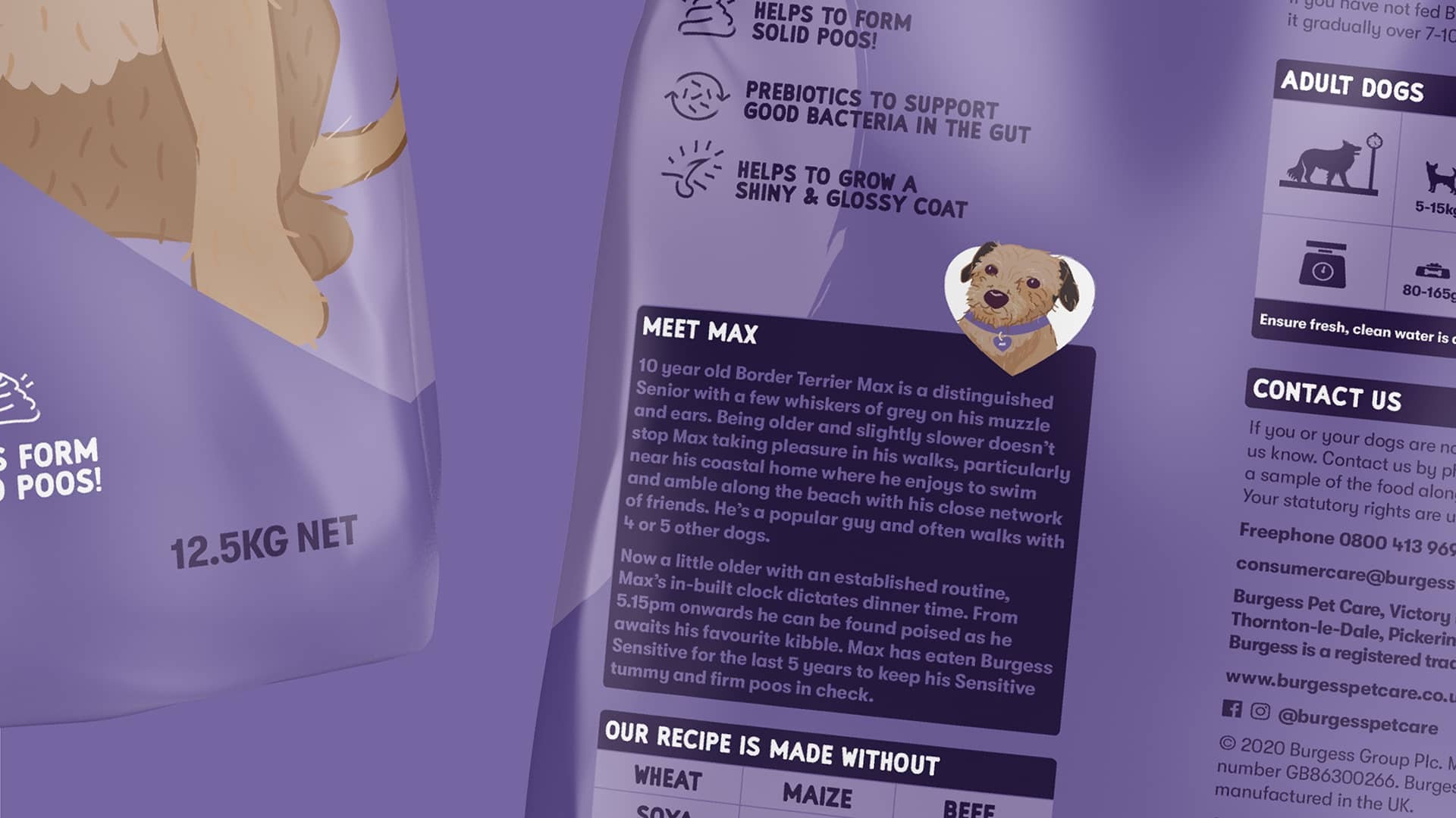
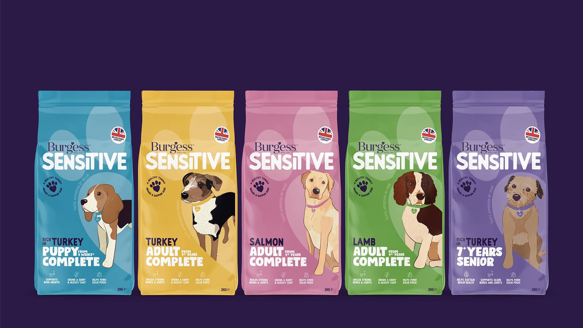
The portfolio of packaging designs centers on illustrations of dogs, but not just any dogs; they feature the beloved pets of the Burgess team. We meticulously crafted a set of custom illustrations based on provided reference material, striving to capture each dog's personality in detail. Each canine has its own unique story and serves as the focal point on one of the five packs in the Sensitive range.

1 / 5
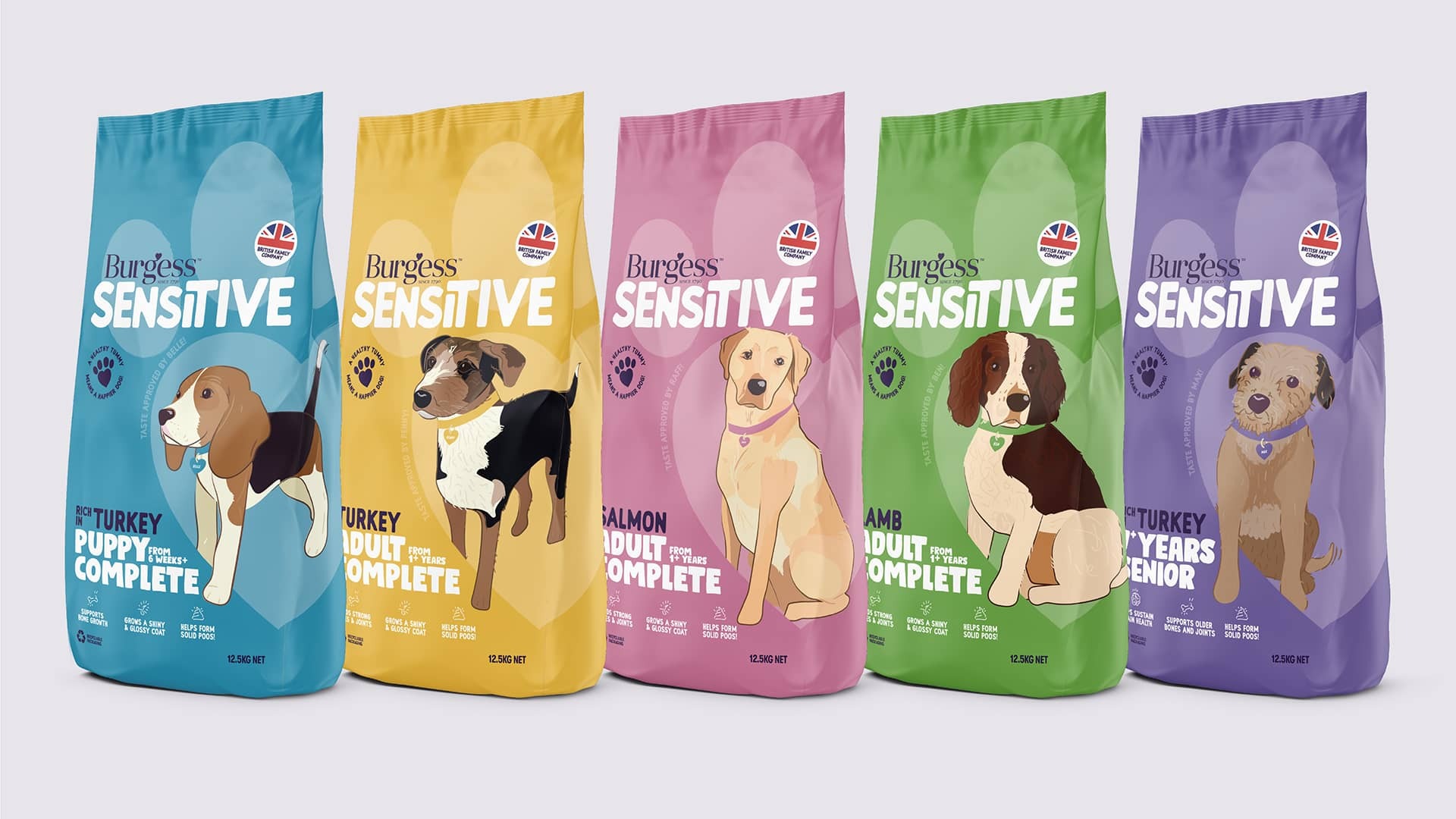
We created a style for the packaging that put the brand name, the product type and more importantly, the dog, front and centre. Each product variant has its own colour, with all other elements consistently placed using the same styling - to ensure that customers could recognise products across the range.
1 / 5
"Dear Burgess"
We devised a launch campaign for the newly packaged products, emphasising the notion that if your dog could speak, it would express its preference for Burgess Sensitive. This concept inspired our "Dear Burgess" campaign, where we brought the dogs to life by giving them voices. They became the stars of the show, engaging with Burgess and articulating their health concerns. Our campaign effectively transformed the serious issue of canine stomach health into an enjoyable experience, enabling Burgess to communicate directly with the dogs and recommend the most suitable products for them.