Redefining lifestyle for an everyday fashion brand.
The Story
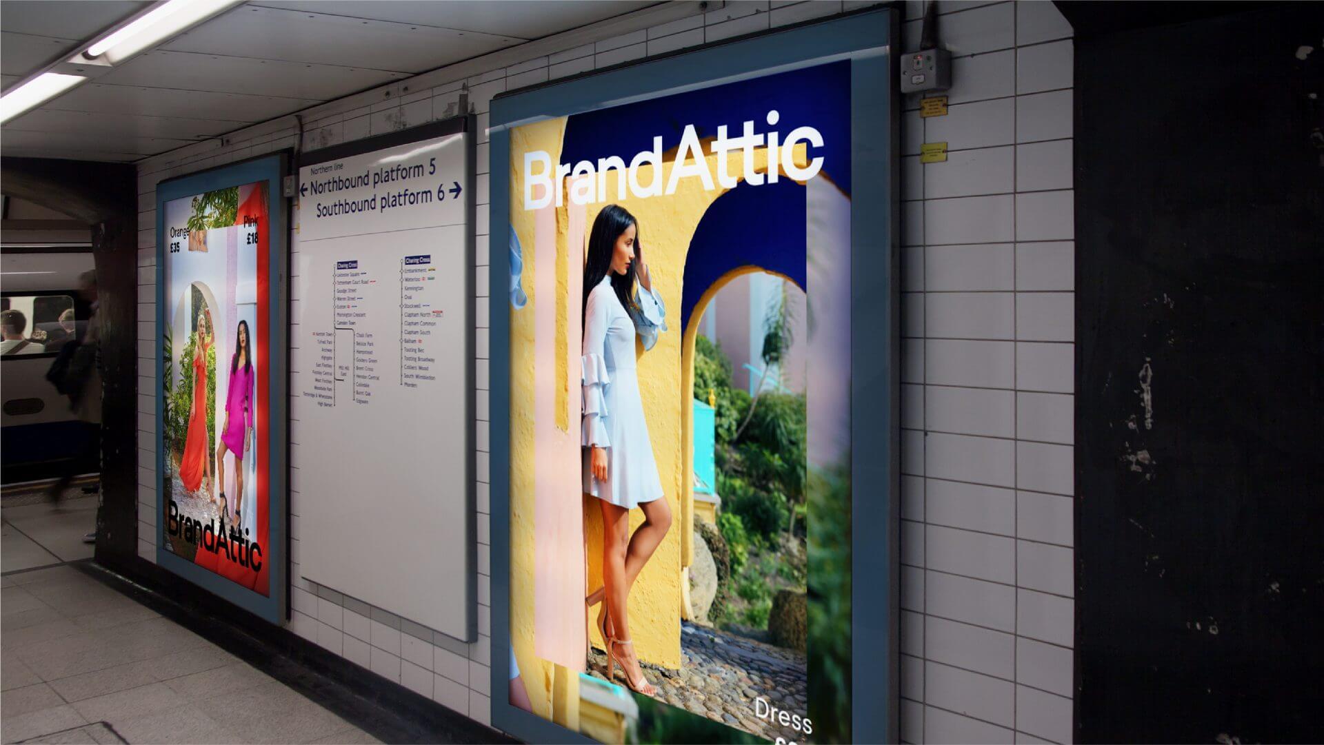
Originally set up to bring together all of the Group’s brands under one roof, Brand Attic was an affordable everyday fashion brand from LF Europe. The Brand Attic identity had become cluttered over time, and as such we were tasked with rebuilding their identity from the ground up, relaunching it with a bold campaign on the London Underground.

Concept
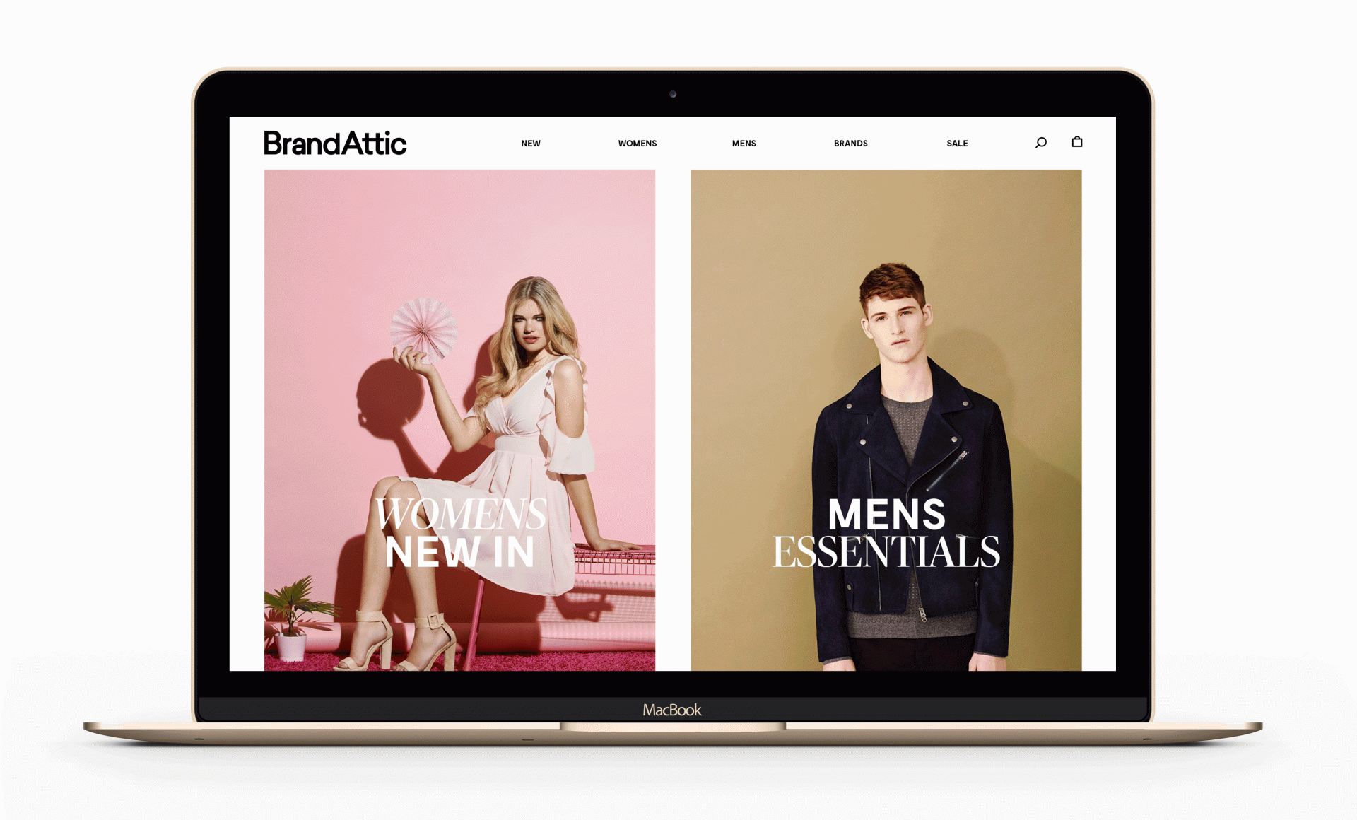
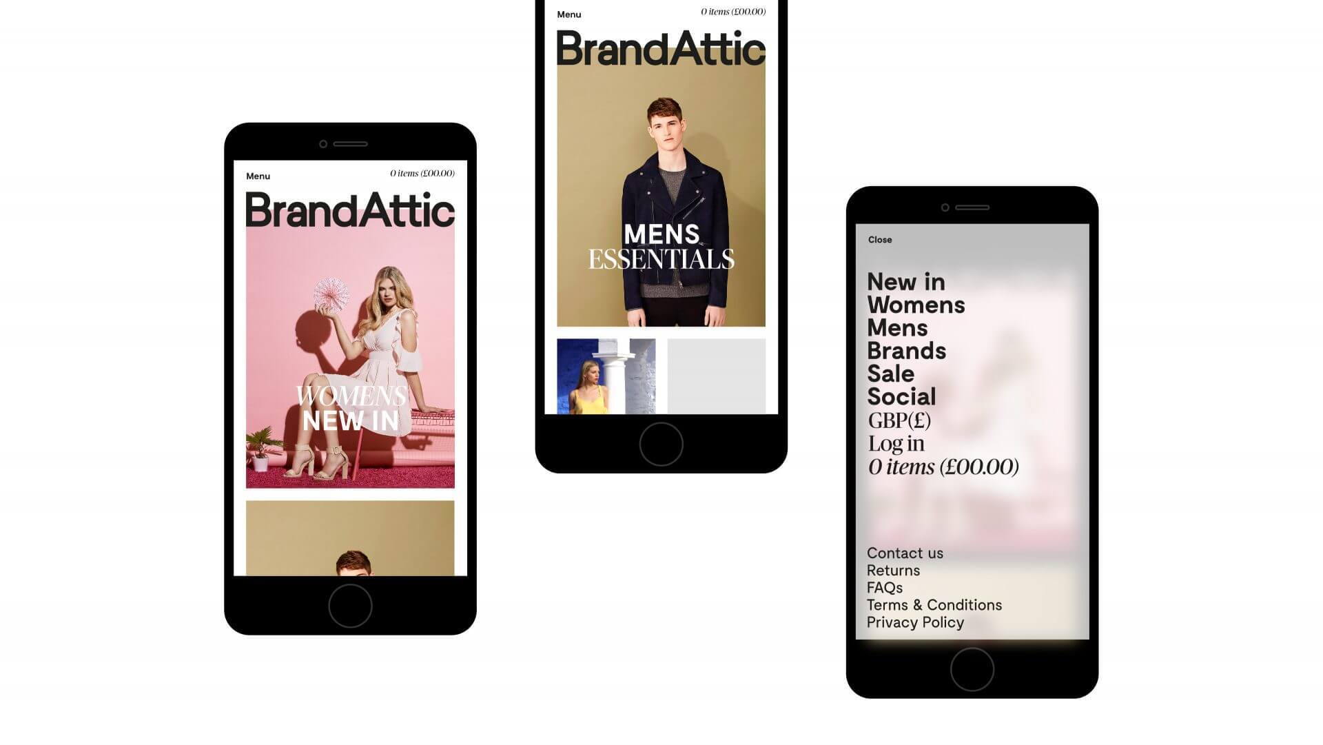
Our new identity was centred around the notion of ‘life style’ – that is, Brand Attic’s commitment to quality and investing in brands of a similar mindset to their own. They offered an effortless, uncomplicated, e-commerce experience that educates customers and enables them to live style - even if fashion isn’t part of their lifestyle. With the brand proposition established, new values and a rewritten elevator pitch, we set about creating a contemporary identity with comprehensive guidelines. Ensuring that the brand toolkit we curated was coherent enough to pass over to Brand Attic’s in-house creative team, so they could hit the ground running and begin using the assets.

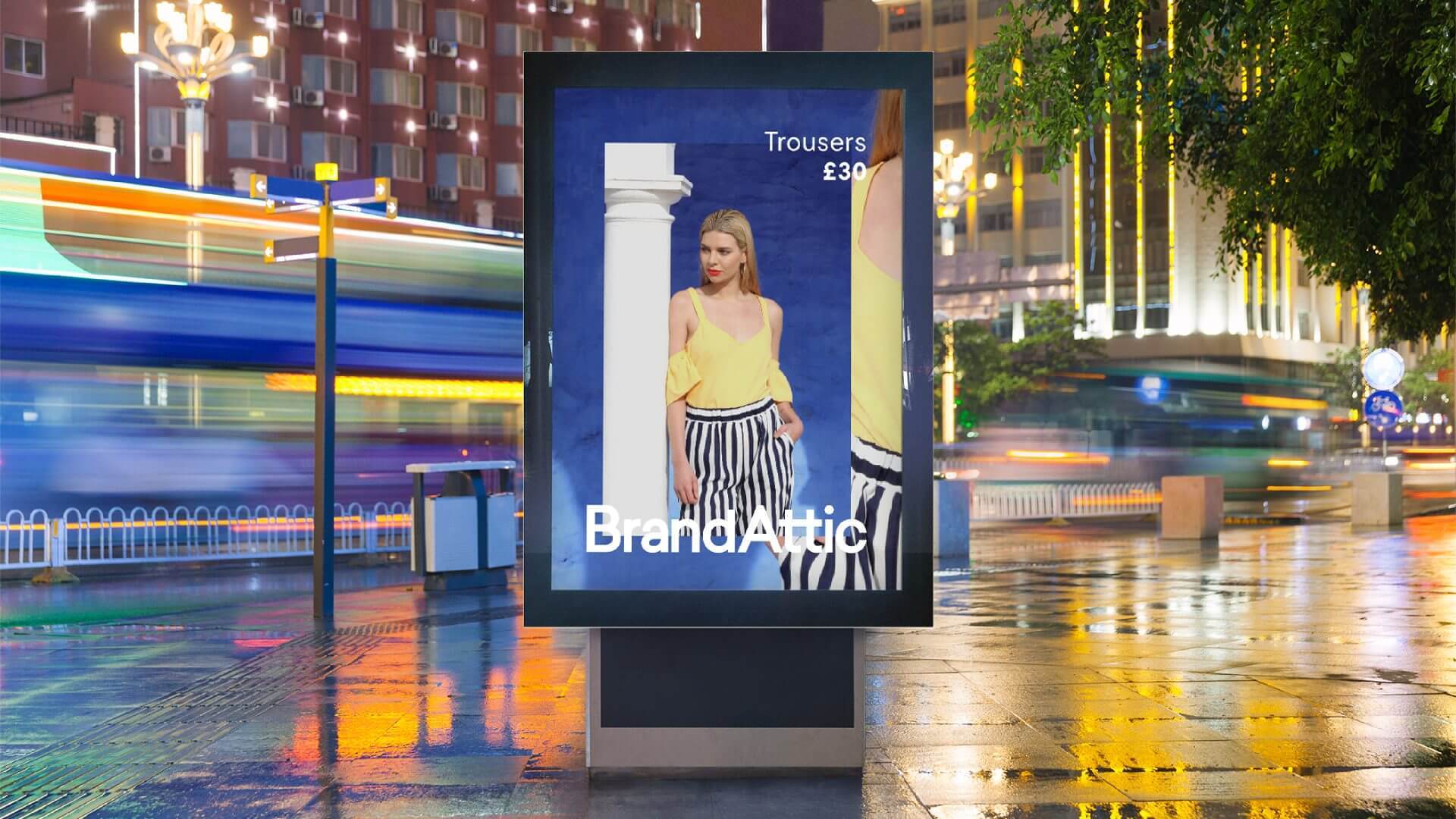
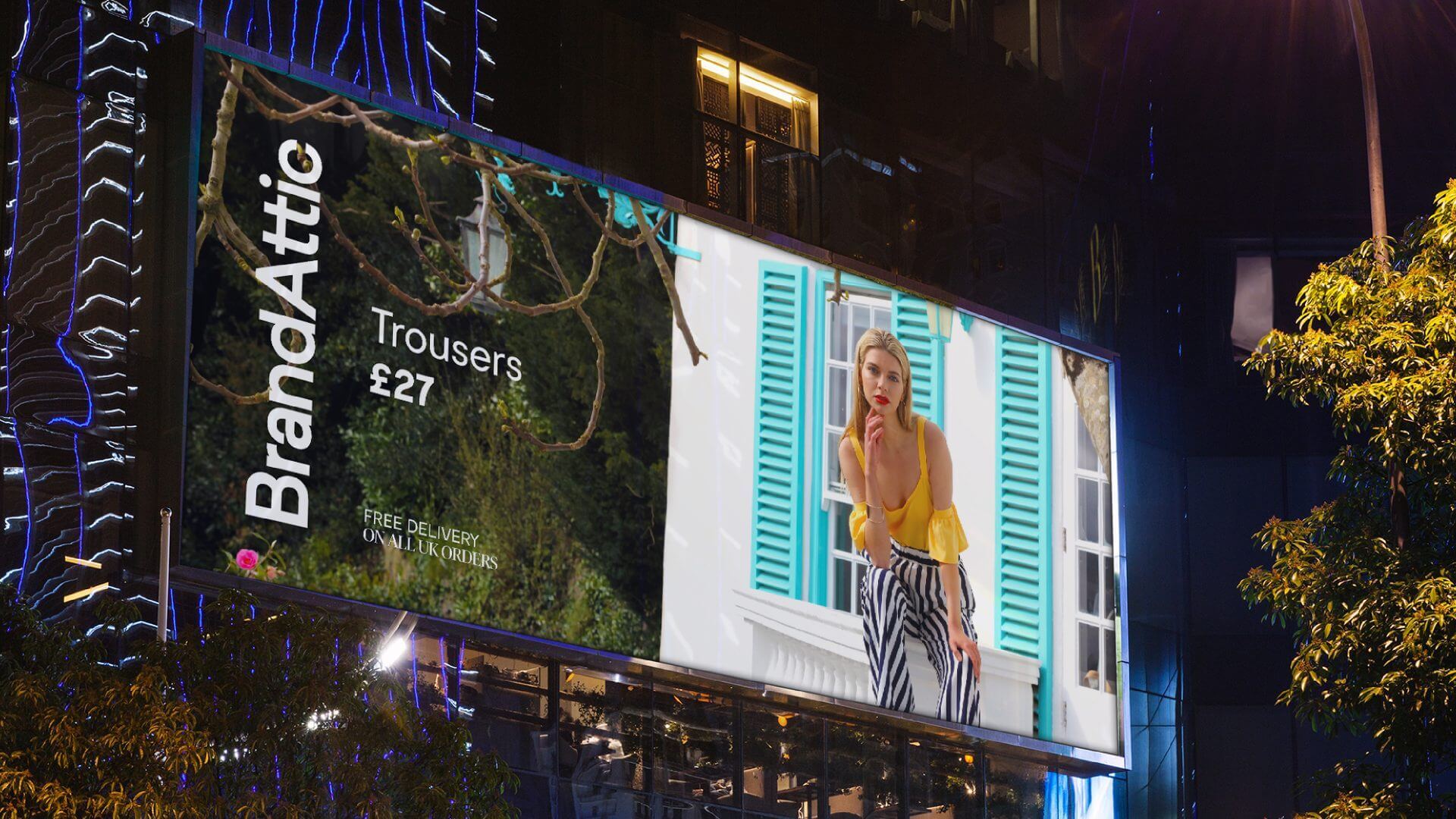
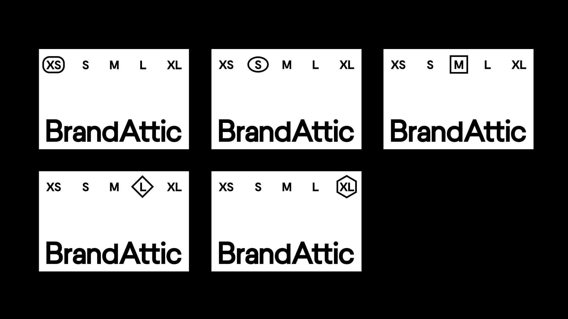
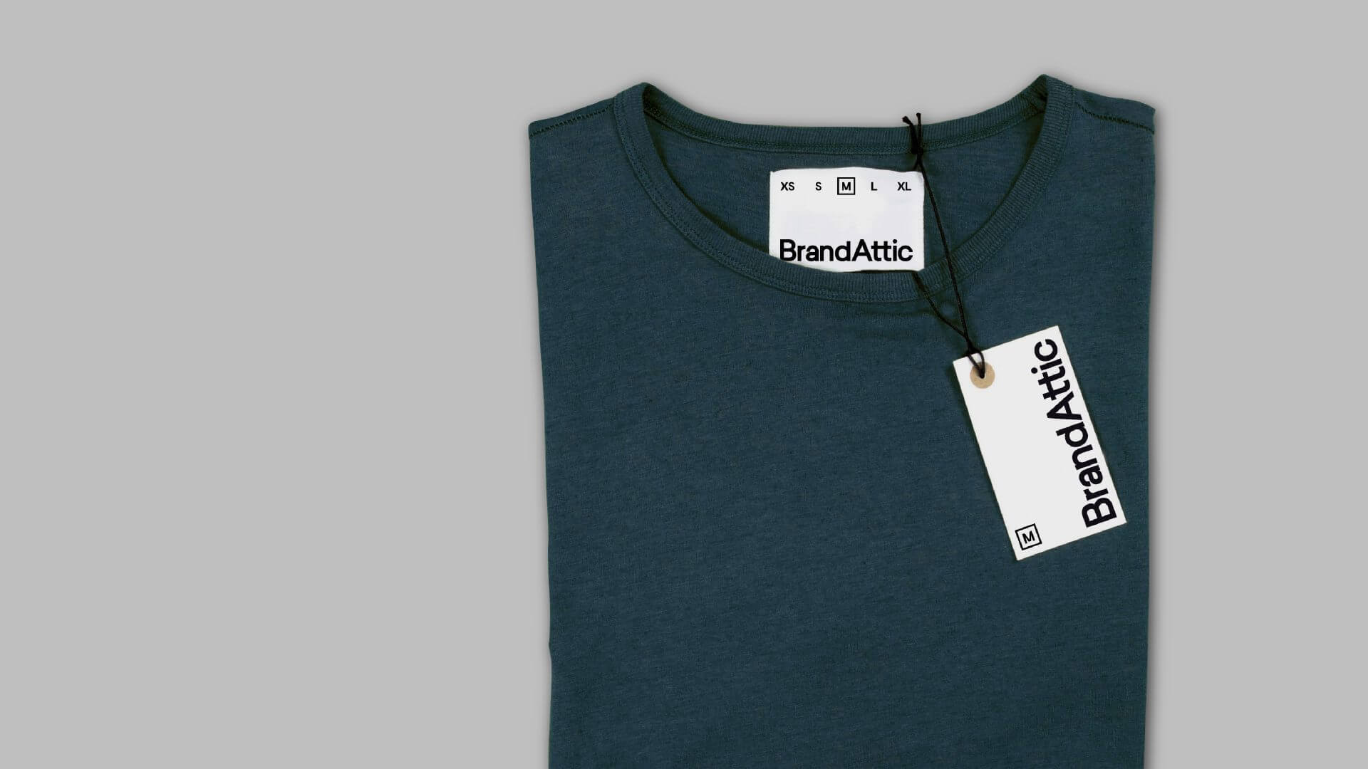
The identity itself is clean and contemporary, shown in stripped-back black and white that never overshadows Brand Attic’s latest campaign photography. We make use of two contrasting fonts on every one of Brand Attic’s touchpoints. The male-orientated font is the geometric sans typeface Moderat Bold, while the female-orientated font is a more aspirational serif typeface in the form of Publico Italic.


1 / 3
Execution
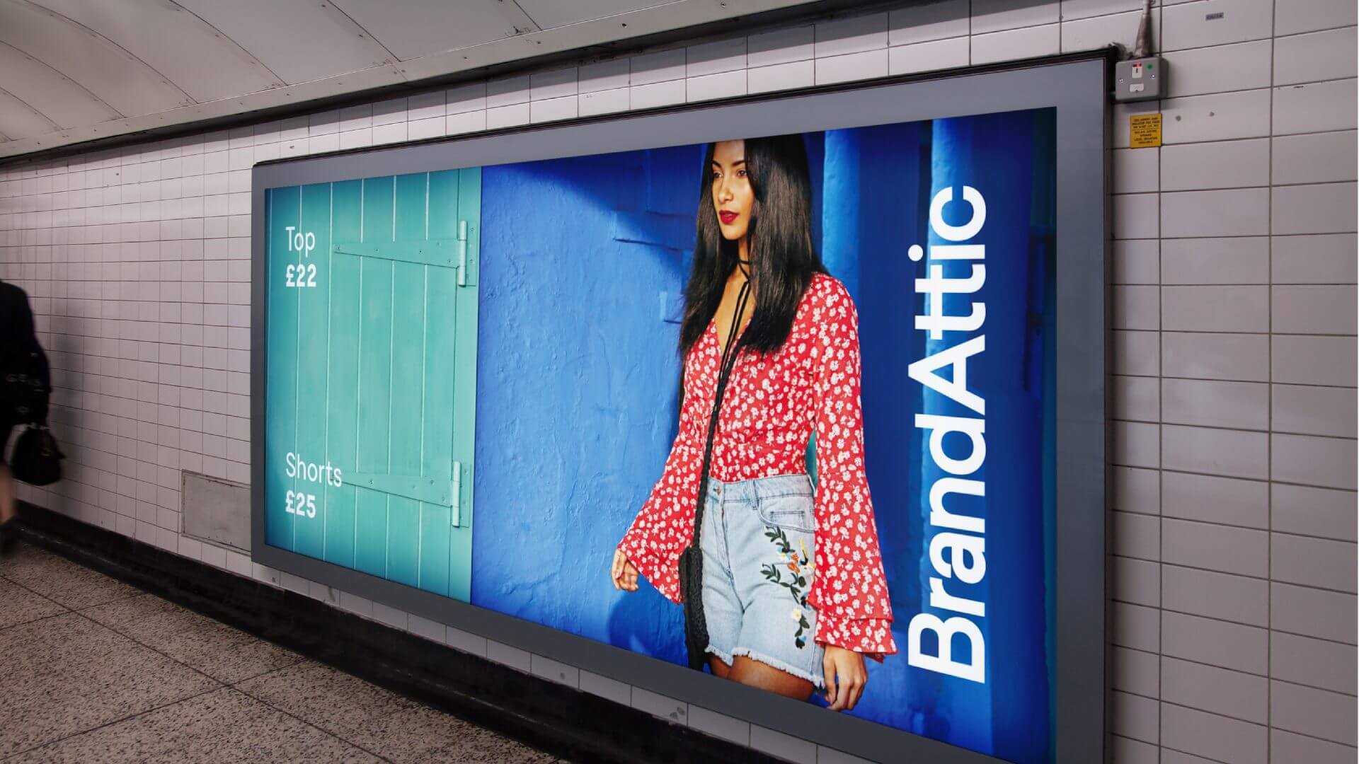
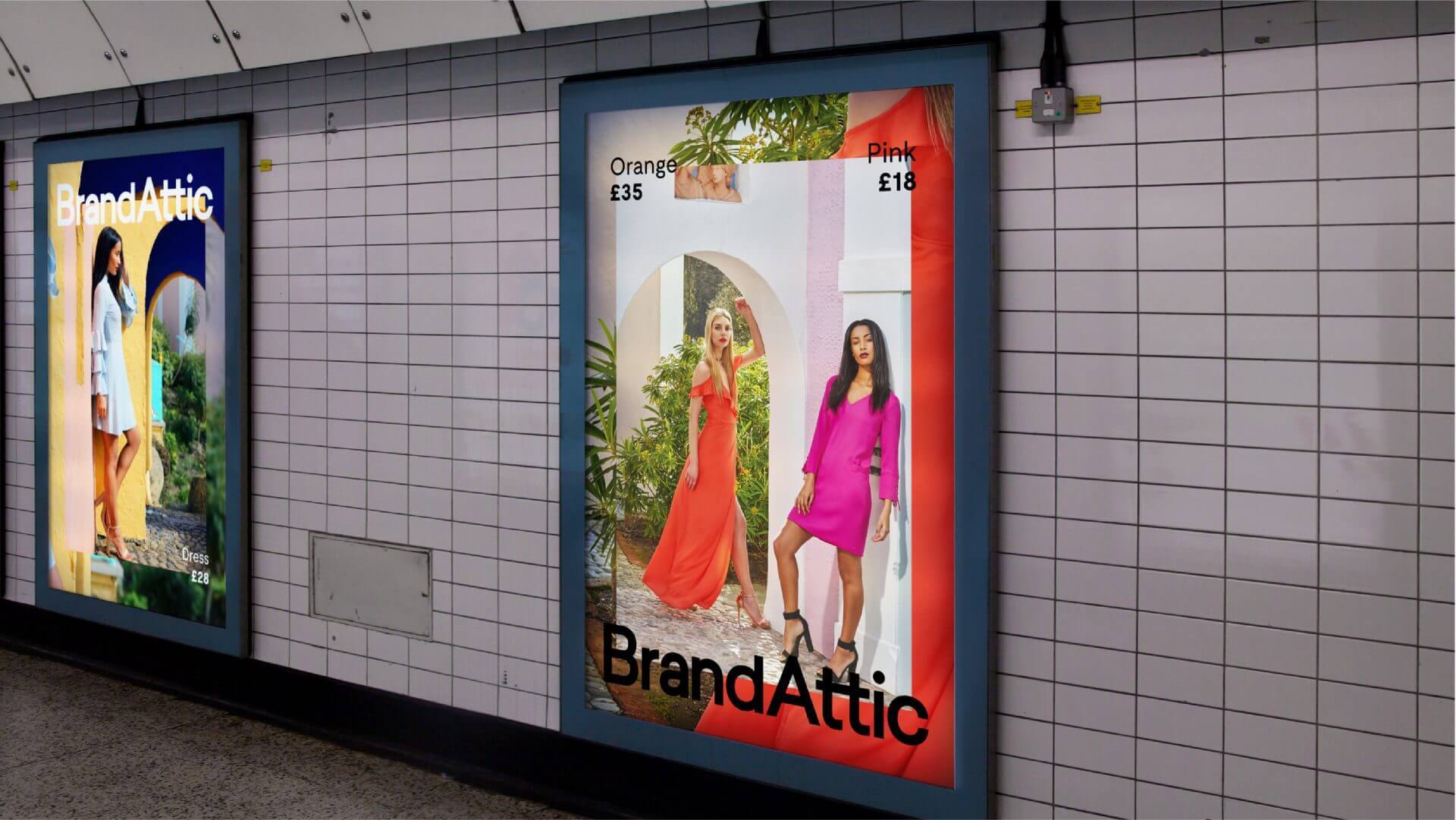
The first campaign, featuring photography from Pip Rustage, was rolled out to Sky’s AdSmart TV service, London Underground stations, Manchester Metro shuttle buses and railway stations throughout the UK and six and forty-eight sheets nationwide. The campaign made use of a unique layering technique – highlighting details and naturally catching the eye simultaneously.
1 / 2