11.10.2023
We’re a branding agency that work with you to Maximise your Potential with effective design, across all platforms.
View all servicesFind the right service for you
-

Creating Brands
By getting to know all there is to know about you and what makes you different from everyone else, we apply this insight into creating, redefining or evolving your brand.
-
Online Brand Delivery
Once we’ve got your strategy locked-in, we’ll get to work with how your brand communicates across website design, development and motion.
-
Offline Brand Delivery
We believe traditional marketing communications can be just as strong as digital. Give your brand the quality, personality and value through campaigns, packaging and print.
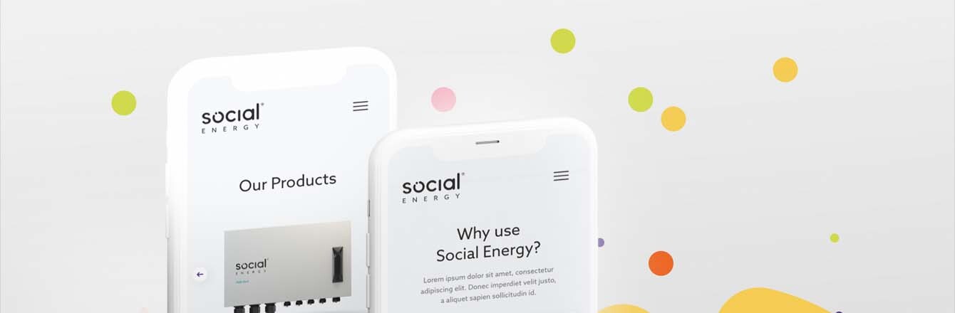
Logos and Responsive Design Logos and Responsive Design
09.10.2017
Logos and Responsive Design
Chances are, you have already heard about responsive design. You know why you need it, and you may even have recently redesigned your brand’s website to accommodate it. In an age where even one named device’s screen size can’t be counted on – the iPhone has three separate screen sizes to account for (the SE, 7 and 7 Plus), as does the iPad (Mini, Pro 9.7” and Pro 12.9”) , and these are all still current models you can buy from the Apple Store today – responsive design is the only way to go.
What people maybe don’t realise is that responsive designs need responsive logos. But as we all know, the philosophy that sits at the core of responsive design isn’t simply one of scaling up or down, but rather making elegant and efficient use of screen space at any resolution. The general rule of thumb is that designs should be simpler at smaller sizes, and more and more detailed as the screen size gets larger and larger.
The beauty of this is that it doesn’t restrict brands to any single, rigid visual appearance – conveying personality in even the most corporate, buttoned-up of brands. Where matters can become slightly complicated is in cases where brands haven’t already accounted for responsive presentation of their marque and/or wordmarque. What I mean by this is that most well-designed brand identities will cover a number of different lock-ups of the core marque, at a number of different sizes – all of which will translate perfectly for usage in this way. Where these considerations haven’t been made, designers will have to create alternative versions themselves, using one of or a combination of all three of these techniques:
1. Reducing detail
Dealing down intricacy at smaller sizes increases the overall legibility of a brand asset. Intricacy is generally reduced by smoothing detailed shapes out, thickening thin strokes and filling previously-outlined elements, for instance.
2. Shifting composition
Taking a horizontal lock-up and making it vertical, or vice versa. This makes sure that the marque doesn’t overlap with menu elements, or require the main navigation to be any wider than it needs to be.
3. Measured subtraction
Removing elements of type within marques can work wonders at smaller sizes, meaning that the smallest sizes might not have any text in them at all, while the largest will not only have the brand name but potentially a tagline, year of incorporation or any other details you might want to convey.
Joe Harrison’s website, Responsive Logos, is a great resource for visualising how responsive logos might change at different sizes. Open a new browser window on desktop at full size, and then slowly resize horizontally to see how the logos of some of the world’s biggest brands reduce down at different screen sizes.