Best Creative Website Design Tips For An Ecommerce Site
Online shopping experiences should be simple and straightforward. Unfortunately, we’ve all had bad ones in the past.
You know the scenario – search for a product, click through the options on Google. Then face a website bombarding you with messy content, disorganised menus and product pictures that look amateur at best.
Like all websites, aesthetics are an important part of keeping customers hooked while they browse. And to get those conversions, you need to delve even deeper to ensure you create a hassle-free checkout process.
Read on to learn more about blending creativity with user-friendly website design.
Keep the design simple
Simple and creative often feel like they don’t fit together. But in reality, simple aesthetics offer room for focal features on your website. The main aspects should allow a straightforward user experience. However, two key areas can bring the design to life – colours and typography.
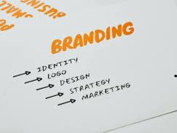
Brand colours
Colour has a surprising effect on emotions and responses. But, that’s not always positive. Too many colours and it’s overwhelming. Try to stick to five or less in your branding and choose shades that complement each other for a positive interaction.
Typography
Of course, if you want people to read your content, it needs to be legible. Consider the typeface style, as this is how customers interpret your brand. Plus, don’t go crazy with lots of different fonts. Try to stick to three or fewer to ensure consistency.
Use high-quality images and videos
Good quality images always boost conversions. Customers want to see the details of what they’re buying.
To enhance the experience further, incorporate video or 360-degree imagery. Think about the background and aesthetics for your shots. Product photos should be clear and detailed.
Use original design features
There are tons of templates and stock graphics out there. However, a little originality goes a long way. Hire a designer to create brand icons, illustrations and graphics to enhance the visual interpretation of your brand and website.
Utilise the latest web design trends
Every industry recognises trends and the web design world is no different. While not every trend is suitable for every business, some are often easily incorporated.
For example, creative website design trends in 2022 include:
- Oversized typography
- Interactive fonts
- Collage visuals and graphics
- Black outlines and bordered buttons
- Gender-neutral design
Make navigation a focal feature
A website menu is often stuffed in the top or sidebar, and while customers subconsciously know this, why not make finding products even easier? Make navigation more visual, up front and centre.
For example, check out websites such as Etsy and Not On The High Street. You’ll find navigational visuals that take you straight to what you want. Plus, you can switch these up to improve sales in specific product categories or to focus on trending items.
Creative website design ideas that convert
Are you looking to improve your website with exciting and visually creative elements that boost conversions? We can help! Our website design agency in Manchester is on hand to help your business take the next step in ecommerce marketing. Contact us today to find out more.


