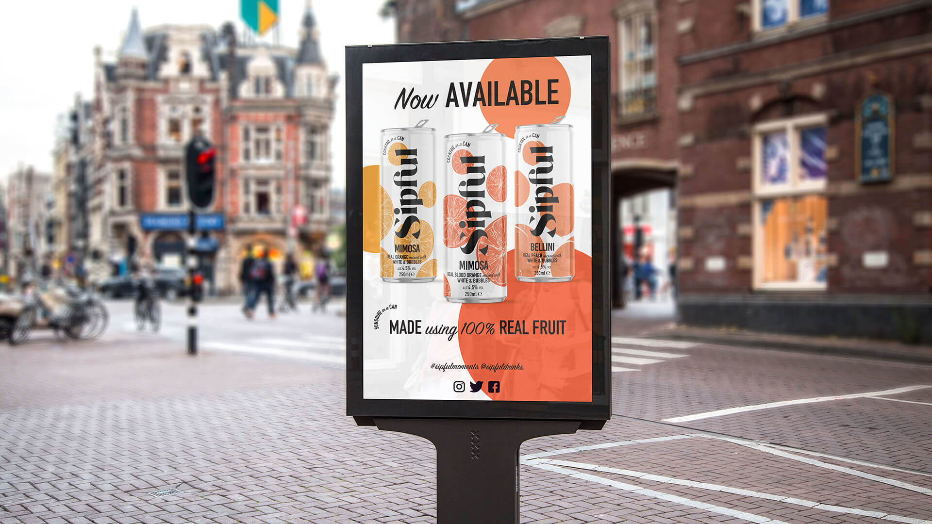
A bubbly brand that enables people to drink well, and do good.

The Story
We were commissioned by Sipful to bring an organic, refreshing, ready-to-drink canned cocktail to the market and cut through the oversaturated space, filled with synthetic and overly sweet alternatives. Sipful’s passionate founders were looking for a format that was portable and compact, ready for any occasion.

The Challenge
To bring an organic, refreshing, ready-to-drink canned cocktail to the market and cut through the oversaturated space, filled with synthetic and overly sweet alternatives. Sipful’s passionate founders were looking for a format that was portable and compact, ready for any occasion.
With their eco-friendly ethos, the product and packaging needed to embody just that.
Concept
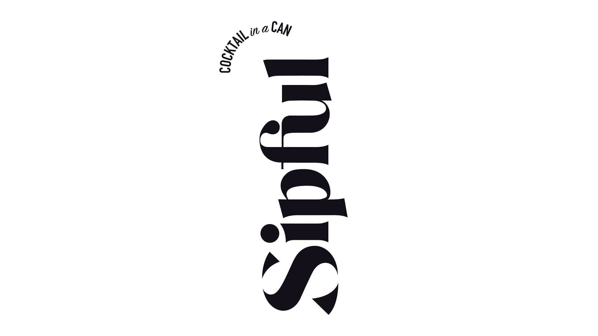
We created ‘Sipful’, originating off the back of the words sip and tipple. Synonymous with traditional RTD formats, the dimensions were tall and slim. Positioning the logo vertically allowed it to hero the space with a bold contrast against the soft colour palette, ensuring strong shelf standout and recognisability. Inspired by a cocktail garnish, the ‘cocktail in a can’ tagline was purposefully positioned above the Sipful logo.
Execution
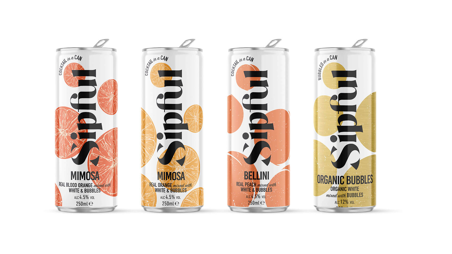
The illustrated design approach is intended to showcase the organic and natural ingredients, with a sleek and grown-up attitude. The visual identity works across the full portfolio, with room for expansion.
Keeping the founders ethos in mind, the Sipful labels were printed on paper and applied to recyclable cans.
